
霓虹灯招牌设计分享

完整提示词
🚀归来第二弹,今天跟大家分享的是一个有趣的门头招牌! 习惯了传统的四方四正的门头,和万年不变的门头。 😄今天我来给大家带来点经典升级的门头设计!不废话看正片! 🧠灵感来源:作为一个地道的北方人。 在很小的时候的关于霓虹灯记忆,更多都是来自于香港的 电影中街头的招牌,觉得做的是真的好看,漂亮。 于是想,是不是可以将其设计自定义输入任何内容生产对应品牌的门头呢?我想将它实现。 🏪应用场景:用于制作门头品牌或者一些比较适合使用霓 虹灯展示其不同表达的场景。 ✍🏻使用方法: ①直接复制系统Prompt 到你的YOUMIND(为例),然后输入你需要制作的【品牌名称】,有些知名的品牌可以直接写名称,自定义的可以这样描述,比如【张飞炸猪排】。 ②直接将系统提示词复制到Gemini /Gem 中,然后系统会进行回复,你直接回复对应的想制作的内容即可,记得选择Nano Banana 🍌 2模型. 欢迎大家提交作业,我想看看有没有更好的创意 ❤️。 Prompt 放置在评论区~ #NanoBananaPro case 霓虹灯招牌提示词如下,记得收藏和交作业! A perfectly, mathematically straight-on, direct frontal architectural photograph taken precisely at eye-level at night. The composition is an orthographic view, with zero perspective distortion, presenting the scene as a perfectly flat geometric elevation. It captures a monumental, highly sculptural 3D neon commercial sign mounted dead center on a futuristic \"smart\" building facade. The facade is composed of textured dark metallic cladding with visible weathering (oxidized patina, rain streaks), integrated with subtle, slow-pulsing [ADAPTIVE_TONE] architectural LED accent strips that complement the sign's color temperature. // 1. BRAND NAME SECTION (Intelligent Scaling) The brand name section at the top features the **complete and full sequence** of the large Chinese characters \"[INPUT_BRAND_NAME]\". **All characters provided must be clearly rendered without any truncation or abbreviation.** They are arranged horizontally across the upper section, constructed as **deep, extruded metal channel letters** (depth: [AUTO_DEPTH]cm based on name length) housing **[AUTO_LAYER_COUNT] stacked layers of exposed glass neon tubes**. These tubes glow in [INPUT_BRAND_COLOR], encased behind thick, clear textured acrylic plates (visible micro-scratches, slight frosting) that create complex light refractions, chromatic aberration at edges, and immense depth viewed directly from the front. Character spacing: [AUTO_KERNING] for optimal readability. // 2. LOGO EMBLEM (Dynamic Sizing) To the right is a **protruding, dimensional emblem logo** (size: [AUTO_LOGO_SIZE] relative to brand name length) incorporating \"[INPUT_LOGO_DESCRIPTION]\". It features [INPUT_LOGO_COLOR] neon outlines with backlighting that makes it float off the background surface. Logo mounting includes visible polished chrome stand-offs with bolt details. // 3. CATEGORY TEXT (Smart Line Breaking) Directly below, the category text \"[INPUT_CATEGORY_NAME]\" is rendered in **thick, stacked layers of [INPUT_CATEGORY_COLOR] neon tubes** set deep within raw, brushed metal channels (visible weld seams). If category text exceeds 6 characters, it automatically splits into two lines with balanced character distribution. Provides strong, heavy industrial contrast with [AUTO_CONTRAST_LEVEL] intensity. // 4. ENGLISH/TAGLINE (Floating Typography) At the bottom, the English text \"[INPUT_ENGLISH_TEXT]\" is in smaller **single-line [INPUT_ACCENT_COLOR] neon tubes** mounted on a raised transparent acrylic support bar (8mm thickness, visible edge lighting), giving a floating appearance. Font weight adjusts to [AUTO_WEIGHT] based on text length. // 5. ADVANCED MATERIAL DETAILS The entire structure emphasizes heavy industrial 3D construction with realistic weathering: - **Metal Framework:** Visible thick steel framing with oxidized copper patina, exposed bolt heads (M12 hex), TIG weld seams with slight discoloration - **Chrome Stand-offs:** Polished mirror-finish mounting hardware with Fresnel reflections and subtle fingerprint smudges - **Wiring Conduits:** Exposed flexible metal conduits with cable strain relief clamps, proper bend radius - **Acrylic Enclosures:** 12mm thick cast acrylic with UV yellowing simulation, micro-scratches from maintenance, slight warping from heat - **Neon Tubes:** Borosilicate glass tubes (15mm diameter) with electrode glow at ends, slight gas color shift indicating age (argon blue aging to subtle purple tint) // 6. ENHANCED LIGHTING PHYSICS The intense multi-colored glow interacts with the environment through advanced light physics: - **Volumetric Scattering:** Atmospheric haze with Rayleigh scattering (blue light scatter) and Mie scattering (larger particle glow) - **HDR Bloom:** Physically accurate bloom with inverse-square falloff, creating star-burst effects on brightest neon sections - **Chromatic Aberration:** Slight RGB color separation visible at high-contrast edges of neon tubes - **Fresnel Reflections:** Angle-dependent specular highlights on chrome hardware and wet metallic facade - **Caustics:** Complex light patterns from textured acrylic refracting onto metallic cladding - **Ambient Occlusion:** Contact shadows where sign mounts to facade, enhancing depth perception - **Light Bleed:** [INPUT_BRAND_COLOR] light spilling onto adjacent LED strips, creating color temperature mixing zones - **Rain Effect (Optional):** Water droplets on facade creating lens effect, light streaks, and enhanced reflections // 7. ATMOSPHERIC CONTEXT The atmosphere is bustling urban technological at night with: - Distant city glow creating ambient light pollution (warm orange sky gradient) - Subtle steam/mist rising from street level - Lens flare from brightest neon elements - Sharp specular highlights across architectural surface - [AUTO_WEATHER_MOOD]: Clear/Misty/Light Rain based on brand personality // 8. TECHNICAL SPECIFICATIONS - **Resolution:** 8K (7680×4320) for maximum detail - **Color Space:** Wide-gamut HDR (Rec. 2020) - **Camera Simulation:** Hasselblad H6D-400c MS, 80mm lens, f/11, ISO 400, 2-second exposure - **Lighting Setup:** Ambient night exposure + neon practical lighting - **Post-Processing:** Minimal color grading to preserve neon color accuracy - **Aspect Ratio:** 【9:16 (vertical/portrait orientation) 】 【以张飞炸猪排为例】 广东人应该都喜欢✌🏻
来源: Berryxia.AI
怎么用这条提示词
- 1. 复制上面的完整提示词。
- 2. 打开免费生成器,粘贴到提示词输入框。
- 3. 如果提示词需要参考图,先上传参考图,然后生成。
这条提示词是为 Nano Banana Pro 写的,在其他 Nano Banana 模型上同样可用,风格和细节会略有差异。
更多产品与品牌提示词
查看全部 →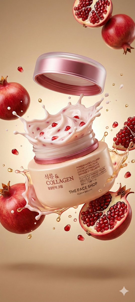
A hyperrealistic premium product photography scene of a
"A hyperrealistic premium product photography scene of a smooth beige cosmetic jar labeled “Collagen" Pomegranate & Collagen Volume Lifting Cream” exploding open mid-air, with the metallic rose-gold lid floating slightly above the jar and a thick, whipped, pale pink cream bursting upward in a dramatic splash, glossy and textured with visible red pomegranate seeds, surrounded by suspended whole red pomegranates and halved pomegranates with glistening ruby-red arils, golden liquid droplets and creamy splashes frozen in motion around the jar, the container tilted slightly to the right and centered in frame, shot from a straight-on macro perspective, illuminated by soft yet high-contrast studio lighting from above and slightly behind to create glowing highlights on the wet textures and translucent splashes, subtle shadows beneath the floating elements, a smooth warm beige gradient background enhancing the color palette of soft pinks, creams, and deep red fruit tones, ultra-sharp focus on the jar and cream with shallow depth of field for the outer fruit, cinematic realism, luxury skincare advertising aesthetic, crisp reflections, 8K photorealistic detail, energetic and fresh mood."
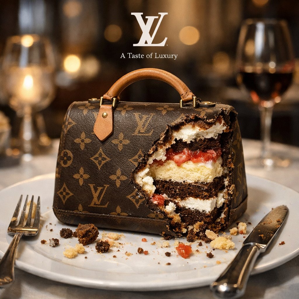
A bitten realistic classic product on the dish, revealed
A bitten realistic classic [brand] product on the dish, revealed inner dessert layers, and there are cake crumbs near, finished fork and knife near by, against blurry high end restaurant background, white small logo on top of background, beneath the logo, there is a tiny brand slogan that suit this scene.
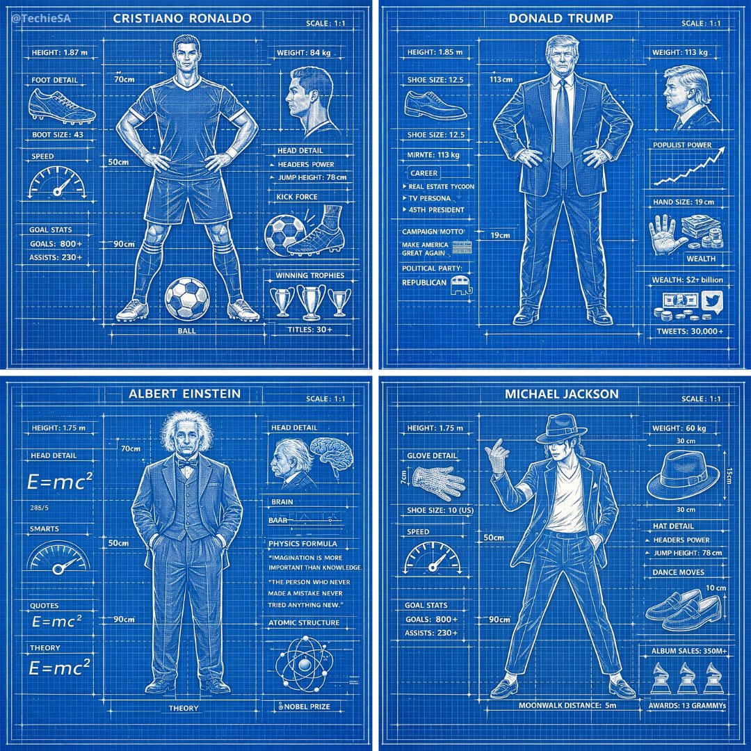
A detailed technical blueprint illustration of , drawn in
A detailed technical blueprint illustration of [CHARACTER], drawn in blueprint style on a blue grid background with precise white linework. Includes subtle measurement markings, labels, and schematic-style annotations around the figure. The design is clean, symmetrical, and centered, giving it the look of a professional engineering drawing.
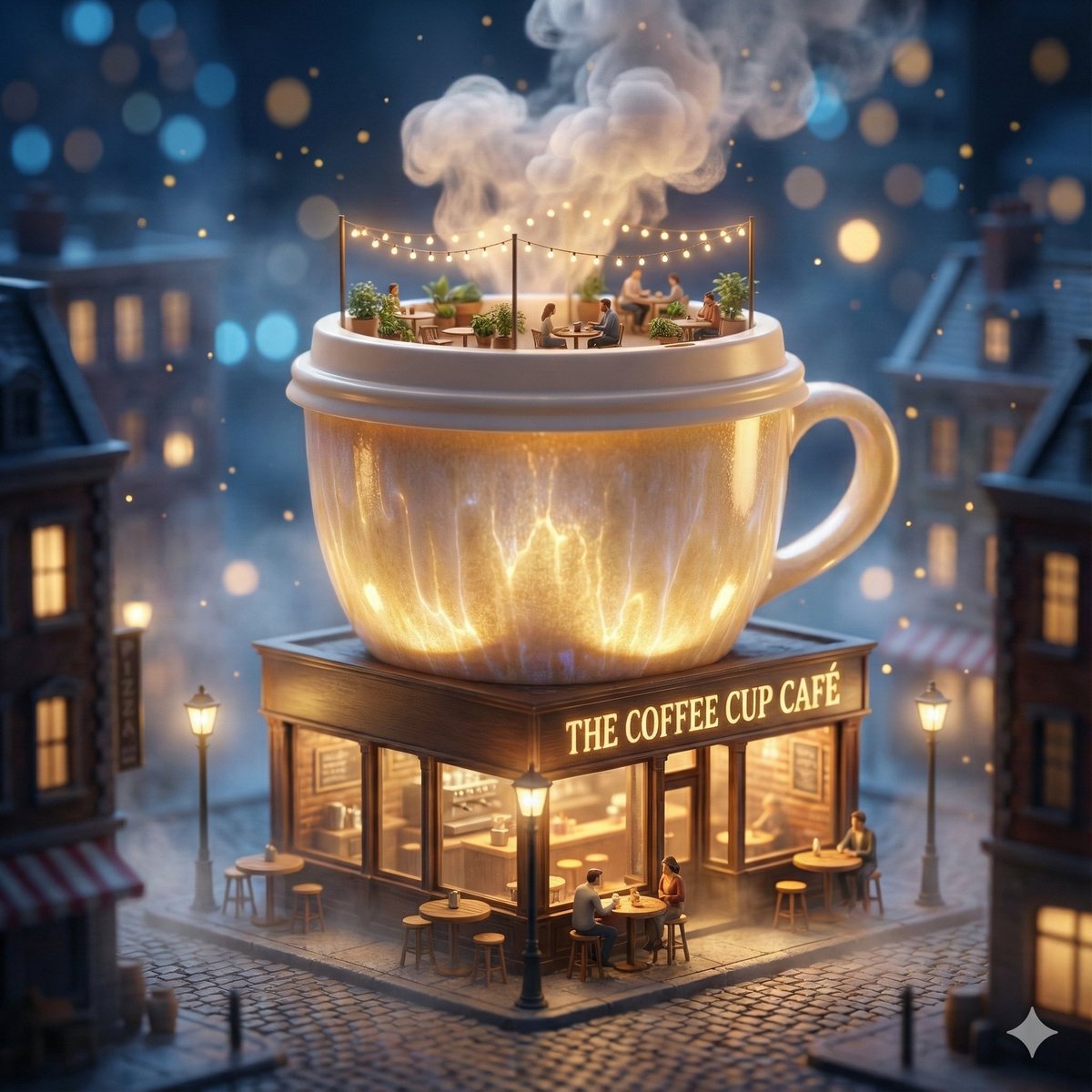
ChatGPT Image 1.5 × Google Veo 3.1
ChatGPT Image 1.5 × Google Veo 3.1 → Nano Banana Pro / GPT-Image 1.5 → Copy & Paste the Prompt → View Results Below ⤵️ Prompt: A surreal miniature city scene where a giant coffee cup transforms into a cozy café building. The coffee cup forms the main structure, with steam rising like clouds, ceramic textures glowing softly, and the lid acting as a rooftop terrace. The ground floor is a warmly lit café storefront with glass windows, tiny tables, stools, barista counters, and glowing street lamps. Nighttime atmosphere with cinematic bokeh lights, floating particles, soft fog, warm interior glow, hyper-detailed materials, fantasy realism, premium brand storytelling. Tilt-shift effect, ultra-sharp focus, dramatic lighting, square frame, 1080×1080, high-end commercial illustration, ultra-detailed 8K quality.
Commercial luxury product photography, photorealistic
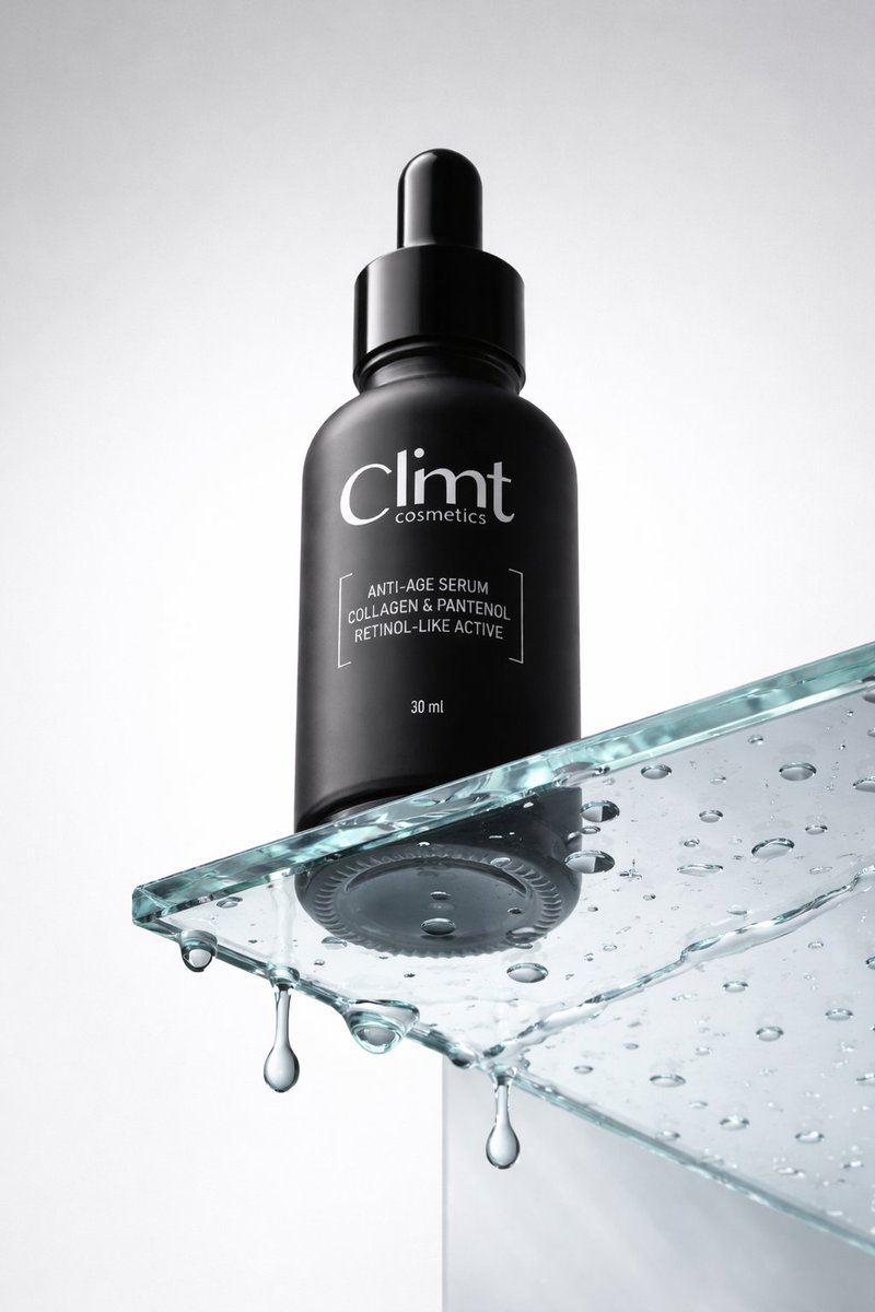
Commercial luxury product photography, photorealistic, ultra high detail, 8K quality. A minimalist matte black cosmetic dropper bottle placed on a clear glass podium. Low angle camera view to make the bottle feel tall and powerful. The bottom of the bottle is clearly visible through the transparent glass. The glass surface is wet with realistic water droplets, with a few drops hanging underneath the glass, frozen mid drip for a time stopped effect. Matte light gray background with no texture or gradient. Soft, even studio lighting with clean reflections, premium skincare advertising look, sharp focus, realistic materials, no distractions.
Conceptual transformation, bird nest construction
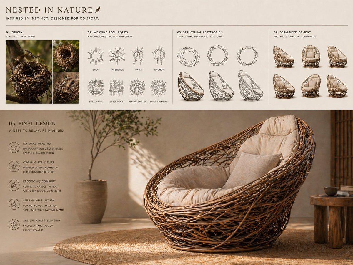
Conceptual transformation, bird nest construction techniques shaping a sculptural lounge chair, sequence from nest-building photography to weaving diagrams to organic structural abstraction to final product, interwoven frame forming seat and backrest, natural fibers with soft cushioning, earthy tones with refined finish, sustainable luxury aesthetic, presentation layout, sketches above, render below, warm natural lighting. AR – 4:3
Create a 16:9 horizontal bento-grid brand collage for in a
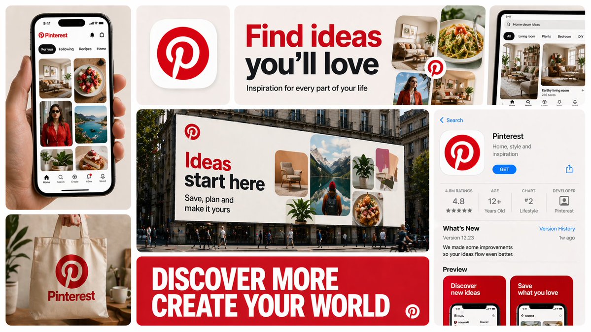
Create a 16:9 horizontal bento-grid brand collage for [BRAND NAME] in a polished contemporary campaign style. Use a fixed 3-row, 4-column bento structure with rounded tiles, equal gaps, clean alignment, and a light neutral background. The layout must stay consistent across generations, but the content inside each tile must adapt to the real business model, product ecosystem, and brand language of [brand name]. Grid blueprint Build the composition as 11 visible content zones arranged in a fixed bento layout: Top-left tile: 1 column × 2 rows, tall vertical hero device or primary brand surface Top-middle-left tile: 1 column × 1 row, compact square brand asset tile Top-middle-right tile: 2 columns × 1 row, wide headline/message tile Center tile: 2 columns × 2 rows, dominant campaign hero scene Top-right tile: 1 column × 1 row, secondary device / product surface / branded object Bottom-left tile: 1 column × 1 row, product artifact or branded utility object Bottom-center tile: 2 columns × 1 row, large bold typography tile Bottom-right tile: 1 column × 2 rows, tall informational product / interface / feature tile All tiles must share the same corner radius, spacing system, and visual polish. The dominant focal points are the large center hero tile, the wide top headline tile, and the wide bottom typography tile. Adaptive content logic Do not assume [brand name] is a fintech brand. Before deciding what appears inside each tile, infer what [brand name] actually is: social platform, SaaS tool, media brand, retailer, hospitality brand, hardware company, mobility app, AI product, consumer app, etc. Every tile must contain a plausible branded asset based on that business type. Use this rule: If [brand name] has a real consumer app, dashboard, product UI, creator interface, booking flow, editor, storefront, feed, player, workspace, or operating surface, use those. If [brand name] does not realistically have payment cards, watches, or hardware, do not invent them. Only include branded physical objects when they make sense for the brand: packaging, merch, signage, magazine, laptop sticker, storefront card, delivery box, product box, wearable, poster, notebook, tote, badge, ticket, book, etc. If the brand is primarily digital, prioritize screens, interface fragments, campaign graphics, app/store listings, editorial visuals, and branded communication assets. If the brand is a platform, use realistic platform surfaces: profile screens, creator dashboards, boards, playlists, templates, analytics, publishing tools, discovery feeds, search, collaboration views, etc. If the brand is a physical-product company, use realistic product shots, packaging, product detail pages, retail signage, and lifestyle scenes. If the brand is a service business, use realistic booking, scheduling, marketplace, onboarding, testimonial, results, or service-delivery interfaces. If exact assets are unknown, infer the most believable official-looking product and campaign system for [brand name]. Tile-by-tile rules 1) Tall left hero tile Show the most iconic primary branded surface for [brand name]. Examples: phone with app UI laptop with dashboard/editor tablet with creative workspace product packaging held in hand branded poster or printed object storefront or physical product close-up This tile should represent the brand’s main touchpoint, not a generic device. 2) Small square brand asset tile Show a compact brand-signature element: app icon logo mark symbol product badge branded motif miniature packaging unit icon system object sticker or seal simplified 3D brand emblem This tile should feel like a distilled identity marker. 3) Wide top headline tile Use a short strategic message that fits [brand name]’s category and tone. Do not repeat generic fintech copy. The line should feel like a real campaign headline for that specific brand. Examples of direction: discovery creativity organization inspiration connection travel productivity expression streaming collaboration automation Use large, bold, high-contrast typography. 4) Large center hero tile Create the main campaign scene for [brand name] in a real-world or branded-environment context. This should be the most expressive tile. Possible formats: outdoor billboard subway poster retail installation city poster wall laptop-on-desk hero scene creator workspace product-in-use lifestyle shot editorial campaign image interface projected into environment branded event signage The scene must make sense for the brand’s world and audience. 5) Top-right support tile Show a secondary but still realistic brand surface: another device view product detail branded object campaign variation interface zoom-in packaging angle social post mockup desktop widget creator tool panel notification / discovery / search view This tile should complement the main touchpoint, not duplicate it exactly. 6) Bottom-left artifact tile Show a category-appropriate branded artifact, not a fixed “bank card”. Choose the artifact based on [brand name]: for fintech: payment card, wallet pass, transfer screen, exchange card for social/media: creator card, profile card, post template, content preview, board tile, channel card for SaaS/productivity: workspace card, document preview, template card, dashboard widget for e-commerce/retail: packaging, shipping box, loyalty pass, product tag, order card for travel/hospitality: booking card, room key, boarding-style pass, itinerary card for music/media: album card, playlist card, player card, event ticket for AI/software: prompt card, generation result card, model card, workflow card This tile must feel like a believable branded unit of value for that company. 7) Wide bottom message tile Use one strong oversized statement in uppercase or bold display typography. This is not necessarily the slogan from the top tile; it can be a broader campaign line or category promise. The message must match the actual brand behavior of [brand name]. For example, do not use “MOVE MONEY WITHOUT BORDERS” unless the brand actually deals with payments or finance. 8) Tall right informational tile Show a structured branded information surface: app store page product page onboarding screen feature overview marketplace listing creator profile brand campaign landing screen dashboard overview editorial page discovery feed help center / setup / feature panel This tile should add product depth and make the collage feel like a full brand system. Brand realism rules Use the real or highly plausible brand identity of [brand name]: logo, color palette, typography feel, icon language, image treatment, interface style, and tone of voice. If exact assets are unavailable, invent only what is necessary, but make it feel like the official visual system of [brand name]. Do not force a product category onto the brand. Do not invent impossible hardware, payment tools, packaging, or app features unless they are realistic adjacent extensions of the brand. Prefer believable brand adaptation over visual symmetry. Visual consistency rules Even though tile content is adaptive, the final image must still feel like one campaign system: same overall grid structure same tile spacing same corner radius same art direction quality same brand palette across all tiles consistent typography logic consistent mockup realism consistent lighting and polish Style Clean premium brand presentation, high detail, polished mockup realism, soft shadows, strong hierarchy, editorial-quality composition, modern campaign aesthetics. Avoid random collage chaos. Avoid tiny unreadable text. Avoid generic placeholder UI. Keep the structure fixed, but let the objects and branded surfaces adapt intelligently to [brand name]. Stronger one-line instruction Important: the layout is fixed, but the objects are not fixed. For each generation, select tile content based on what [brand name] realistically sells, ships, publishes, displays, or lets users interact with. Never insert category-inappropriate objects just to fill the grid.
Create a 3×3 grid in
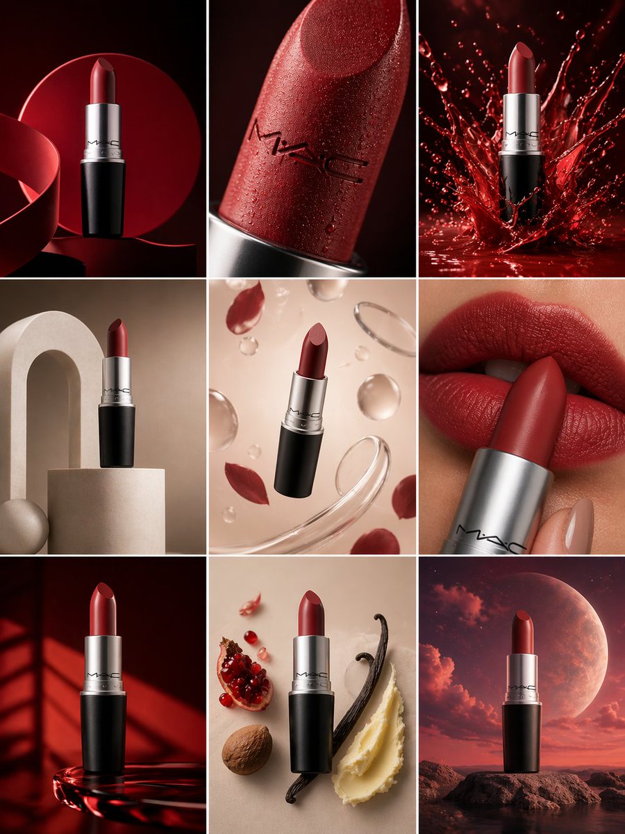
Create a 3×3 grid in 3:4 aspect ratio for a high-end commercial marketing campaign using the uploaded product as the central subject. Each frame must present a distinct visual concept while maintaining perfect product consistency across all nine images. Grid Concepts (one per cell): 1. Iconic hero still life with bold composition 2. Extreme macro detail highlighting material, surface, or texture 3. Dynamic liquid or particle interaction surrounding the product 4. Minimal sculptural arrangement with abstract forms 5. Floating elements composition suggesting lightness and innovation 6. Sensory close-up emphasizing tactility and realism 7. Color-driven conceptual scene inspired by the product palette 8. Ingredient or component abstraction (non-literal, symbolic) 9. Surreal yet elegant fusion scene combining realism and imagination Visual Rules: Product must remain 100% accurate in shape, proportions, label, typography, color, and branding No distortion, deformation, or redesign of the product Clean separation between product and background Lighting & Style: Soft, controlled studio lighting Subtle highlights, realistic shadows High dynamic range, ultra-sharp focus Editorial luxury advertising aesthetic Premium sensory marketing look Overall Feel: Modern, refined, visually cohesive High-end commercial campaign Designed for brand websites, social grids, and digital billboards Hyperreal, cinematic, polished, and aspirational
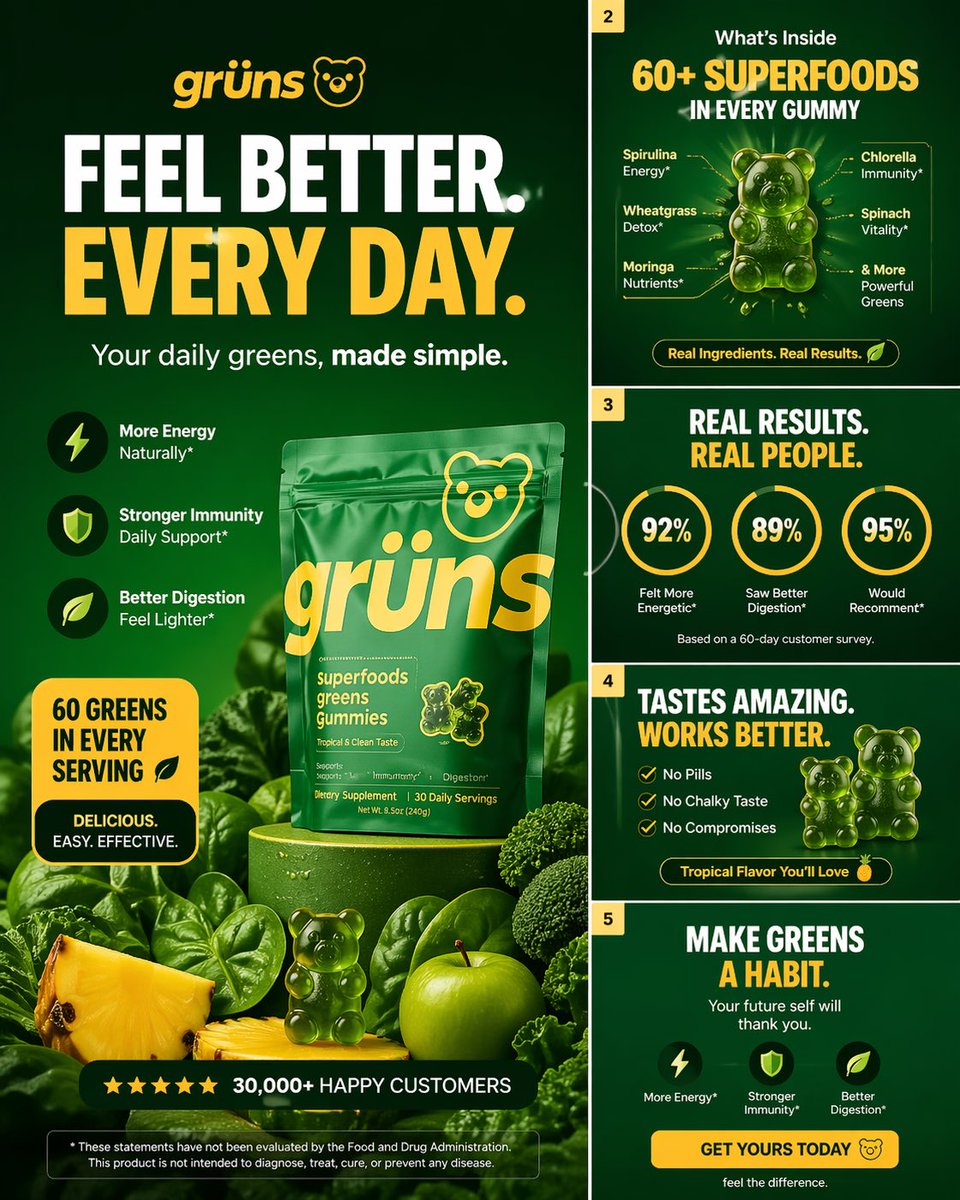
Create a high-converting carousel image for Grüns (greens
Create a high-converting carousel image for Grüns (greens gummies). Bold hook, clear outcome, premium DTC design. Mobile-first, 4:5, advanced design level.
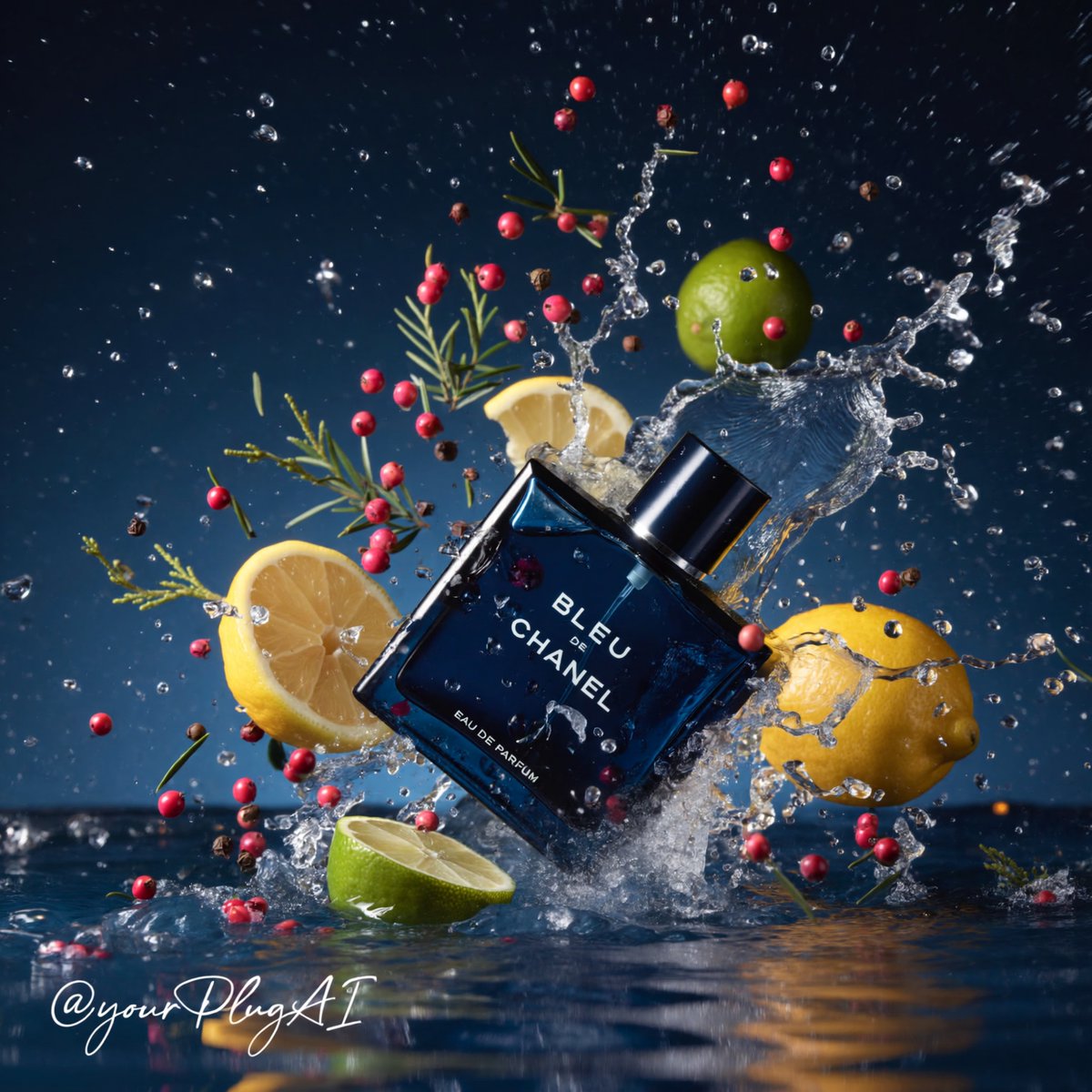
Create a hyper-realistic cinematic luxury perfume product
Create a hyper-realistic cinematic luxury perfume product photograph featuring [PERFUME BOTTLE DESIGN] positioned in [COMPOSITION / ANGLE] within a dramatic elemental environment of [ELEMENTAL SETTING: water, smoke, ice, firelight, forest, florals, spices, gemstones]. The bottle should feel premium and tactile, with [MATERIAL DETAILS: glossy glass, metallic cap, gold label, transparent liquid, frosted surface, engraved text], sharp reflections, realistic refractions, and crisp readable branding: [BRAND / LABEL TEXT]. Surround the product with carefully arranged sensory ingredients such as [BOTANICALS / SPICES / FRUITS / OBJECTS], using strong contrast between [PRIMARY COLOR PALETTE] and [ACCENT COLORS]. Lighting should be cinematic and high-contrast, with [LIGHTING STYLE], deep shadows, sparkling highlights, volumetric atmosphere, and a luxurious commercial advertising finish. Background: [BACKGROUND DESCRIPTION], shallow depth of field, premium editorial composition, ultra-detailed textures, 8k resolution, photorealistic studio quality. Cheat Sheet [PERFUME BOTTLE DESIGN]: shape, color, cap, label style [COMPOSITION / ANGLE]: tilted crash, centered still life, close-up tray, hand interaction [ELEMENTAL SETTING]: splash, smoke, candlelight, ice, forest, aurora [MATERIAL DETAILS]: glass, metal, liquid, frost, reflections [BRAND / LABEL TEXT]: exact readable perfume text [BOTANICALS / SPICES / FRUITS / OBJECTS]: lemons, vanilla pods, roses, pinecones, gemstones [PRIMARY COLOR PALETTE]: navy, amber, silver, black, icy blue [ACCENT COLORS]: gold, red, lime green, magenta, teal [LIGHTING STYLE]: dramatic spotlight, candle glow, cool moonlight, golden rim light [BACKGROUND DESCRIPTION]: moody studio, dark forest, blurred luxury interior, smoky backdrop
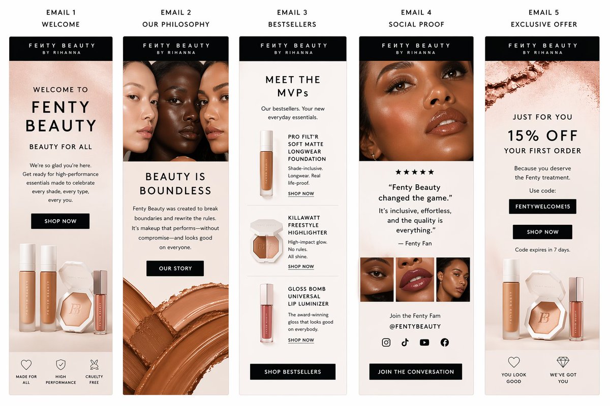
Create a polished email sequence template for fenty beauty
Create a polished email sequence template for fenty beauty
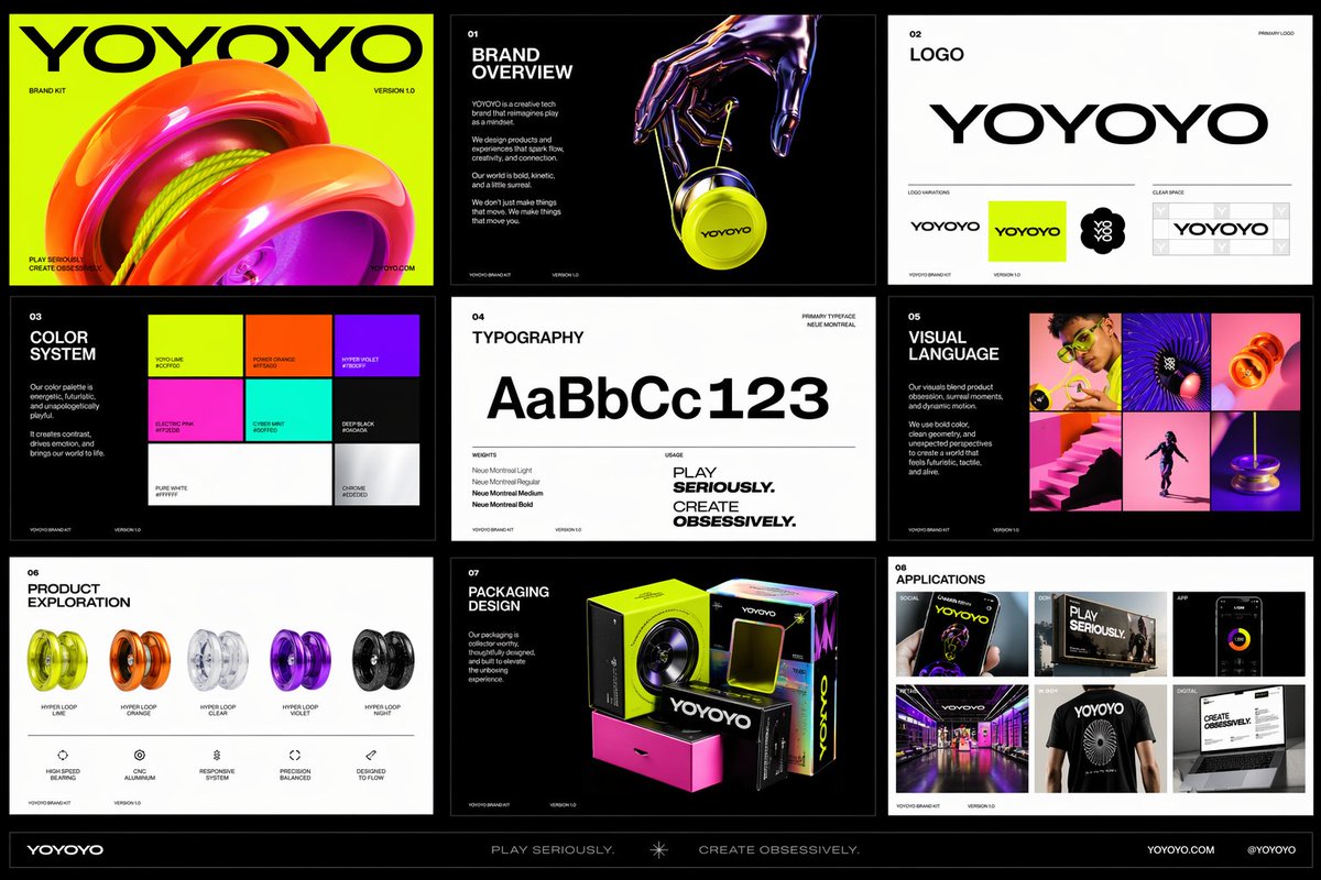
Create a polished multi-page (multiple images) brand kit
Create a polished multi-page (multiple images) brand kit for a company called [YOYOYO]. The brand should feel playful, futuristic, vibrant, and design-forward, blending the energy of a toy-inspired product with the sophistication of a premium creative tech brand. Use a bold, experimental visual identity with bright color, clean geometry, modern typography, dynamic motion cues, and slightly surreal imagery. The overall mood should feel inventive, youthful, rhythmic, tactile, and high-concept, with a balance of fun consumer product culture, fashionlike presentation, and contemporary digital design. Include a sense of product obsession, visual experimentation, packaging exploration, editorial photography, immersive retail, and cross-platform brand application. Make it feel like a confident, contemporary brand world that is both accessible and art-directed, with strong graphic cohesion and a premium creative-studio aesthetic.