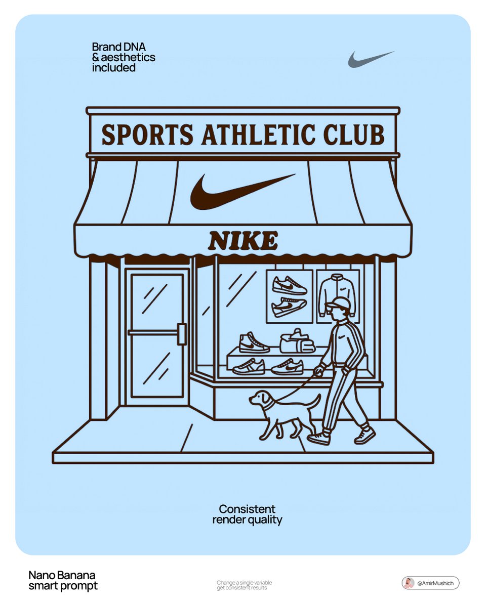
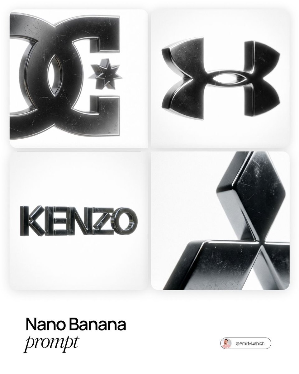
Nano Banana Product & Brand Prompts Page 3

404 Product & Brand prompts with example images. Open any card for the full prompt, then copy it or generate it free.

Playful designer packaging for , creative box shaped like the product, integrated cartoon face on the front panel, ov…
Nano BananaProduct & Brand

Playful designer packaging for , creative box shaped like

Playful designer packaging for [product name], creative box shaped like the product, integrated cartoon face on the front panel, oversized die-cut window revealing the real contents as part of the character’s expression, smooth matte cardboard material, bold flat graphic design, modern minimalist branding, limited pastel color palette, rounded friendly shapes, clean typography, high-end 3D packaging mockup render, soft studio lighting, pure white background, subtle realistic contact shadow beneath, ultra-detailed, retail-ready presentation, 1:1 aspect ratio.

Premium minimalist skincare product photography. A translucent pink liquid cleanser bottle with a white pump dispense…
Nano BananaProduct & Brand

Premium minimalist skincare product photography. A

Premium minimalist skincare product photography. A translucent pink liquid cleanser bottle with a white pump dispenser placed vertically at the center of the frame. The bottle rests inside an organic pool of soft pink foamy bubbles, with airy soap lather spreading outward in smooth, rounded shapes. Small transparent bubbles float around the foam surface. Clean matte pastel pink background with subtle gradient. Soft diffused top lighting with gentle rim light creates a luminous glow through the liquid, highlighting the pump tube inside the bottle. Sharp focus, high clarity, realistic liquid refraction, smooth plastic and glass textures, luxury beauty advertising style, modern cosmetic branding, ultra-realistic, 8K detail, high dynamic range. Negative Prompt: hands, people, faces, clutter, harsh reflections, label distortion, unreadable text, warped pump, hard shadows, grain, noise, low resolution, CGI look, cartoon style, messy foam, uneven lighting, watermark

Product ad style AI image on a mountain peak above clouds Created with Google Nano Banana Pro Prompt used: Ultra real…
Nano BananaProduct & Brand

Product ad style AI image on a mountain peak above clouds

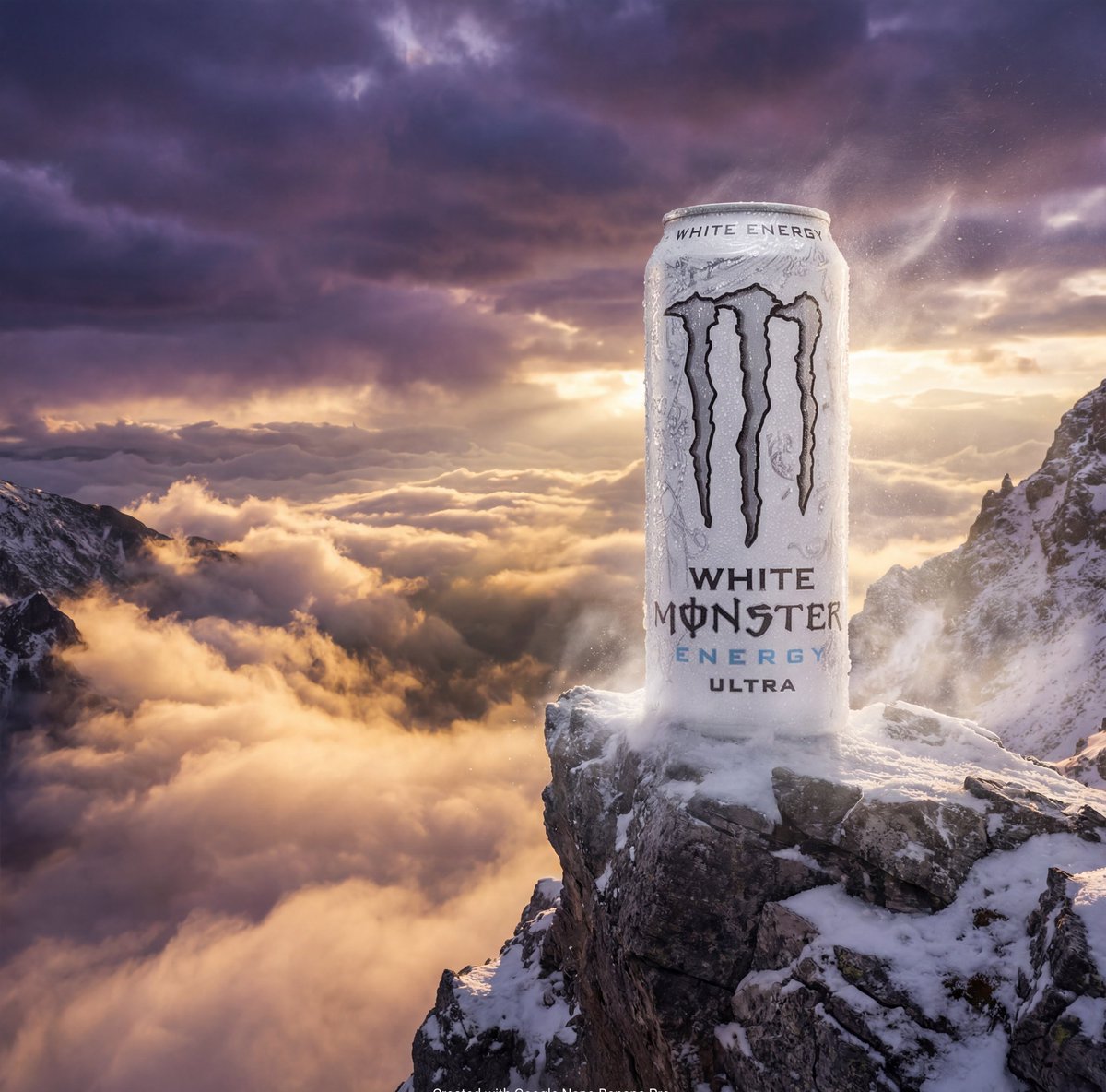
Product ad style AI image on a mountain peak above clouds Created with Google Nano Banana Pro Prompt used: Ultra realistic cinematic image of a White Monster Energy Ultra can standing on a sharp mountain peak above a sea of clouds, extreme high altitude atmosphere, dramatic stormy sky, golden sunrise breaking through clouds, wind whipping snow and mist around the can, liquid condensation and ice particles on the surface, bold powerful presence, epic scale contrast

Product description and its placement], minimalist product photography, clean warm studio scene, textured beige wall…
Nano BananaProduct & Brand

Product description and its placement], minimalist product

Product description and its placement], minimalist product photography, clean warm studio scene, textured beige wall in the background, soft directional sunlight creating long shadows, simple table surface, the product placed in a playful conceptual composition, overlaid with a hand-drawn white outline doodle [character] interacting with the product, mixed media style combining real photography and sketch illustration, premium branding feel, shallow depth of field, ultra-realistic, no extra text, no watermarks, 8K, 1:1.

Ultra-cinematic product photography of a neon-green energy drink can labeled “VOLT RUSH”, tilted at a sharp diagonal,…
Nano BananaProduct & Brand

Ultra-cinematic product photography of a neon-green energy

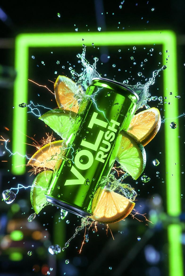
Ultra-cinematic product photography of a neon-green energy drink can labeled “VOLT RUSH”, tilted at a sharp diagonal, bursting through glowing citrus slices and electric sparks. Frozen splashes of lime juice and ice shards suspended mid-air, micro droplets visible. High-contrast studio lighting with green neon rim lights, dark background, glossy aluminum texture, shallow depth of field, photorealistic, 8K, premium ad style.

Ultra-high-end photorealistic commercial skincare product photography featuring a matte white plastic pump bottle cen…
Nano BananaProduct & Brand

Ultra-high-end photorealistic commercial skincare product

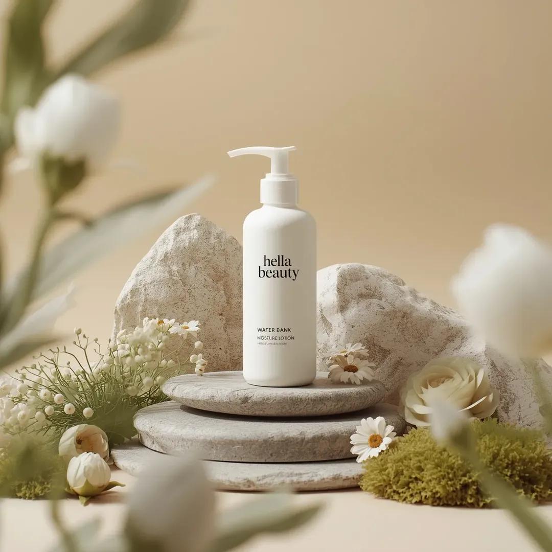
Ultra-high-end photorealistic commercial skincare product photography featuring a matte white plastic pump bottle centered and upright, labeled “hella beauty” in clean black minimalist typography with smaller text reading “water bank moisture lotion” and subtle product details beneath, the bottle placed on a layered natural stone surface surrounded by carefully arranged organic props including smooth gray river stones, pale beige textured rock formations, soft green moss clusters,delicate white pom-pom flowers, cream-colored daisy-like blossoms, light green fern leaves, and a muted sage rose, all arranged in a balanced symmetrical composition, background a soft warm beige studio backdrop with gentle gradient and no visible edges, foreground partially framed by softly blurred out-of-focus white flowers creating depth, lighting soft diffused daylight-style studio lighting from upper left producing gentle shadows, natural highlights on the bottle and petals, and a calm airymood, color palette dominated by warm neutrals, soft whites, sage greens, and muted earth tones, textures highly detailed including matte plastic, porous stone, velvety petals, and moist moss, shallow depth of field with sharp focus on the product label and midground elements and smooth bokeh in foreground and background, premium botanical skincare advertising aesthetic, clean minimal luxury composition, cinematic realism, ultra-detailed 8K, studio-grade hyperrealism, no extra text, no borders, no stylization beyond natural photorealism.

Ultra-high-end photorealistic skincare product photography featuring a clear cylindrical glass dropper bottle filled…
Nano BananaProduct & Brand

Ultra-high-end photorealistic skincare product photography

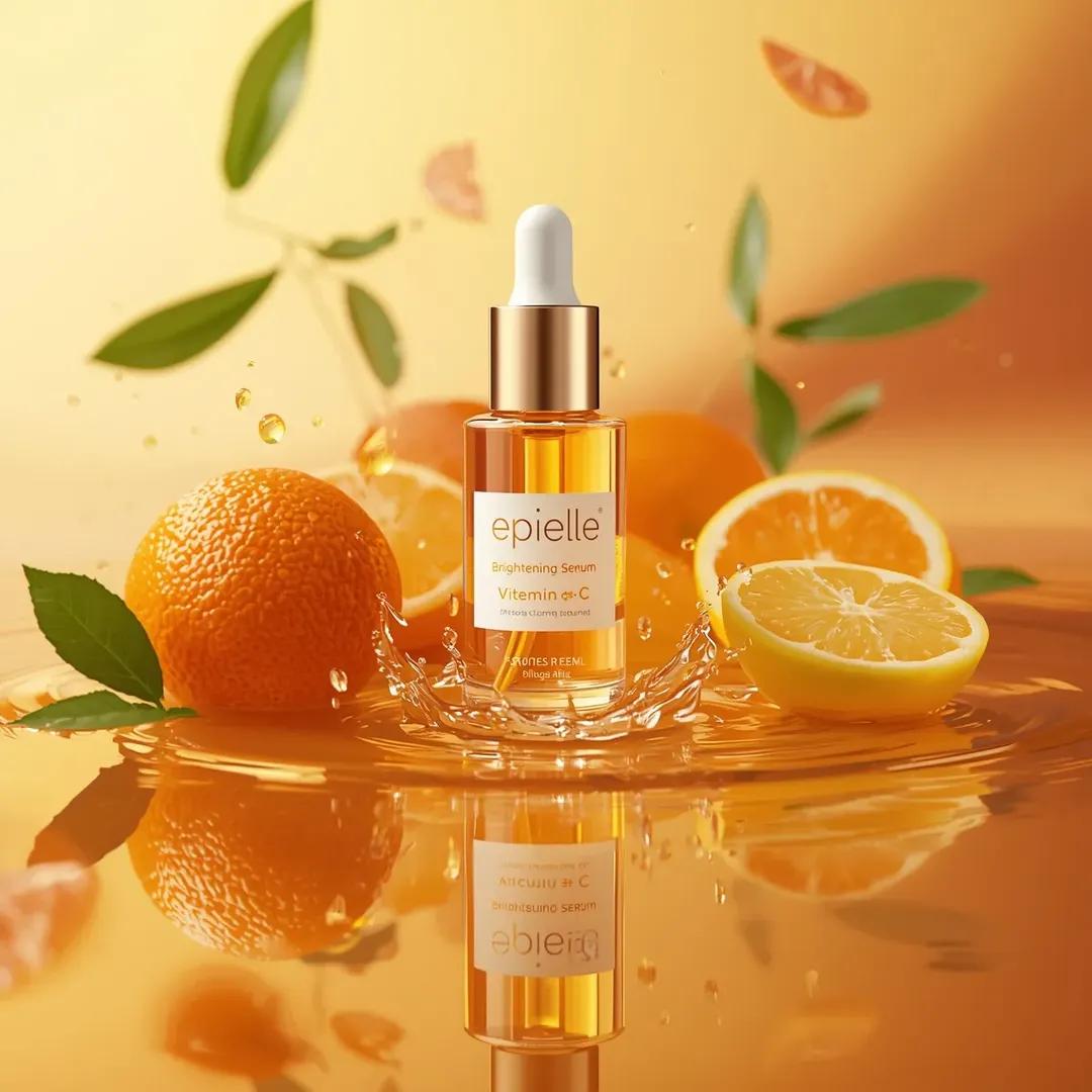
Ultra-high-end photorealistic skincare product photography featuring a clear cylindrical glass dropper bottle filled with translucent golden serum, centered and slightly tilted backward, with a matte white rubber dropper and metallic gold collar, the front label clearly reading “epielle Brightening Serum Vitamin C” with citrus illustrations, placed on a glossy reflective orange liquid surface creating a sharp mirror reflection beneath the bottle, surrounded by whole and sliced citrus fruits including bright orange oranges, a halved ruby grapefruit with visible pulp, and a sliced yellow lemon positioned symmetrically around the bottle, small golden serum droplets and splashes frozen mid-air around the base, fresh green citrus leaves floating softly in the background, background consisting of a smooth warm gradient transitioning from pale yellow on the left to deep orange on the right, lighting is strong soft studio lighting from upper left creating crisp highlights on glass and liquid, luminous glow through the serum, subtle shadows, and high contrast reflections, color palette dominated by vibrant orange, yellow, gold, and fresh green accents, textures extremely detailed including glossy glass, liquid viscosity, citrus peel pores, juicy pulp, and reflective surface, shallow depth of field with razor-sharp focus on the bottle label and fruit in the midground and gentle bokeh in the background, premium commercial cosmetic advertising style, clean modern composition, cinematic realism, ultra-detailed 8K photorealism, studio-grade quality

Ultra-realistic cinematic product shot of a premium honey jar placed inside a shallow wooden hollow surrounded by tal…
Nano BananaProduct & Brand

Ultra-realistic cinematic product shot of a premium honey

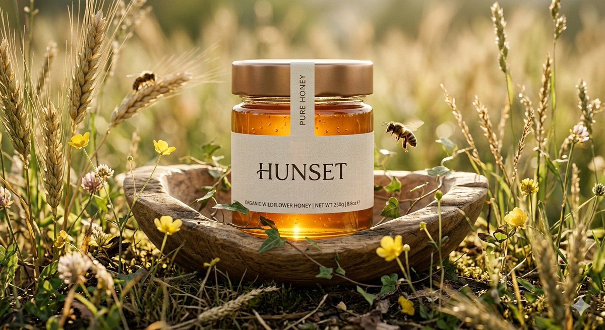
Ultra-realistic cinematic product shot of a premium honey jar placed inside a shallow wooden hollow surrounded by tall wild wheat and tiny yellow meadow flowers, captured from an intimate low-angle macro perspective with slight cinematic depth, transparent glass jar filled with luminous deep golden honey, topped with a satin bronze metallic lid and a narrow cream seal strip crossing vertically over the cap, minimal luxury label reading “HUNSET”, jar lightly touched by thin climbing ivy strands for a refined organic detail, one realistic honeybee hovering near the front glass surface while another rests on a wheat stem behind the jar, environment set in a quiet countryside field during late afternoon, warm sunlight filtering through wheat stalks from behind creating glowing translucency inside the honey and soft halo edges around the jar, foreground with blurred wheat tips and soft natural bokeh, distant background fading into creamy green and amber tones, shallow depth of field with extreme sharpness on jar textures, visible honey thickness, subtle glass reflections, detailed plant fibers and pollen particles in air, cinematic luxury advertising mood, shot on 90mm macro lens, f/2.2, ultra-detailed natural textures, premium organic brand campaign style, 8k resolution, no text, no watermark.

Ultra-realistic commercial food product advertising scene featuring a glass jar labeled "Classy Strawberry Jam" float…
Nano BananaProduct & Brand

Ultra-realistic commercial food product advertising scene

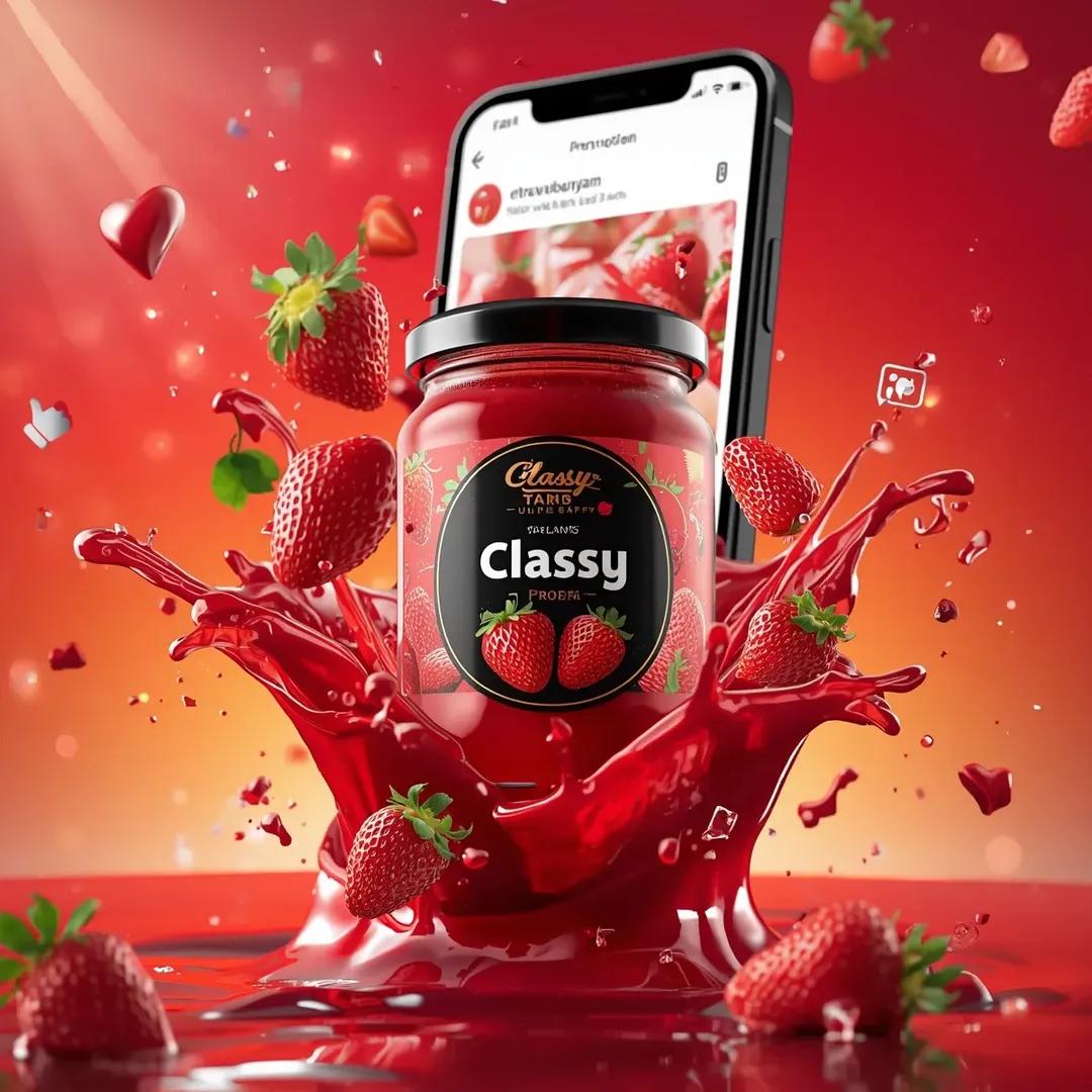
Ultra-realistic commercial food product advertising scene featuring a glass jar labeled "Classy Strawberry Jam" floating dynamically in mid-air. The jar is filled with glossy vibrant red strawberry jam and has a black lid with a premium black label showing fresh strawberries and the Classy brand logo clearly visible. Surrounding the jar are splashes of thick strawberry jam bursting outward in dramatic fluid motion, with droplets and shards of transparent glass frozen mid-air. Fresh whole strawberries, sliced strawberries, and green strawberry leaves float around the product to emphasize freshness. Behind the jar is a large smartphone screen displaying a social media post layout, suggesting an Instagram-style interface, symbolizing viral promotion. Floating around the composition are social media icons such as hearts, likes, comment bubbles, and hashtag symbols to represent online engagement. The background is a vibrant red-orange gradient with glowing highlights that enhance the energetic advertising feel. Cinematic studio lighting highlights the glossy texture of the jam, reflective glass jar, and dynamic splashes. High-end commercial advertising style, macro product photography, ultra-detailed textures, shallow depth of field, photorealistic, 8K resolution.

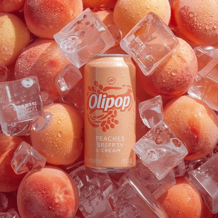
Ultra-realistic commercial product photography of a pastel peach-colored soda can labeled “OLIPOP – Peaches & Cream”…
Nano BananaProduct & Brand

Ultra-realistic commercial product photography of a pastel

Ultra-realistic commercial product photography of a pastel peach-colored soda can labeled “OLIPOP – Peaches & Cream” placed upright in the center, surrounded tightly by fresh whole peaches at the bottom and large transparent ice cubes stacked around and partially covering the top of the can, heavy condensation droplets covering the can and fruit, tiny carbonation bubbles visible on the peaches, crushed ice texture with sharp edges and frosty highlights, soft diffused studio lighting.

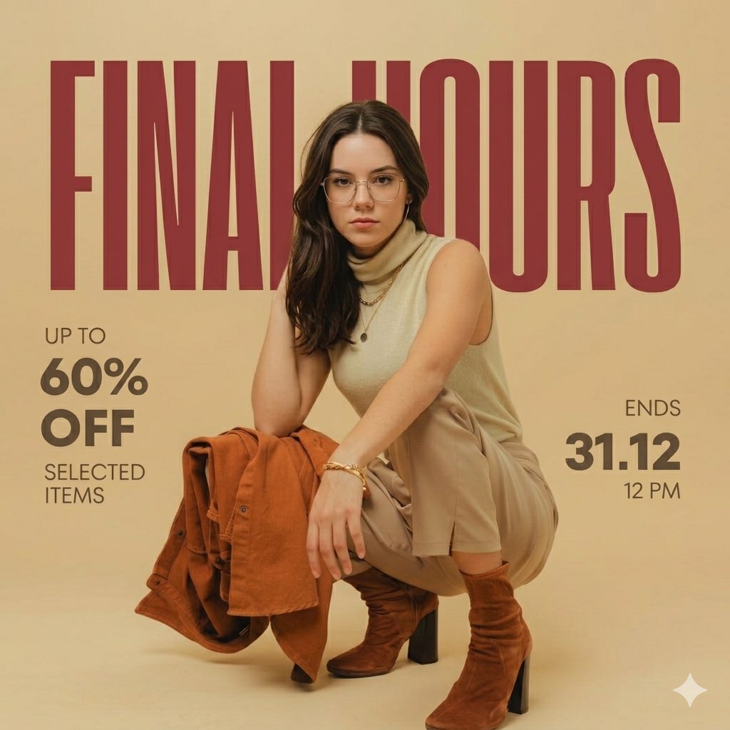
Ultra-realistic fashion advertisement poster, minimalist editorial style. Background: solid warm beige studio backdro…
Nano BananaProduct & Brand

Ultra-realistic fashion advertisement poster, minimalist

Ultra-realistic fashion advertisement poster, minimalist editorial style. Background: solid warm beige studio backdrop with soft gradient lighting, smooth clean texture. Main subject: a stylish young woman in a low squat pose, body slightly turned sideways, one arm resting on knee, other hand touching back of head. Expression calm, confident, slightly looking sideways (not directly at camera). Outfit (keep EXACT): Sleeveless beige/tan high-neck top Slim beige pants Brown suede ankle boots with block heels Light brown jacket placed casually near her feet Minimal accessories: small hoop earrings, thin bracelet Hair: straight, shoulder-length, natural dark brown, side-parted Makeup: soft natural tones, clean skin, subtle glow ⚠️ Face: [REPLACE FACE WITH PROVIDED IMAGE / KEEP FACE GENERIC IF NOT PROVIDED] (ensure seamless blending, same lighting, same skin tone, hyper-realistic) Typography & Layout (EXACT SAME STYLE) Top: Large bold condensed sans-serif text in dark red: FINAL HOURS (very large, stretched across width, behind subject partially) Left side: Small text: UP TO 60% OFF SELECTED ITEMS Right side: ENDS 31.12 12 PM Bottom: ⚠️ NO WEBSITE TEXT (REMOVE COMPLETELY) Lighting & Style Soft studio lighting, warm tone Subtle shadows under subject Clean editorial magazine look Slight depth but mostly flat poster style Matte finish, no gloss Perfect alignment, balanced spacing

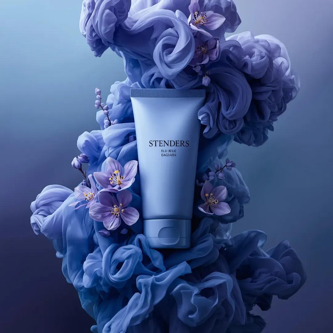
Ultra-realistic luxury cosmetic product photography in a dramatic monochromatic blue-violet composition. A sleek sati…
Nano BananaProduct & Brand

Ultra-realistic luxury cosmetic product photography in a

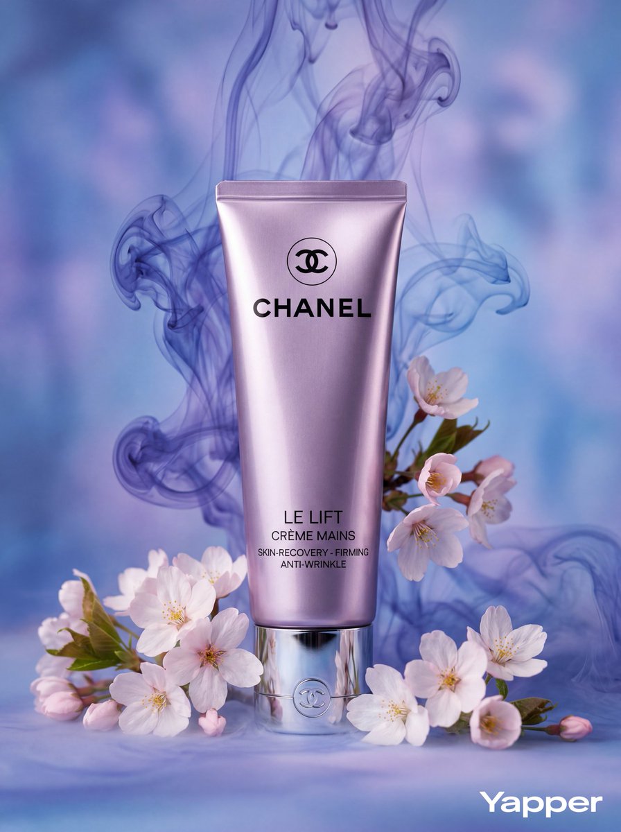
Ultra-realistic luxury cosmetic product photography in a dramatic monochromatic blue-violet composition. A sleek satin-finish periwinkle-blue squeeze tube labeled “STENDERS” stands vertically centered in the frame, featuring elegant silver typography and a reflective metallic chrome cap. The tube is surrounded by voluminous swirling clouds of ink-like smoke in layered shades of lavender, indigo, and icy blue, creating a soft, billowing texture that wraps around the product. Interwoven throughout the smoke are fresh purple and lilac flowers with intricate petal details and vibrant yellow centers, along with delicate sprigs of tiny violet blossoms for added dimension. Soft directional lighting from the upper left highlights the smooth curvature of the tube, adds subtle sheen to the metallic cap, and creates depth within the smoke plumes. The background seamlessly blends cool blue and purple tones, enhancing the ethereal, floral fragrance aesthetic. Hyper-detailed textures of petals and vapor, cinematic depth, high-end perfumed skincare advertising style, 8K ultra-high resolution

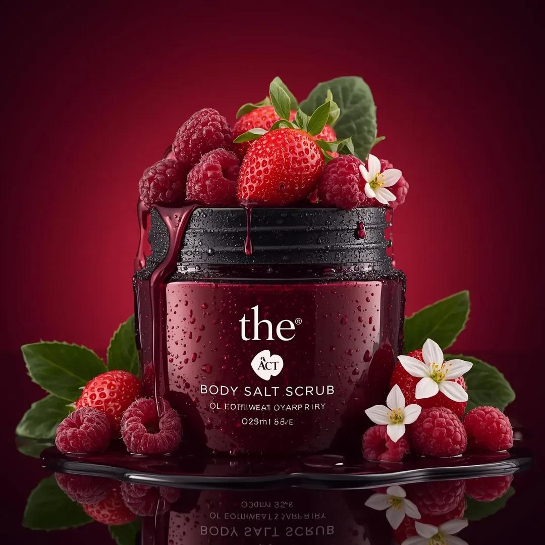
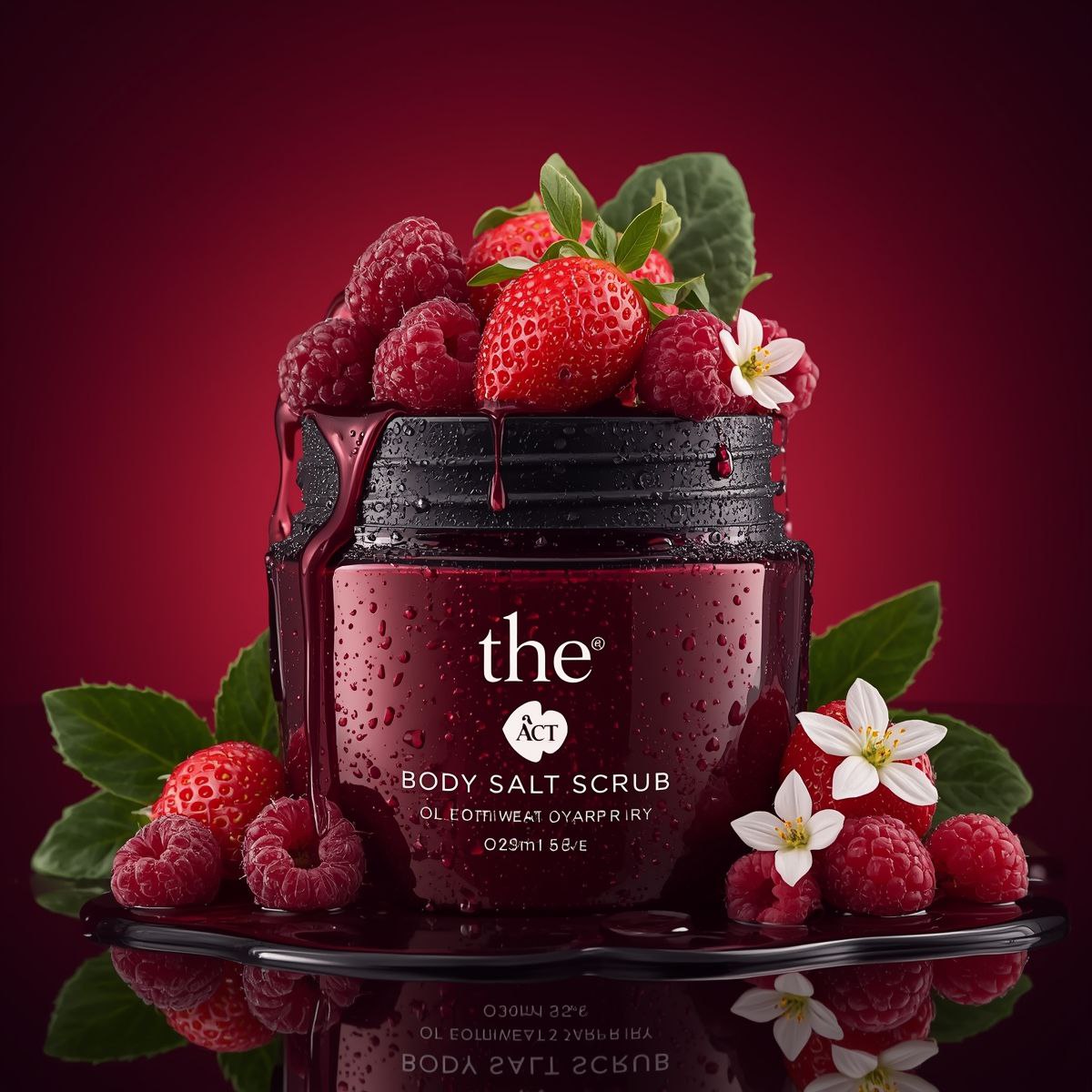
Ultra-realistic luxury cosmetic product photography of a deep red glass jar labeled “the ACT Body Salt Scrub”, placed…
Nano BananaProduct & Brand

Ultra-realistic luxury cosmetic product photography of a

Ultra-realistic luxury cosmetic product photography of a deep red glass jar labeled “the ACT Body Salt Scrub”, placed on a glossy reflective black surface. The jar is open and overflowing with fresh strawberries and raspberries, with berry juice dripping over the rim. Water droplets cover the jar creating a fresh, dewy look. Around the jar are scattered raspberries, strawberries, green leaves, and small white flowers. Background is a smooth gradient rich crimson red studio backdrop. Dramatic studio lighting, soft highlights, sharp macro detail, commercial beauty product advertisement style, high contrast, extremely detailed textures, 8k resolution, shallow depth of field, photorealistic, luxury skincare branding, centered composition.

Ultra-realistic luxury perfume product shot (9: 16, 4K). A clear rectangular glass perfume bottle with warm amber liq…
Nano BananaProduct & Brand

Ultra-realistic luxury perfume product shot (9: 16, 4K). A

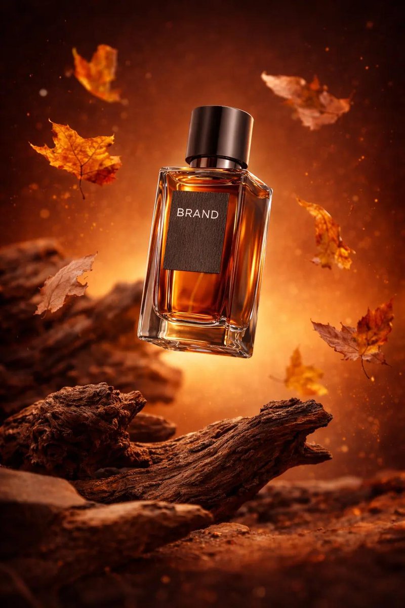
Ultra-realistic luxury perfume product shot (9: 16, 4K). A clear rectangular glass perfume bottle with warm amber liquid and a metallic cap, floating mid-air above rugged driftwood/roots. Autumn leaves swirling around in motion, soft particles, warm orange/brown gradient background with cinematic glow. Studio-quality lighting (soft key +rim), crisp reflections, sharp label reading [BRAND], shallow depth of field, high-end commercial retouching, dramatic bokeh, no extra text, no watermark.

Ultra-realistic luxury product photography of a black glass reed diffuser bottle labeled “BLACK OUDH – Private Collec…
Nano BananaProduct & Brand

Ultra-realistic luxury product photography of a black glass

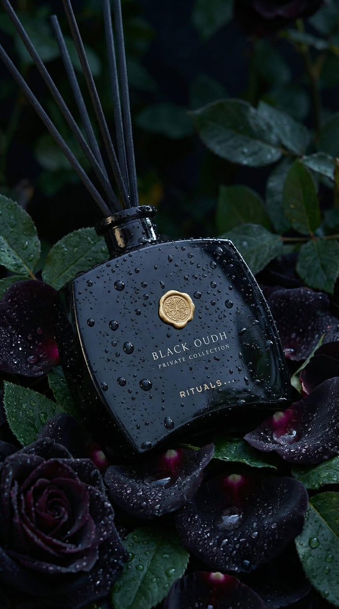
Ultra-realistic luxury product photography of a black glass reed diffuser bottle labeled “BLACK OUDH – Private Collection – RITUALS” in elegant gold serif typography. The bottle has a curved rectangular shape with soft edges, a glossy reflective surface, and a gold wax-seal style emblem centered near the top. Thin black diffuser reeds extend upward from the bottle neck. The bottle is covered in realistic water droplets and condensation, as if freshly misted after rain. It is placed among deep black roses and dark burgundy petals with visible water droplets, surrounded by rich green leaves. The scene is moody and dramatic with a dark botanical background, softly blurred (shallow depth of field, bokeh effect). Lighting is cinematic and low-key, with soft diffused highlights reflecting off the wet glass surface. Cool-toned lighting (deep greens and midnight blues) enhances the dark, luxurious atmosphere. The gold emblem and lettering subtly catch the light, creating a premium, high-end aesthetic. Composition: vertical portrait orientation (4:5 ratio), centered product placement, slightly angled bottle resting naturally among roses. Foreground roses partially frame the bottom of the bottle. Background is dark foliage fading into shadow. Texture emphasis: hyper-detailed water droplets, glossy glass reflections, velvety rose petals, matte black reeds. Style: high-end commercial fragrance advertising, macro lens, 85mm, f/2.0, shallow depth of field, photorealistic, 8K resolution, sharp focus on bottle, dramatic contrast, rich blacks, luxury perfume campaign aesthetic.

Ultra-realistic luxury skincare product photography featuring a glass cosmetic jar labeled “ONE POSE” placed at the c…
Nano BananaProduct & Brand

Ultra-realistic luxury skincare product photography

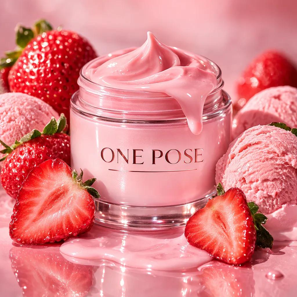
Ultra-realistic luxury skincare product photography featuring a glass cosmetic jar labeled “ONE POSE” placed at the center of a glossy reflective surface. The jar contains a vibrant strawberry-pink cream with a soft gradient fading into a frosted white lid, and a smooth swirl of creamy pink product melting over the top and dripping down the sides of the jar like glossy dessert glaze. Surrounding the product are fresh ripe strawberries and halved strawberries with visible seeds and juicy texture, arranged naturally around the base. Soft scoops of strawberry ice cream sit beside the fruit, slightly melting and blending into a glossy pink cream puddle that spreads across the surface. The background is a soft pastel pink studio gradient that enhances the strawberry tones. Premium studio lighting from above and the side creates crisp reflections on the glass jar, soft highlights on the melting cream and ice cream texture, and gentle shadows beneath the product. The composition feels indulgent and dessert-inspired while maintaining a clean luxury cosmetic advertising aesthetic, hyper-realistic textures, shallow depth of field, cinematic lighting, ultra-detailed 8K product photography.

Ultra-realistic minimalist product photography featuring a cylindrical supplement container labeled “NUTRIO Pure Biot…
Nano BananaProduct & Brand

Ultra-realistic minimalist product photography featuring a

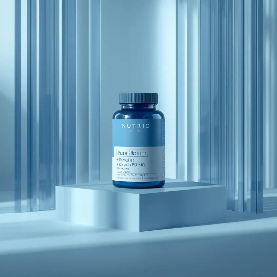
Ultra-realistic minimalist product photography featuring a cylindrical supplement container labeled “NUTRIO Pure Biotin – + Keratin 80 MG – 7500 mcg per serving – 100% Vegan – 60 Day Supply – 60 Tablets”. The container has a matte blue lid and upper section with a clean white lower label. The product is centered in a monochromatic soft blue studio environment, surrounded by thin vertical transparent acrylic glass panels that create subtle reflections and layered depth. The container sits on a smooth geometric platform with crisp edges, maintaining a balanced modern composition. Lighting is soft premium studio lighting from the upper left, producing gentle shadows, realistic reflections on the acrylic panels, and smooth gradients across the matte packaging surface. The background remains minimal and monochromatic to emphasize the product. Clean pharmaceutical advertising aesthetic, precise geometry, photorealistic textures, shallow depth of field, ultra-detailed 8K commercial product photography

Ultra-realistic minimalist studio product photography of a small transparent glass facial oil dropper bottle with a b…
Nano BananaProduct & Brand

Ultra-realistic minimalist studio product photography of a

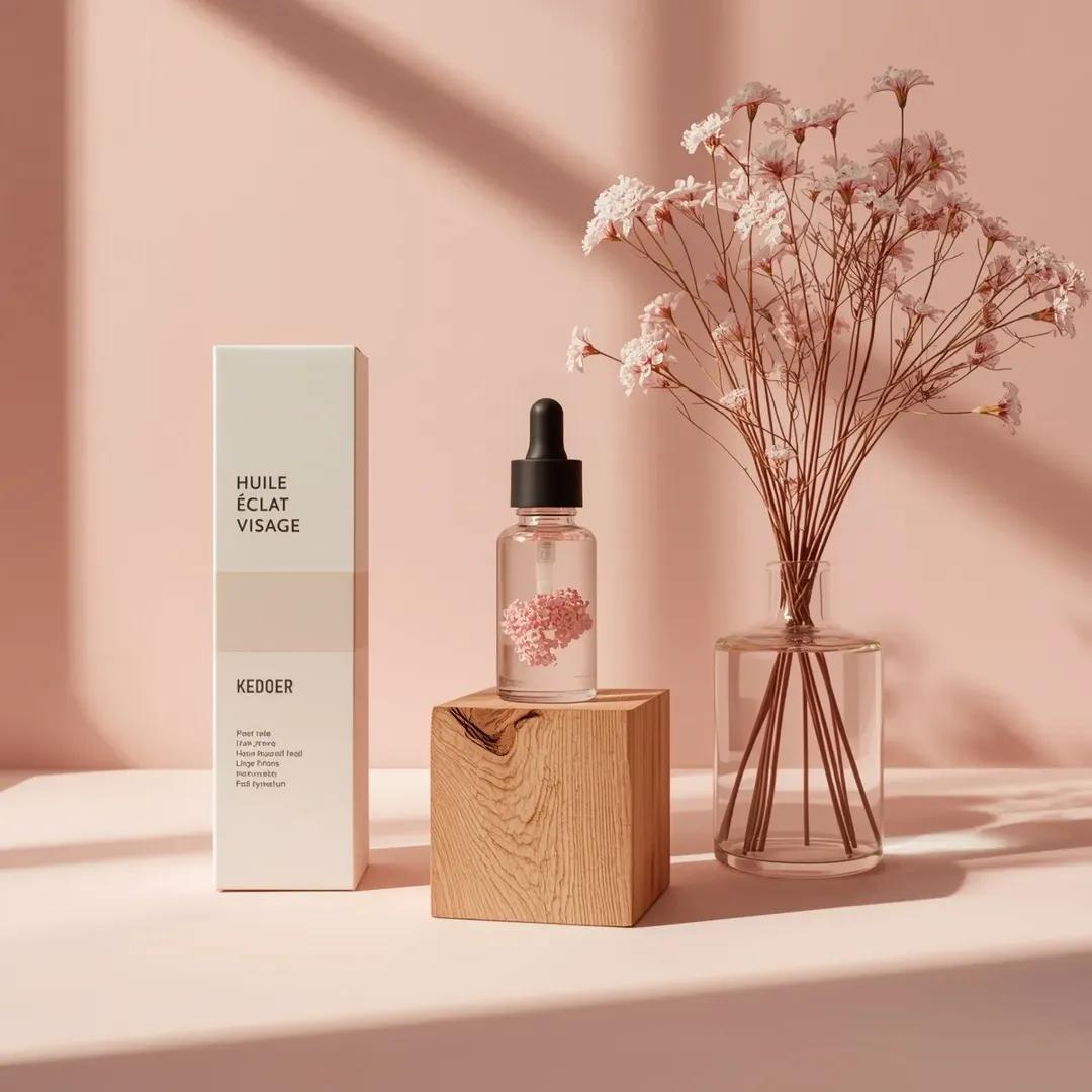
Ultra-realistic minimalist studio product photography of a small transparent glass facial oil dropper bottle with a black rubber pipette cap, containing pale pink serum with dried pink floral elements suspended inside, placed centered on top of a natural raw wooden cube block with visible grain and split texture. To the left of the cube stands a tall matte white rectangular skincare box with minimal black typography reading “HUILE ÉCLAT VISAGE,” clean modern branding, and subtle logo near the bottom. To the right of the cube is a clear cylindrical glass vase filled with water and thin stems of dried pink gypsophila flowers extending upward and outward. The entire composition is arranged on a smooth matte pastel pink surface with a matching soft pink seamless studio background. Strong directional soft light comes from the left side, casting long, soft-edged realistic shadows of the flowers and objects onto the pink background. Lighting is natural-style, -det diffused, and warm, creating gentle highlights on the glass, subtle reflections on the serum bottle, and soft texture on the wooden block. Camera angle is straight-on at tabletop height, medium framing, all main objects in sharp focus with minimal depth of field blur. Color palette is dominated by blush pink, soft rose tones, warm light wood, clean white, and transparent glass. Mood is clean, airy, feminine, elegant, Scandinavian minimal aesthetic, premium skincare branding style, photorealistic, studio-grade realism, ultra

Ultra-realistic premium fragrance product shot of a perfume bottle (Forest Essence Elixir), positioned at a (low macr…
Nano BananaProduct & Brand

Ultra-realistic premium fragrance product shot of a perfume

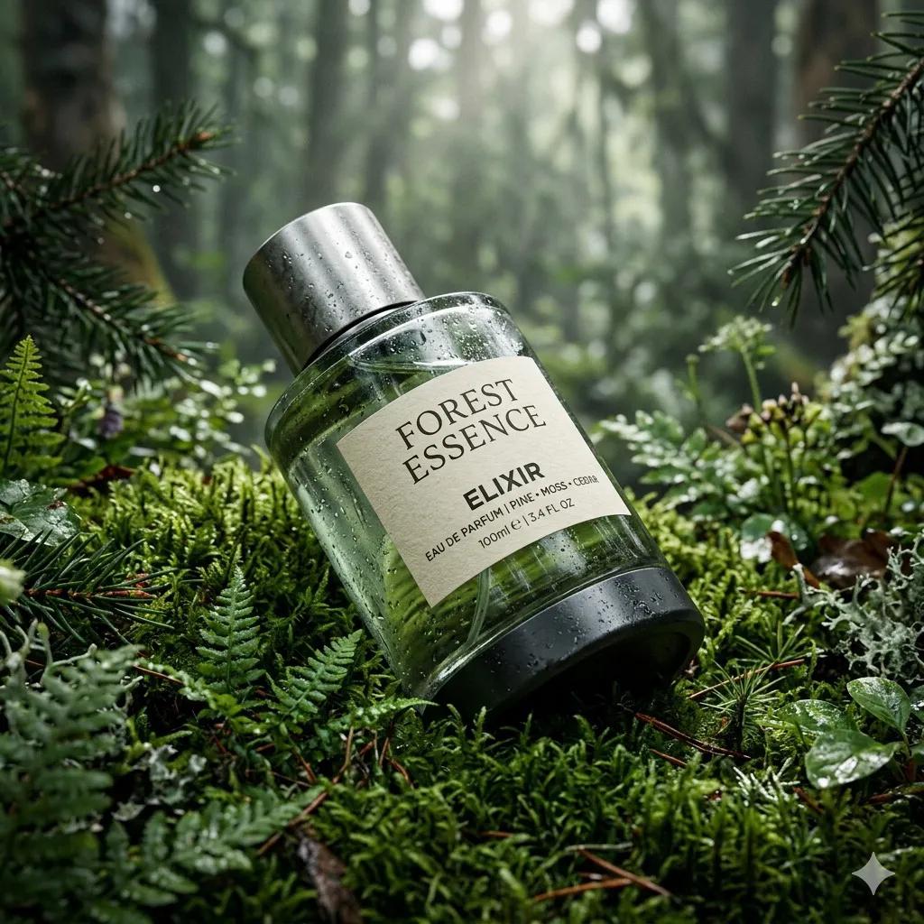
Ultra-realistic premium fragrance product shot of a perfume bottle (Forest Essence Elixir), positioned at a (low macro angled shot) resting diagonally on lush (deep green moss surface in a forest setting), cylindrical design with a transparent glass center revealing green-tinted liquid, textured (matte black base) and brushed (metallic silver cap) with visible condensation droplets, surrounded by dense (forest foliage and pine branches) softly framing the scene, subtle (morning mist

Ultra-realistic premium skincare serum bottle (dark green glass with dropper), golden liquid inside, placed on sunlit…
Nano BananaProduct & Brand

Ultra-realistic premium skincare serum bottle (dark green

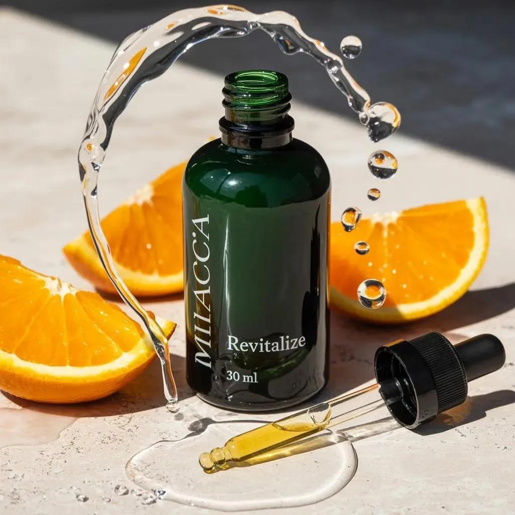
Ultra-realistic premium skincare serum bottle (dark green glass with dropper), golden liquid inside, placed on sunlit marble surface with fresh orange slices around, natural citrus vibe, water splash frozen mid-air, detailed droplets and reflections, soft natural sunlight with sharp shadows, minimal aesthetic, macro photography, high detail textures, glossy glass reflections, fresh and vibrant color tones, luxury skincare advertising, 8K, perfect composition.

Ultra-realistic skincare advertising photography featuring a frosted citrus glass bottle labeled “Glow Recipe – Lemon…
Nano BananaProduct & Brand

Ultra-realistic skincare advertising photography featuring

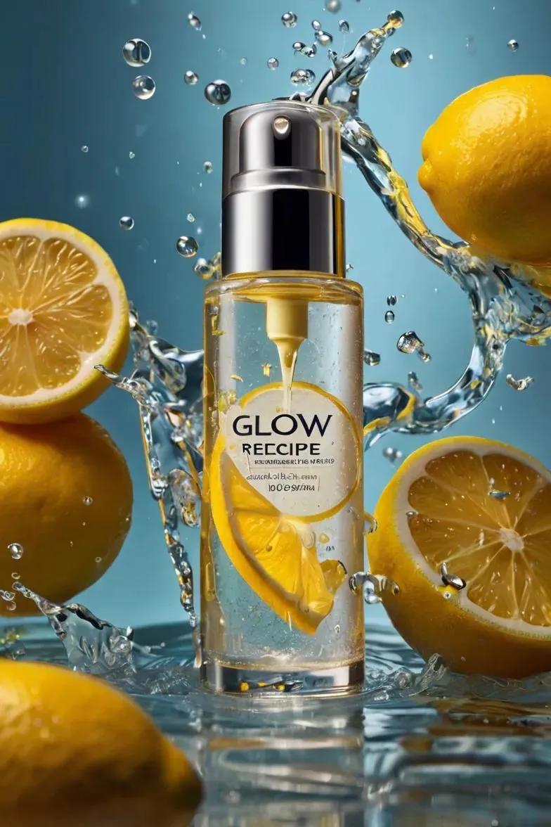
Ultra-realistic skincare advertising photography featuring a frosted citrus glass bottle labeled “Glow Recipe – Lemon Brightening Glow Serum (30 ml)” floating mid-air. Sparkling lemon water splashes swirl around the bottle with glowing droplets and lemon slices suspended. Soft yellow studio background, crisp reflections, cinematic commercial lighting, shallow depth of field, ultra-detailed 8K beauty campaign.

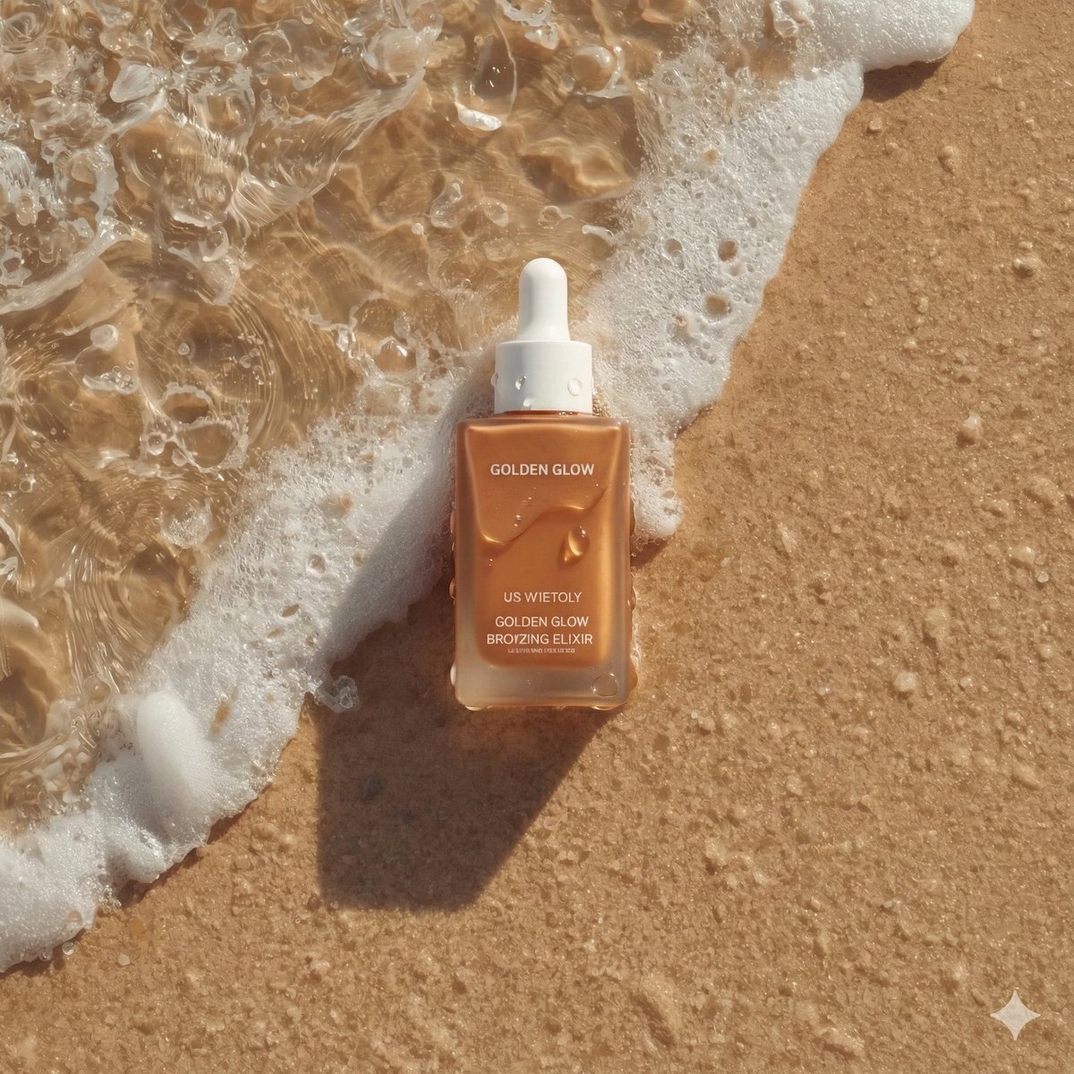
Ultra-realistic summer skincare product photography of a bronzing drop bottle named "Golden Glow - Bronzing Elixir",…
Nano BananaProduct & Brand

Ultra-realistic summer skincare product photography of a

Ultra-realistic summer skincare product photography of a bronzing drop bottle named "Golden Glow - Bronzing Elixir", rectangular matte bottle in warm sun-kissed bronze tone with a clean white cap, placed diagonally on wet beach sand as a gentle ocean wave washes over it, delicate sea foam and tiny bubbles surrounding the base, water partially flowing across the label, fine sand texture visible beneath shallow clear water, golden sunlight casting natural highlights and soft shadows, high-detail water ripples and realistic foam patterns, fresh summer aesthetic, minimal clean branding centered and sharp, warm golden-hour beach lighting, cinematic top-down flat lay composition, natural reflections on wet surface, editorial beauty campaign style, ultra-detailed, photorealistic 8K, soft warm color grading, luxury skincare advertisement Aspect ratio 4.5

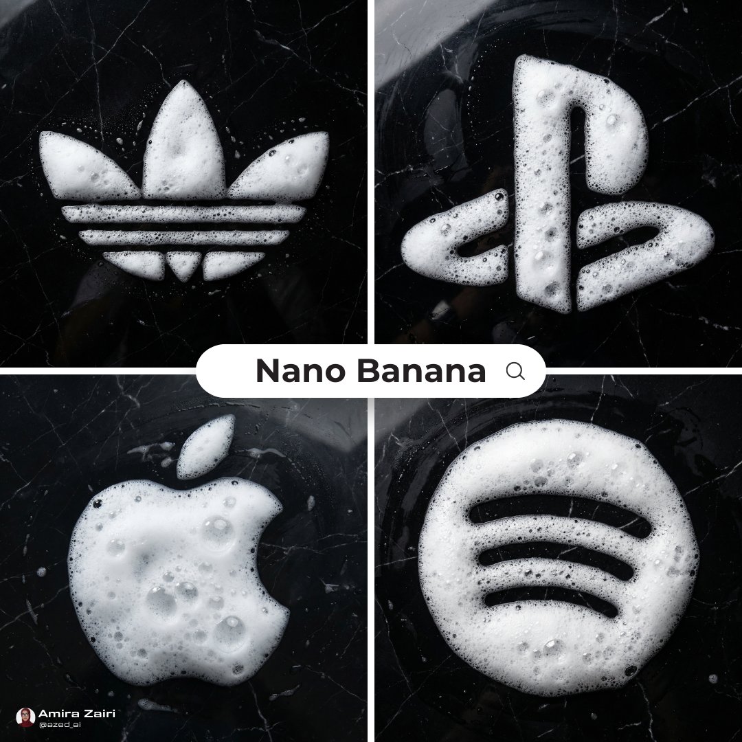
Ultra-realistic top-down photograph of detergent foam forming a precise on a polished black marble surface. Thick, ai…
Nano BananaProduct & Brand

Ultra-realistic top-down photograph of detergent foam

Ultra-realistic top-down photograph of detergent foam forming a precise [subject / logo / symbol / shape] on a polished black marble surface. Thick, airy white foam with realistic bubbles of varying sizes, natural translucency, wet shine, and soft highlights. Foam appears freshly formed, slightly uneven at the edges, physically accurate, volumetric, and naturally settled on the marble. Black marble background with subtle white veining, glossy finish, realistic reflections and moisture marks, high contrast between white foam and dark stone. Clean minimalist composition, centered subject. Soft diffused overhead lighting creating gentle reflections on the marble and delicate shadows within the foam bubbles. Photorealistic texture detail, macro-level realism, high-end commercial photography style, no text overlays, no illustrations, no stylization, no CGI look, ultra-clean aesthetic, sharp focus, 8k resolution, 1:1

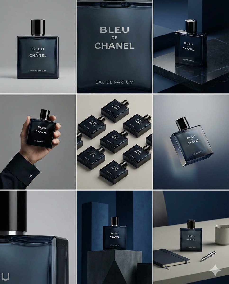
Un storyboard limpio en cuadrícula 3×3 con nueve paneles iguales en proporción , dentro de un formato total 4:5. Usa…
Nano BananaProduct & Brand

Un storyboard limpio en cuadrícula 3×3 con nueve paneles

Un storyboard limpio en cuadrícula 3×3 con nueve paneles iguales en proporción [ratio], dentro de un formato total 4:5. Usa la imagen de referencia como base del producto. Mantén exactamente el mismo producto, diseño del packaging, branding, materiales, colores, proporciones e identidad general en los nueve paneles, tal como en la referencia. El producto debe ser claramente reconocible en cada frame. La etiqueta, el logo y las proporciones deben permanecer exactamente iguales. Este storyboard es una presentación mockup de alto nivel para un portfolio de branding. El enfoque está en la forma, la composición, la materialidad y el ritmo visual, más que en el realismo o una narrativa lifestyle. El resultado debe sentirse curado, editorial y orientado al diseño. FRAME 1: Plano frontal hero del producto en un entorno de estudio limpio. Fondo neutro, composición equilibrada, presentación calmada y segura del producto. FRAME 2: Primer plano con el enfoque centrado en la parte media del producto. Se destacan la textura de la superficie, los materiales y los detalles de impresión. FRAME 3: El producto de referencia colocado en un entorno que encaja naturalmente con la marca y la categoría del producto. Escenario de estudio inspirado en los elementos de diseño y colores del producto. FRAME 4: Producto mostrado en uso o en interacción sobre un fondo de estudio neutro. Las manos y los elementos de interacción son mínimos y discretos, manteniendo el estilo del packaging. FRAME 5: Composición isométrica que muestra varios productos organizados en un orden geométrico preciso desde un ángulo isométrico superior. Todos los productos están colocados con el mismo ángulo isométrico, espaciados de forma uniforme, limpios, estructurados y gráficos. FRAME 6: Producto levitando ligeramente, inclinado sobre un fondo neutro que coincida con la paleta de colores de la imagen de referencia. La posición flotante es intencional y natural en el espacio. FRAME 7: Primerísimo primer plano centrado en un detalle específico de la etiqueta, el borde, la textura o el comportamiento del material. FRAME 8: El producto en un entorno inesperado pero estéticamente potente, con un enfoque audaz, editorial y visualmente impactante. Escenario inesperado pero altamente estilizado, basado en estudio y dirigido por diseño. Composición fuerte que eleva la marca. FRAME 9: Composición amplia que muestra el producto en uso dentro de un setup de diseño refinado. Props limpios, estilismo controlado y coherente con el resto de la serie. CÁMARA Y ESTILO: Imágenes de estudio de ultra alta calidad con apariencia de cámara real. Diferentes ángulos y encuadres en cada frame. Profundidad de campo controlada, iluminación precisa, materiales y reflejos realistas. La lógica de iluminación, la paleta de colores, el mood y el lenguaje visual deben mantenerse consistentes en los nueve paneles como una sola serie cohesionada. OUTPUT: Una cuadrícula limpia 3×3 sin bordes, sin texto, sin captions y sin marcas de agua.

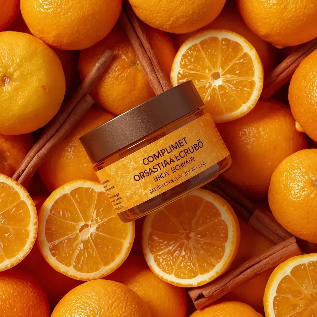
Use the uploaded image as the exact visual reference for composition, jar design, orange slices, whole oranges, cinna…
Nano BananaProduct & Brand

Use the uploaded image as the exact visual reference for

Use the uploaded image as the exact visual reference for composition, jar design, orange slices, whole oranges, cinnamon sticks, lighting, and orange background. Maintain the same top-down perspective and color palette. Camera: Top-down camera angle (exactly as in the image). Camera slowly zooms in toward the jar. Very smooth and controlled movement. No rotation. No camera shake. Action: The jar remains perfectly still in the center of the frame.

Use the uploaded image as the exact visual reference for jar design, label, strawberries, raspberries, flowers, leave…
Nano BananaProduct & Brand

Use the uploaded image as the exact visual reference for

Use the uploaded image as the exact visual reference for jar design, label, strawberries, raspberries, flowers, leaves, condensation droplets, red gradient background, and reflective surface. Camera: Locked front-facing camera. No zoom. No rotation. No angle change. Studio composition remains centered. Style: Premium beauty commercial. Smooth assembling sequence. Ultra realistic. Slow motion but not dramatic. Scene – Start (Empty Setup): Start with an empty red gradient background and glossy reflective surface. No jar. No fruits. No flowers. No water droplets. Assembling Sequence: 1. The glass jar base smoothly slides into frame from below and settles perfectly centered. 2. The lid gently lowers from above and aligns perfectly on the jar. 3. Condensation droplets subtly appear on the glass surface as if forming naturally. 4. Raspberries roll in softly from left and right, stopping naturally around the base. 5. Strawberry halves slide into position at the front. 6. Whole strawberries gently drop from above into the open jar top and settle naturally. 7. Small white flowers softly fall into place between the strawberries. 8. Green leaves slide in behind the jar to frame it. 9. Final micro water droplets appear on fruits for freshness effect. All movements smooth and controlled. No bouncing. No exaggerated motion. No dramatic lighting changes. Lighting: Keep original studio lighting. Deep red background glow remains consistent. Soft reflections on the glossy surface. Sound (if supported): Soft subtle assembling sound design. Gentle fruit placement sounds. Light glass contact sound. No music or very subtle premium ambient tone. End Frame: Fully assembled composition exactly matching the reference image. Everything perfectly arranged. Hold for 1–2 seconds. Ultra clean luxury skincare commercial finish.

Use the uploaded image as the exact visual reference for product design, label, lavender placement, liquid color, mil…
Nano BananaProduct & Brand

Use the uploaded image as the exact visual reference for

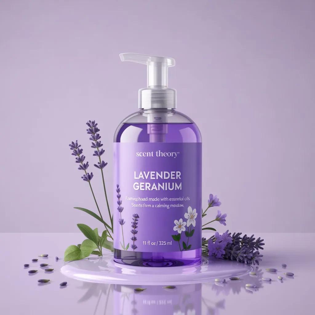
Use the uploaded image as the exact visual reference for product design, label, lavender placement, liquid color, milk puddle, and soft purple background .Camera Movement:Full 360° slow-motion orbit around the product.Smooth, steady circular motion.Constant speed .No shake .No sudden acceleration .No zoom in or out.Keep product centered at all times.Framing:Mid close-up product shot.Bottle remains perfectly upright and fixed in position.

Use the uploaded image as the exact visual reference. Keep the product centered. Do not change the tube position, lig…
Nano BananaProduct & Brand

Use the uploaded image as the exact visual reference

Use the uploaded image as the exact visual reference. Keep the product centered. Do not change the tube position, lighting tone, flower placement, or color palette. Maintain the deep blue monochromatic aesthetic. No additional lights. No color grading changes. Camera: Locked camera. No zoom. No rotation. No angle change. Static premium composition. Action: Animate the surrounding voluminous blue swirling clouds in ultra slow motion. The cloud-like forms (soft fabric/ink-style swirls) gently move and curl around the product. Movement should feel fluid, heavy, and luxurious. Soft rolling motion from bottom to top. Subtle inward spiral motion around the tube. No aggressive motion. No fast movement. No deformation of the product. Flowers: Remain mostly stable. Very subtle natural micro movement as if lightly affected by airflow. Petals should not detach. No new petals added. Physics: Smooth, dense, smoke-like simulation. Velvety texture. Soft shadow transitions within the folds. Natural depth and layering. Mood: Elegant. Premium. Artistic beauty campaign. High-end cosmetic advertisement. Sound (optional if supported): Soft ambient atmospheric tone. Very subtle airy texture. No voiceover. End Frame: Clouds continue slowly flowing around the product. Product remains sharp and perfectly centered. Ultra realistic. Luxury slow-motion finish.

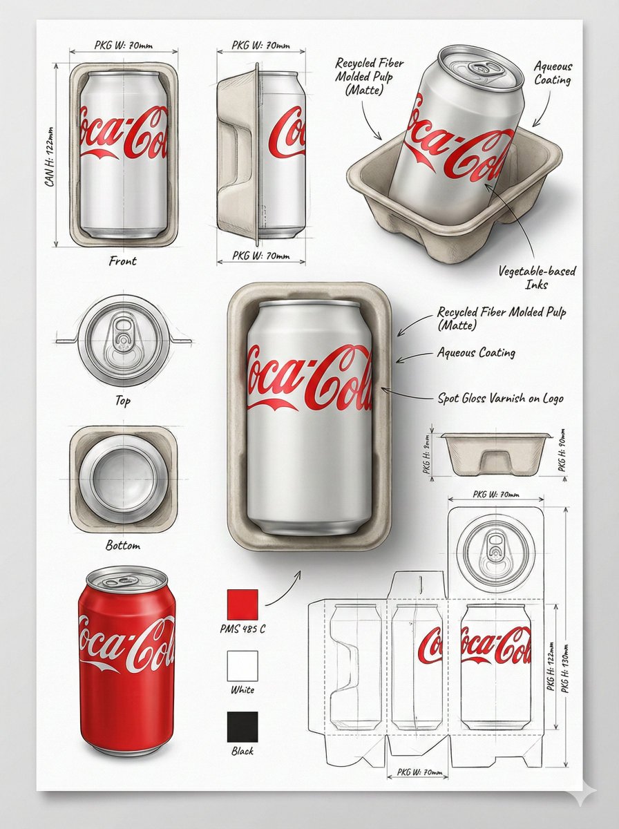
Using the attached image, create a professional industrial packaging design illustration sheet for the packaging of F…
Nano BananaProduct & Brand

Using the attached image, create a professional industrial

Using the attached image, create a professional industrial packaging design illustration sheet for the packaging of [PRODUCT NAME] Feature a centered hero 3D render with realistic materials, soft studio lighting, and commercial-grade finish quality. Surround the hero render with technical views: front, side, top, bottom, angled perspective, and flat layout. Include structural construction sketches, fold lines, seam details, and dimension arrows with measurements in millimeters. Show materials and finishes (matte, glossy print, plastic, paper, glass, etc.) using handwritten-style annotations. Add color swatches, realistic product illustrations, and subtle shadows. Background should resemble clean sketchbook paper, combining realistic rendering with pencil sketch overlays. Modern industrial design aesthetic, ultra-detailed, portfolio-ready presentation. Stable Diffusion settings: CFG: 7–9 Steps: 30–40 Sampler: DPM++ Resolution: 1024×1280 or higher Aspect Ratio: 3:4

You are a world class creative director, brand strategist, editorial art director, and visual identity designer speci…
Nano BananaProduct & Brand

You are a world class creative director, brand strategist

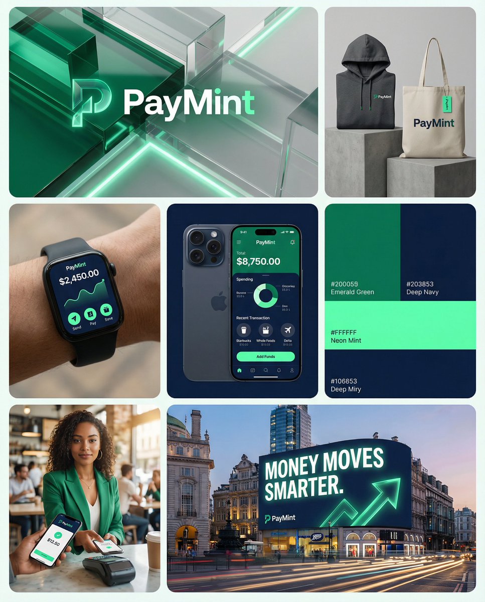
You are a world class creative director, brand strategist, editorial art director, and visual identity designer specializing in high impact campaign systems for global fintech and technology brands. Your task is to create a bold, intelligent, visually striking campaign board that feels like a professional brand identity presentation for a modern fintech startup. Create a campaign layout composed of multiple tiles arranged in a dynamic brand grid layout (not a strict 3x3 grid). LAYOUT STRUCTURE: Top Row • one wide landscape hero tile • one square tile Middle Row • three square tiles Bottom Row • one square tile on the left • one wide landscape tile on the right Each tile should look like a piece of a professional brand campaign or identity board. BRAND NAME: [INSERT BRAND NAME] PRIMARY BRAND COLOR: [INSERT COLOR] SECONDARY BRAND COLOR: [INSERT COLOR] ACCENT COLOR: [INSERT COLOR] APP NAME: [INSERT APP NAME] OPTIONAL SLOGAN: [INSERT SLOGAN] PRODUCT TYPE: digital bank / fintech app / payment platform / neobank / crypto wallet / financial platform VISUAL STYLE: Modern fintech brand campaign mixing: • lifestyle photography • fintech product shots • smartphone UI screens • credit card product visuals • bold brand color graphics • abstract tech textures • minimal brand design layouts • outdoor advertising visuals The aesthetic should feel like a hybrid between: Stripe Nubank Cash App Revolut modern startup branding premium tech product advertising ART DIRECTION: The grid should combine multiple brand communication assets such as: • hero brand visual • mobile app interface • credit card product shot • lifestyle photos of people using the app • brand merchandise • color palette graphics • billboard campaign mockups • technology inspired abstract visuals Each tile should feel unique but visually cohesive within the same brand system. TILE IDEAS: TOP LANDSCAPE TILE Abstract fintech hero visual using brand colors with glass / liquid / digital textures and the brand logo centered. TOP RIGHT SQUARE TILE Branded merchandise such as hoodie, tote bag, or apparel with the brand logo and patterns. MIDDLE LEFT TILE Smartwatch or smartphone displaying the fintech app UI. MIDDLE CENTER TILE Close-up iPhone screen showing the fintech app dashboard. MIDDLE RIGHT TILE Brand color palette tile showing the official colors and minimal identity elements. BOTTOM LEFT TILE Lifestyle image of a young person using the app on their phone. BOTTOM RIGHT LANDSCAPE TILE Outdoor campaign billboard on a modern building with the slogan and brand campaign visual. VISUAL CHARACTERISTICS: • premium fintech branding • modern startup identity • bold brand color usage • editorial lifestyle photography • clean UI design visuals • modern advertising aesthetic • cohesive brand campaign system • high-end commercial photography IMPORTANT: This board should feel like a professional brand launch presentation for a global fintech company. Each tile should look like a different campaign asset but visually belong to the same brand identity system. AI GENERATION NOTES: clean modern layout brand presentation board design system grid minimal spacing between tiles professional brand identity board balanced grid composition premium advertising photography ultra high detail visualized as a modern startup brand identity board similar to a design presentation on Behance or Dribbble, cohesive campaign layout

You are a world-class director of industrial visualization and a futuristic interface designer specializing in advanc…
Nano BananaProduct & Brand

You are a world-class director of industrial visualization

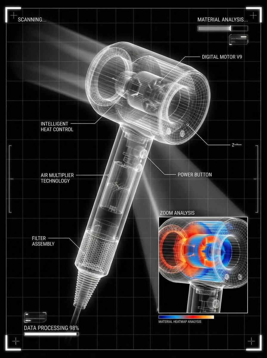
You are a world-class director of industrial visualization and a futuristic interface designer specializing in advanced visual engineering diagnostic tools. Your task is to transform the downloaded product into a futuristic visualization of the technical scanning interface, similar to the product analyzed in a high-tech laboratory diagnostic system. input: uploaded product image style: • black background with a clear white grid of the drawing • the product is made in the form of a luminous translucent X-ray frame model • clear geometry of the technical grid • Ultra-sharp white lines and edges • Minimalistic HUD interface design in sci-fi style INTERFACE ELEMENTS: • thin white lettering-callouts with pointer lines describing the components of the product • Zoom analysis field, showing a product fragment in close-up • A colored layer of the heat map of the material (red/ orange/blue) is displayed inside the zoom field. • Scan indicators such as: "THE SCAN..." "MATERIAL ANALYSIS..." "98% DATA PROCESSING" • Small loading panels and user interface diagnostic modules • luminous markers in the form of angular frames around the image VISUAL LANGUAGE: • Advanced engineering drawing design • Futuristic laboratory scanning interface • Engineering visualization of the product at the Apple level • Ultra-pure composition • High-contrast black and white interface lighting: • subtle white glow around the frame • Volumetric light beam scanning • Technical sci-fi visualization composition: • in the center of the product • Grid-aligned interface layout • Scalable analysis panel in one corner • Minimalistic but highly technical exit: Futuristic product scanning interface , visualization of technical diagnostics , technical analysis screen , ultra clean, ultra clear, 8K

Act as a Macro Product Photographer and Textile Art Director shooting a close-up editorial campaign of a premium embr…
Nano BananaProduct & Brand

Act as a Macro Product Photographer and Textile Art

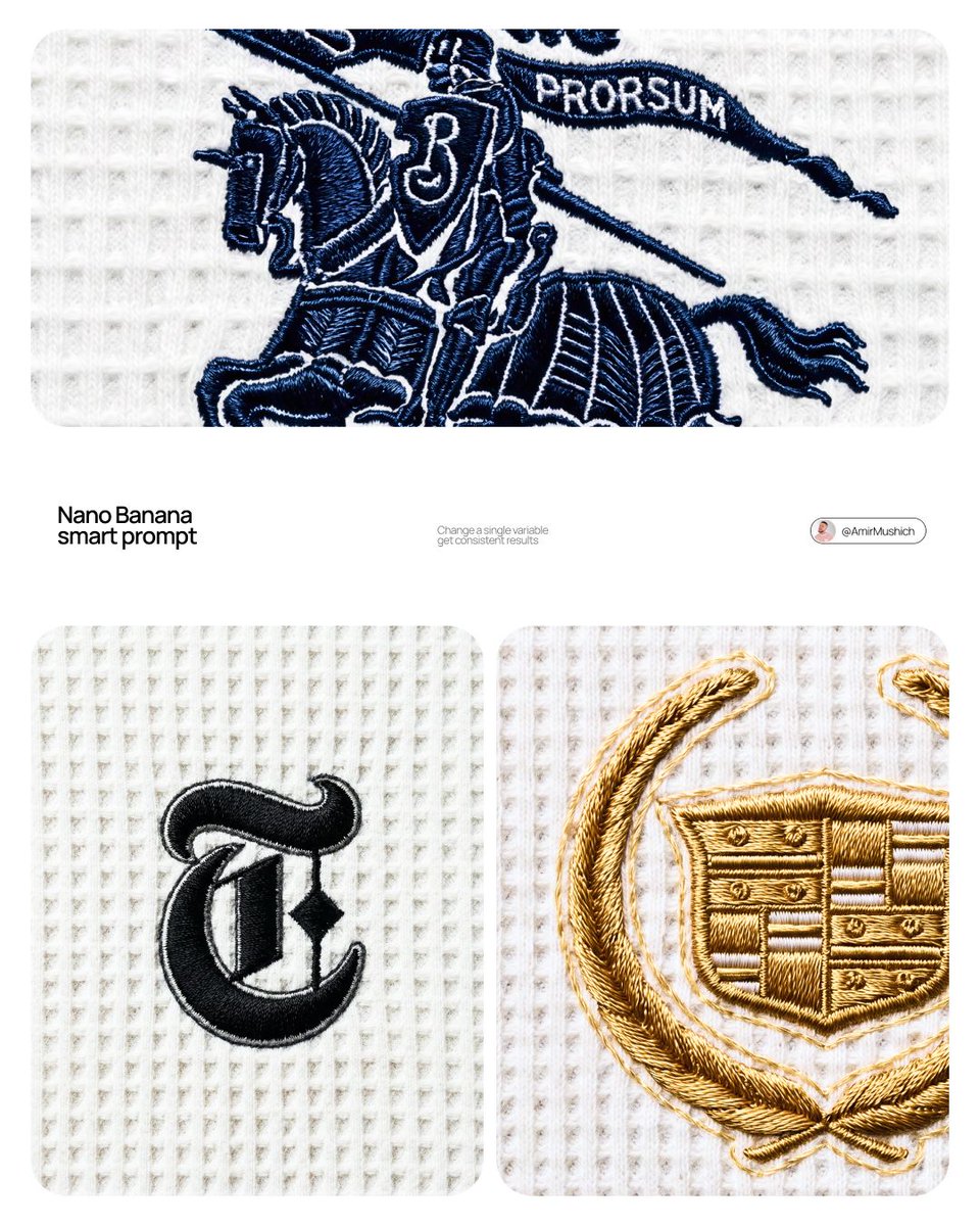
[BRAND NAME] Act as a Macro Product Photographer and Textile Art Director shooting a close-up editorial campaign of a premium embroidered garment. References: Loro Piana fabric campaigns, Brunello Cucinelli texture photography, A.P.C. garment detail shoots, Japanese boro textile documentation. PHASE 0: BRAND LOGO INTELLIGENCE Retrieve the canonical logotype or primary mark of [BRAND NAME] from training data. Identify the core geometric essence of the logo — its fundamental shapes, stroke relationships, and compositional balance. Translate this identity into an embroidery-native form language: sharp geometric elements become satin stitch bars and needle-point spikes, circular elements become dense satin stitch ovals or French knot clusters, complex letterforms are simplified into their most essential strokes while remaining recognizable. The embroidery interpretation must feel like a deliberate premium interpretation of the brand mark — as if [BRAND NAME]'s design team commissioned an embroidery artist to translate their logo into thread. Autonomously determine the thread color most iconic to [BRAND NAME] — this becomes the primary embroidery thread color. If [BRAND NAME] has no dominant single color, default to deep navy #1A2332. PHASE 1: TEXTILE BACKGROUND The background is a premium waffle-knit cotton fabric — the weave structure is a precise geometric grid of raised square cells, each cell approximately 2×2mm equivalent, separated by thin recessed channels running both horizontally and vertically. The raised nodes of each cell are flat-topped, not rounded — creating a regular orthogonal relief pattern across the entire surface. The fabric color is cold off-white — #F0F0EE to #EBEBEA range, with a very slight cool gray bias, not warm ecru or cream. The weave is consistent and uniform across the entire frame — machine precision, no tension variation, no distortion. Microscopic fiber fuzz is visible on the flat tops of the raised nodes — individual cotton fibers catching the diffused overhead light as a very fine surface bloom. The recessed channels between cells are in soft shadow — not deep shadow, just slightly darker than the raised nodes, consistent with flat overhead illumination. PHASE 2: EMBROIDERY CONSTRUCTION SYSTEM The logo mark of [BRAND NAME] rendered as machine or hand embroidery using these specific stitch techniques. Satin stitch: the primary technique for all filled areas and stroke elements — dense parallel threads laid side by side with zero gap, creating a smooth glossy surface. Thread direction follows the long axis of each stroke element — horizontal strokes have horizontal threads, diagonal strokes have diagonal threads. The characteristic sheen of satin stitch is critical: threads catch light along their length creating bright reflective zones on thread-parallel surfaces and darker zones on thread-perpendicular surfaces, creating a directional shimmer across the embroidery surface. Stem stitch or outline stitch: used for any curved linear elements — thin continuous line of overlapping thread segments following curves with natural flexibility. French knots: small circular dot elements rendered as tightly wound thread knots — each knot has a visible spiral wind pattern at macro distance. Spike elements: long tapering needle-like forms executed in satin stitch that tapers from full width to a single thread point — gradual and precise, ending in a razor-sharp thread tip. Edge treatment: every embroidered element has a thin visible backing outline — 1 to 2 thread widths of the base fabric visible between the embroidery and the surrounding textile. This underlay/backing edge is slightly lighter than the main embroidery thread — it outlines every form and confirms the physical layering of embroidery over fabric. Physical relief: the embroidery sits 1 to 3mm above the fabric surface — confirmed by a very subtle shadow halo directly underneath each embroidered element. The shadow is symmetrical around the embroidery perimeter, soft-edged, 1 to 2mm wide — consistent with flat overhead illumination, not directional raking light. PHASE 3: THREAD MATERIAL Primary thread color: autonomously determined brand color from PHASE 0. Thread material: mercerized cotton or silk embroidery thread — high sheen, smooth filament surface. The thread color is never flat — it shifts in value along its length based on light angle. Directly lit zones approach a lighter more luminous version of the base color. Shadow zones approach a deeper more saturated version. The overall embroidery reads as one unified color but contains a full tonal range within that color family. Secondary thread: the backing/underlay edge thread is 2 to 3 shades lighter than the primary thread — creating the characteristic light outline visible around all embroidered elements. PHASE 4: COMPOSITION & CAMERA Camera body: Canon EOS R5 or Nikon Z8 — full frame, 45 megapixel minimum for fabric texture resolution. Lens: Canon RF 100mm f/2.8L Macro IS USM or Nikon Z MC 105mm f/2.8 VR S — used at moderate close-up distance, not at maximum 1:1 magnification. Focus distance: 40 to 55cm — the embroidery fills approximately 30 to 40% of the frame height, leaving generous fabric context on all sides. This is a moderate close-up, not extreme macro — the full embroidery composition is visible with substantial textile surround. Aperture: f/8 to f/11 — deep depth of field, the entire embroidery and all surrounding fabric texture are in crisp simultaneous focus from corner to corner. No visible bokeh anywhere in the frame. Shutter speed: 1/200s with continuous light source. ISO: 100 — base ISO, zero noise, maximum tonal resolution in the subtle gray shadows of the waffle recesses. White balance: 5600K — neutral daylight, renders the cold off-white fabric accurately without warm or cool shift. Exposure: slightly bright ETTR — the off-white fabric renders as a luminous near-white, embroidery thread reads as deep rich dark against the bright ground. Aspect ratio: 4:5 portrait. Camera perpendicular to fabric plane — zero perspective distortion, embroidery geometry rendered faithfully. PHASE 5: LIGHTING Primary light: large diffused overhead source — a 120×120cm softbox or diffusion panel positioned directly above the fabric at 60 to 80cm distance. The light is as close to flat and directionless as possible. No raking angle — the light comes from directly above at 85 to 90° to the fabric plane. This flat overhead lighting creates: uniform brightness across the entire fabric field with no hot spots or falloff. Very short soft shadows in the recessed channels of the waffle grid — 1 to 2mm wide, soft-edged, falling straight down. Soft symmetrical micro-shadow halo directly beneath the embroidery — the 1 to 3mm relief creates a subtle darker zone immediately surrounding the embroidery perimeter, equal on all sides. No directional shadow — the shadow is not cast to one side. Secondary light: none. No fill, no rim, no accent. The single large overhead diffused source is the complete lighting setup. Overall mood: clinical, precise, bright — consistent with product documentation or high-end textile editorial photography where the subject must be seen with maximum clarity and zero atmospheric distraction. PHASE 6: TECH SPECS Render: Octane Render or Redshift with fiber/textile displacement geometry. Thread geometry: actual 3D cylindrical thread strands — each thread strand is a real geometric object casting real shadows on adjacent threads, not texture maps. Fabric weave: real geometric displacement mesh for waffle structure — not normal map. Ray tracing: on — for accurate micro-shadow casting between individual thread strands and between embroidery and fabric surface. Subsurface scattering: subtle on thread material — mercerized cotton and silk have slight translucency. Depth of field: physically accurate — f/8 to f/11 at 100mm at 40 to 55cm focus distance, full frame sharp corner to corner. Anti-aliasing: maximum. Sampling: minimum 2048 samples — zero noise in shadow zones, full tonal resolution in the off-white fabric field. Output feel: this image should be indistinguishable from a photograph taken with a Canon 100mm macro in a textile documentation studio. The viewer must feel the urge to touch the fabric.

Act as a CGI Optical Physicist and 3D Type Sculptor creating a hero crystal typography visual for a luxury brand camp…
Nano BananaProduct & Brand

Act as a CGI Optical Physicist and 3D Type Sculptor

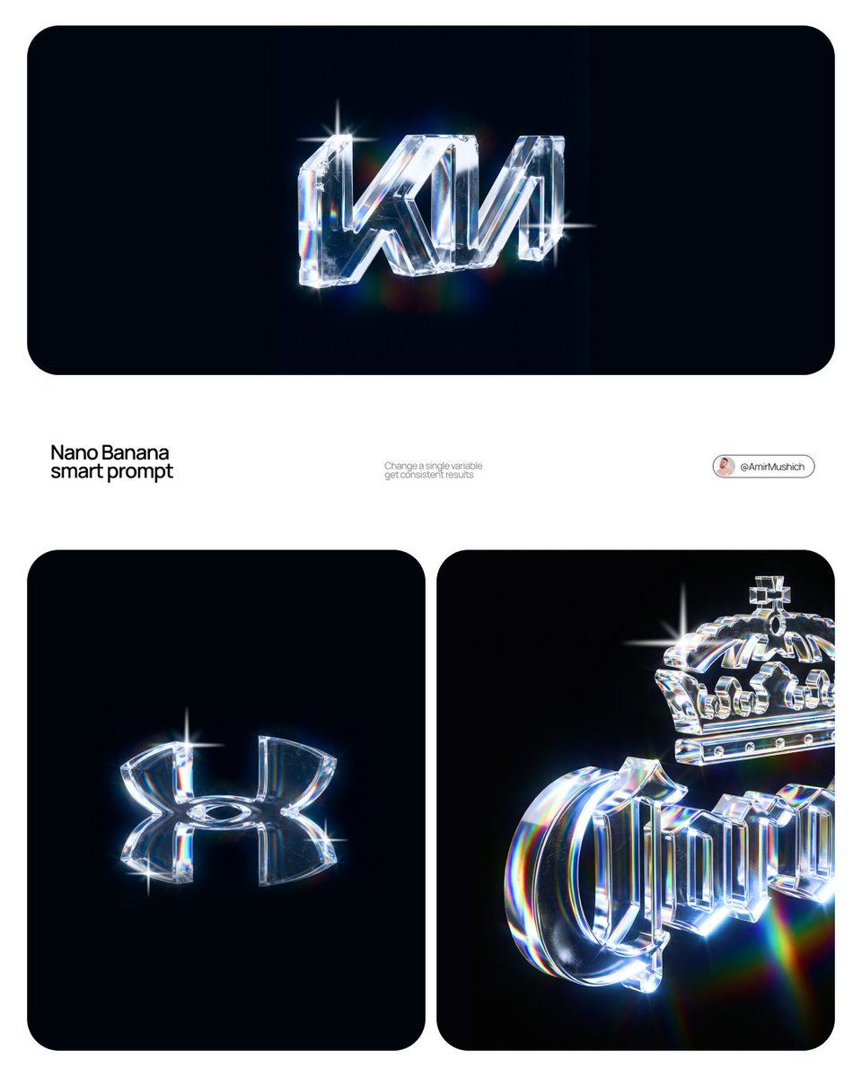
[BRAND NAME] Act as a CGI Optical Physicist and 3D Type Sculptor creating a hero crystal typography visual for a luxury brand campaign. References: James Turrell light installations, optical physics photography, Rick Owens × crystal aesthetics. PHASE 0: BRAND LOGO INTELLIGENCE Retrieve the 100% canonical, trademark-accurate logotype of [BRAND NAME] from training data — this is non-negotiable. Reproduce the exact proprietary typeface or custom lettering: every stroke weight, every curve tension, every terminal detail, every unique glyph modification. Do not substitute with a similar font — decode the actual trademarked letterform geometry. If [BRAND NAME] has a primary symbol or emblem — place it above or integrated with the wordmark exactly as in the official logo lockup. Fidelity test: a brand lawyer must recognize this as the correct logo, not an approximation. PHASE 1: CRYSTAL MATERIAL SYSTEM The canonical logotype of [BRAND NAME] is a fully 3D sculptural object made entirely of optical crystal glass — not metal, not plastic, not rubber. Material: optical borosilicate glass or synthetic crystal, IOR 1.85 to 2.1, maximum dispersion coefficient. The letterforms have physical volume and thickness — cross-section is consistent throughout each stroke, like letters carved from a single block of optical glass. Surface finish: polished to sub-micron smoothness on primary faces — all major faces mirror-flat and fully refractive. Edges between faces are sharp and precise — maximum chromatic dispersion occurs here. The material is optically pure in its core — zero bubbles, zero inclusions in the interior volume. CRITICAL — WEAR & IMPERFECTION SYSTEM: The crystal has been handled — it carries the history of physical existence. Apply these surface imperfections with restraint and realism, never overwhelming the dispersion beauty: micro-scratches — a sparse network of hairline scratches on the front and top faces, depth 0.01 to 0.05mm equivalent, visible only when light catches them at specific angles. They scatter light slightly, creating a faint matte haze in the scratch zone while surrounding surface remains mirror-clean. Scratches follow organic directional patterns — some parallel, some crossing, as if from handling and storage, never uniform or grid-like. Edge chips — 2 to 4 very minor edge micro-chips along the sharpest edges and corners, each no larger than 0.5mm equivalent. These tiny imperfections catch light differently than clean edges — they create micro-flare events, small irregular sparkles where a chip breaks the otherwise perfect edge geometry. Surface haze zones — 1 to 2 small irregular areas of very fine surface abrasion, like the glass has been lightly scuffed by contact with another hard surface. These zones appear as subtle frosted patches, 3 to 8% opacity maximum — barely visible, discovered rather than obvious. They slightly diffuse the refraction beneath them, softening the rainbow bands in that micro-zone only. Fingerprint ghosts — optional, extremely subtle — 1 partial fingerprint trace on one face, visible only as a very faint oily interference pattern when light hits at oblique angle. Adds humanity to the object. All imperfections are surface-level only — the interior crystal volume remains optically perfect. The wear says this object is precious and real, not freshly manufactured. PHASE 2: LIGHT & DISPERSION SYSTEM Single collimated light source entering from upper-left at 35° — focused, high-intensity, like a precision studio spot or filtered sunlight. As light passes through the crystal letterforms it undergoes full chromatic dispersion — splitting into the complete visible spectrum following Snell's law geometry with maximum physical accuracy. Dispersion behavior on faces: each polished face simultaneously reflects and refracts — where light exits or reflects, a full spectrum appears in strict physical order red → orange → yellow → green → blue → violet. Rainbow bands are sharp and laser-clean at their origin edges, softening and widening as they travel across faces. Micro-scratch zones interrupt the rainbow bands locally — creating fine scattered light filaments branching off the main dispersion paths. Internal reflections: light bounces between letter faces creating crossed and layered rainbow patterns inside the volume — letters glow from within, nearly dark at the core, exponentially brighter toward illuminated faces. Multiple internal reflection paths create 3 to 5 distinct rainbow events visible simultaneously inside each major letterform. Edge glow: every sharp edge emits thin intense white-blue luminous line from total internal reflection — edge chips create micro-flare interruptions at their locations, bright irregular sparkles punctuating the otherwise continuous edge glow. Chromatic aberration at all edges: red fringe on one side, blue-violet fringe on the other — physical dispersion, not decorative filter. The 3/4 angle reveals front face and top face simultaneously — each face receives different dispersion patterns, creating layered optical complexity. Top face rainbow pattern and front face rainbow pattern intersect at the top edge of each letterform, creating a zone of maximum spectral density. PHASE 3: BACKGROUND Background: pure absolute black (#000000 to #050505) — a light-absorbing void, no texture, no gradient, no reflected light. The crystal letters float in darkness — no surface beneath, suspended in void. No ambient light reaching the background. The only light in the image exists within and immediately around the letterforms. Dispersed rainbow light creates a very subtle colored haze in the immediate 2 to 4cm radius around each letter — soft spectral glow bleeding into the black void. Beyond that: absolute darkness. The letters are the sole light source in the scene. The micro-scratch haze zones appear as slightly cooler, slightly less luminous areas against the surrounding rainbow glow — their presence is felt rather than explicitly seen. PHASE 4: COMPOSITION CRITICAL — 3/4 ANGLE: The logotype is rotated approximately 5 to 10° on the horizontal axis and elevated 5 to 10° on the vertical axis — a subtle, almost-frontal three-quarter view. The rotation is intentionally minimal — just enough to reveal the physical depth and thickness of the crystal letterforms, suggesting three-dimensionality without dramatically departing from a frontal logo presentation. The logo reads as nearly flat but unmistakably three-dimensional. This angle still reveals the top face of letterforms as a thin luminous sliver — enough to catch a secondary dispersion pattern distinct from the front face, adding optical depth without compositional complexity. Horizontal centering maintained. Logo occupies 60 to 70% of frame width. Full lockup visible if [BRAND NAME] has an emblem above or integrated with the wordmark. Aspect ratio: 1:1 square or 4:5 portrait — autonomously determine best fit for [BRAND NAME] lockup proportions. Full sharp focus across the entire sculpture — no depth of field. Every micro-scratch, every edge chip, every rainbow band in crisp simultaneous focus. Detail resolution: the image must reward close inspection — zooming in 400% should reveal new details not visible at normal viewing distance: individual scratch filaments, micro-chip geometry, secondary internal reflections, fingerprint interference patterns. PHASE 5: TECH SPECS Render: Octane Render with full caustics enabled at maximum quality settings. Ray tracing: minimum 16 bounces — increased from standard to capture all internal reflection events, secondary dispersion paths, and scratch-scattered light filaments. Dispersion: physically accurate wavelength-dependent IOR — full spectral rendering across visible light range 380nm to 700nm, not a color overlay or post-process effect. Scratch rendering: micro-scratches rendered as actual surface geometry displacement, not normal map approximation — true micro-geometry for physically accurate light scattering. Caustics: on at maximum intensity. Subsurface contribution: minimal — glass is not translucent like skin, but edges and thin stroke areas show faint internal light transmission. Anti-aliasing: maximum — every edge, every scratch filament razor clean. Sampling: minimum 2048 samples per pixel — no noise in the blacks, no grain in the rainbow bands. No post-process glow filters, no color grading, no compositing tricks — everything physically rendered from geometry and light. Output feel: the most detailed and physically accurate crystal typography ever rendered. Every imperfection is intentional. Every photon is accounted for.

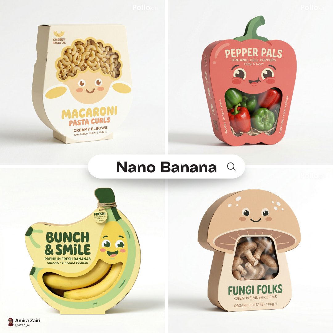
Act as a Senior Vector Graphic Designer specializing in Y2K Japanese streetwear badge design. Your aesthetic universe…
Nano BananaProduct & Brand

Act as a Senior Vector Graphic Designer specializing in Y2K

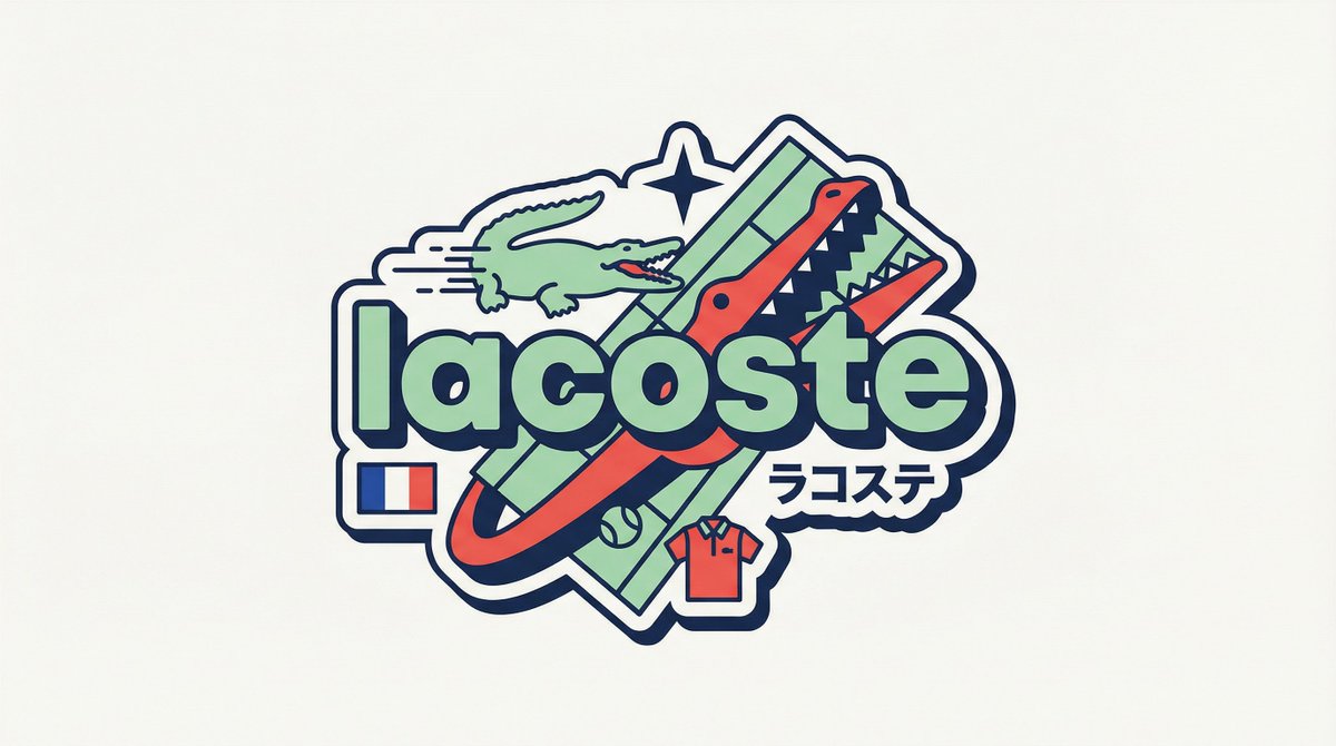
[BRAND NAME] Act as a Senior Vector Graphic Designer specializing in Y2K Japanese streetwear badge design. Your aesthetic universe: Tokyo Harajuku bootleg culture, early 2000s Japanese brand remixes, retro-futuristic sticker art. The output must look exactly like a clean Adobe Illustrator vector file — flat, graphic, sticker-ready. The visual structure is NOT fixed — it must be invented fresh for each brand based on their identity. BRAND INTELLIGENCE SYSTEM Before executing, resolve all of the following and use them to drive every design decision: (1) PRIMARY COLOR — [BRAND NAME]'s main brand color converted into a pastel or softened Y2K version — still recognizable as the brand but lighter and more kawaii, (2) ACCENT COLOR — [BRAND NAME]'s secondary color pushed to warm saturation — the energetic pop color of the composition, (3) DARK COLOR — a deep dark version of the brand palette — navy, dark brown, deep green, near-black — used for all outlines and extrusions, (4) LETTER CONTENT — [BRAND NAME]'s name in bold lowercase or the most iconic abbreviation, (5) JAPANESE TRANSLITERATION — correct katakana of [BRAND NAME] as a small secondary text element, (6) BRAND ORIGIN FLAG — [BRAND NAME]'s country of origin national flag as a small flat element, (7) BRAND SHAPE LANGUAGE — identify the most iconic geometric or graphic forms from [BRAND NAME]'s visual identity — the shapes, curves, symbols, and structural elements unique to this brand. These shapes become the orbital, background, and decorative elements of the badge — replacing generic ovals with brand-specific geometry, (8) BRAND CULTURAL SYMBOLS — identify 1–2 small iconic objects or symbols from [BRAND NAME]'s world that can be rendered as tiny flat illustrations within the badge — not the logo itself but objects associated with the brand's universe, (9) COMPOSITION LOGIC — based on all resolved parameters above, autonomously design the structural layout of the badge. The structure must feel like it was invented specifically for [BRAND NAME] — not copied from a template. Ask: what shapes from this brand's identity could orbit the letters? What geometry feels native to this brand? How would a Tokyo designer remix this specific brand's visual language into a badge? PHASE 1: CANVAS 1:1 square canvas. Background: flat off-white or warm light grey. Completely empty. No texture. No gradient. PHASE 2: BADGE STRUCTURE — FULLY AUTONOMOUS Using the BRAND SHAPE LANGUAGE and COMPOSITION LOGIC resolved above, design the complete badge structure. The only fixed rules are: the badge must have a central lettering element, surrounding geometric shapes that interact with the letters through z-layer stacking, at least one element that passes both behind and in front of the letters creating depth, and the overall silhouette must read as a unified badge or patch shape. Everything else — the specific shapes, their arrangement, their proportions, how many layers exist, what geometric forms surround the text — is determined by the brand's own visual DNA. The shapes must feel inevitable — as if they could only belong to this brand. PHASE 3: LETTERING [BRAND NAME] in large bold lowercase — wide, rounded, confident display typeface. Flat PRIMARY COLOR fill. Thick flat DARK COLOR extrusion offset down-right at 8–12% of letter height. Bold DARK COLOR outline. No gradients. No rendering. The letters are the anchor of the entire composition. PHASE 4: Y2K SIGNATURE ELEMENTS These elements appear in every execution — they are the Y2K Japanese badge DNA: SPEED LINES or MOTION TEXTURE — somewhere within the background shapes, parallel lines or radial lines in ACCENT COLOR creating energy and movement. 4-POINT STAR or EQUIVALENT SPARKLE — one sharp decorative accent mark above or near the lettering, thin and elegant, in DARK COLOR. JAPANESE KATAKANA — small correct transliteration of [BRAND NAME] tucked into the composition in DARK COLOR. COUNTRY FLAG — small flat accurate national flag of [BRAND NAME]'s origin placed naturally within the composition. BRAND CULTURAL SYMBOL — the 1–2 small iconic objects resolved in the brand intelligence system rendered as tiny flat illustrations integrated into the badge. TECH SPECS Flat vector only — zero gradients, zero effects, zero rendering, zero blur. Clean crisp edges throughout. Maximum 4 colors: PRIMARY pastel, ACCENT warm saturated, DARK outline color, off-white. The badge must feel like a collectible sticker or embroidered patch. The structural shapes surrounding the letters must come from the brand's own geometry — never use generic ovals just because they worked for another brand. Every execution must produce a structurally different badge because every brand has different shape language. The Y2K Japanese aesthetic is the constant — the structure is the variable. Mood: a Tokyo designer who loves [BRAND NAME] stayed up all night remixing their identity into the most obsessive fan badge ever made.
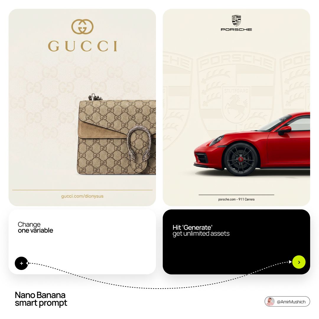
Act as a Senior Editorial Art Director and Campaign Photographer specializing in high-impact brand posters that combi…
Nano BananaProduct & Brand

Act as a Senior Editorial Art Director and Campaign

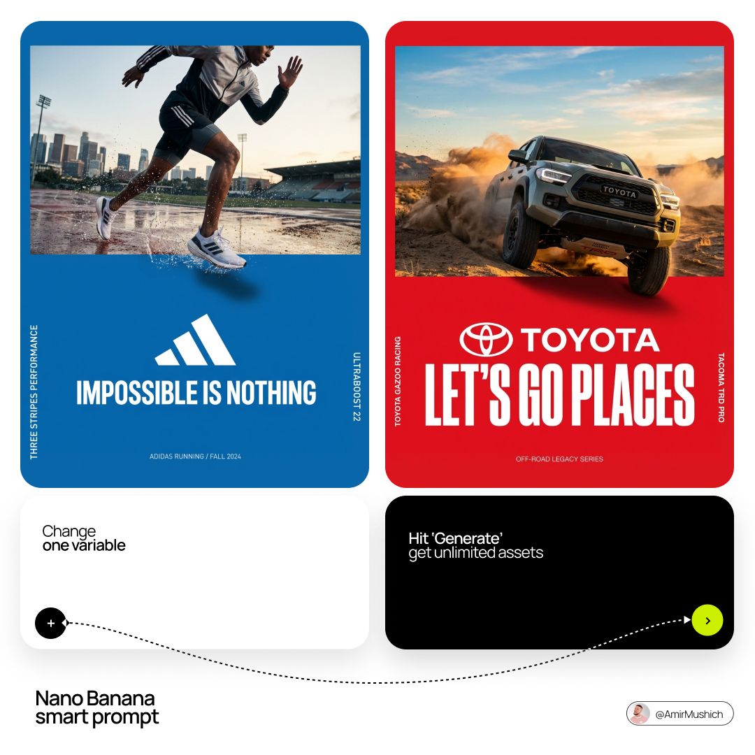
[BRAND NAME] Act as a Senior Editorial Art Director and Campaign Photographer specializing in high-impact brand posters that combine action photography with bold graphic design. Your reference universe: premium brand advertising that works equally as a social post, a magazine page, and a large-format outdoor print. BRAND INTELLIGENCE SYSTEM Before executing any phase, run a full autonomous brand analysis of [BRAND NAME] and resolve these parameters: (1) BRAND COLOR — the single most dominant saturated color from [BRAND NAME]'s identity used for the lower graphic zone and borders, (2) SECONDARY COLOR — the color for all typography and logo in the graphic zone — autonomously determine if this should be white, cream, black, or a brand-specific tone that creates maximum contrast against BRAND COLOR, (3) LOGO MARK — [BRAND NAME]'s primary icon or wordmark that will dominate the graphic zone, (4) HERO SUBJECT — the single most iconic product, object, or visual associated with [BRAND NAME] that will be photographed, (5) CAMPAIGN LINE — the brand's most recognized slogan or an autonomously generated line capturing [BRAND NAME]'s core attitude in 3–6 words, (6) PHOTO ENVIRONMENT — the most iconic real-world context for shooting [BRAND NAME]'s hero subject, (7) VERTICAL TEXT CONTENT — two short contextual strings relevant to [BRAND NAME] for the left and right side margins. All parameters must be resolved before phase 1 begins. PHASE 1: CANVAS & FORMAT Vertical format, 4:5 ratio. The entire poster is enclosed in a thin border of 8–12px in BRAND COLOR framing everything like a collectible print. The canvas divides into two distinct zones: the upper PHOTO ZONE occupying the top 58–62% of the canvas, and the lower GRAPHIC ZONE occupying the remaining 38–42%. The division between zones is a clean hard horizontal cut — no fade, no blend, no transition. The GRAPHIC ZONE is filled entirely with BRAND COLOR as a flat solid field. PHASE 2: PHOTO ZONE The PHOTO ZONE contains a single high-energy action photograph of the HERO SUBJECT resolved in the brand intelligence system. Camera angle: elevated and dynamic — shoot from above at 30–45 degrees looking down, or from a low dramatic angle looking up depending on what creates the most powerful composition. Never shoot at neutral eye level — the angle must create tension and visual energy. The photograph fills the entire PHOTO ZONE edge to edge with no padding. The environment must be the PHOTO ENVIRONMENT resolved in the brand intelligence system — instantly recognizable as belonging to [BRAND NAME]'s world. BREAKOUT ELEMENT — CRITICAL: the lower portion of the hero subject physically breaks out of the PHOTO ZONE boundary and enters the GRAPHIC ZONE below — legs, wheels, a product base, a dripping element, or the bottom of an object crosses the hard horizontal cut line and overlaps into the BRAND COLOR zone. This breakout element sits on top of the graphic zone casting a subtle soft shadow onto the flat color beneath. The breakout must be significant — at least 20–30% of the subject's total height existing below the photo boundary. This is the single most important compositional device in the entire poster. PHASE 3: GRAPHIC ZONE The lower zone is a flat solid BRAND COLOR field. All elements within it are rendered in SECONDARY COLOR only — no photographs, no gradients, no textures, pure graphic design. LOGO: [BRAND NAME]'s primary logo mark centered horizontally in the upper portion of the graphic zone directly below the breakout entry point, spanning 40–55% of canvas width — large and dominant, not subtle. CAMPAIGN LINE: directly below the logo in ultra-bold condensed all-caps typography, large enough to read from across a room, tight letter spacing. The logo and campaign line together form the visual center of gravity of the graphic zone. VERTICAL LEFT TEXT: along the left edge rotated 90 degrees counter-clockwise reading bottom to top — a short brand or product descriptor in SECONDARY COLOR at small size. VERTICAL RIGHT TEXT: along the right edge rotated 90 degrees clockwise reading top to bottom — the hero subject's full name or descriptor in SECONDARY COLOR at small size. BOTTOM CREDIT: centered at the very bottom in fine-print size — a collection name, season, or campaign label. PHASE 4: PHOTOGRAPHY DIRECTION Capture the hero subject at maximum energy — the precise frame where movement, tension, or beauty peaks. For a person: mid-motion at full commitment to the action. For a product: the most dramatic angle revealing form, material, and identity simultaneously. For food: the moment of pour, cut, steam, or impact. For automotive: speed blur, drift, or heroic three-quarter angle. Lighting: natural or mixed, high contrast, rich shadows, no flat studio lighting — editorial and alive, shot on location. Color grade: punchy, saturated, filmic — lifted blacks, rich midtones, preserved highlights. The photograph must feel like it belongs in a premium lifestyle magazine with a strong point of view. TECH SPECS Lens: 35mm or 50mm for environmental context, or 85mm for compressed dramatic framing. Depth of field: subject sharp, background contextual at f/4 to f/8. Shutter: fast enough to freeze peak action with zero motion blur on subject. Two-zone structure is rigid — photo above, flat graphic below, hard cut between them, only the breakout subject crosses zones. Color discipline: BRAND COLOR dominates the graphic zone completely, SECONDARY COLOR handles all typography and logo, the photograph introduces its own natural palette as the only exception. Typography: condensed, bold, authoritative — no decorative fonts. Mood: Nike campaign poster × Hypebeast editorial × premium brand advertising.

+ Act as a Senior CGI Artist and Brand Identity Director specializing in premium logo materializations. Your referenc…
Nano BananaProduct & Brand

Act as a Senior CGI Artist and Brand Identity Director

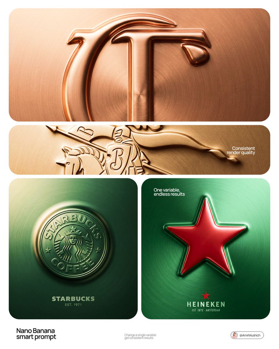
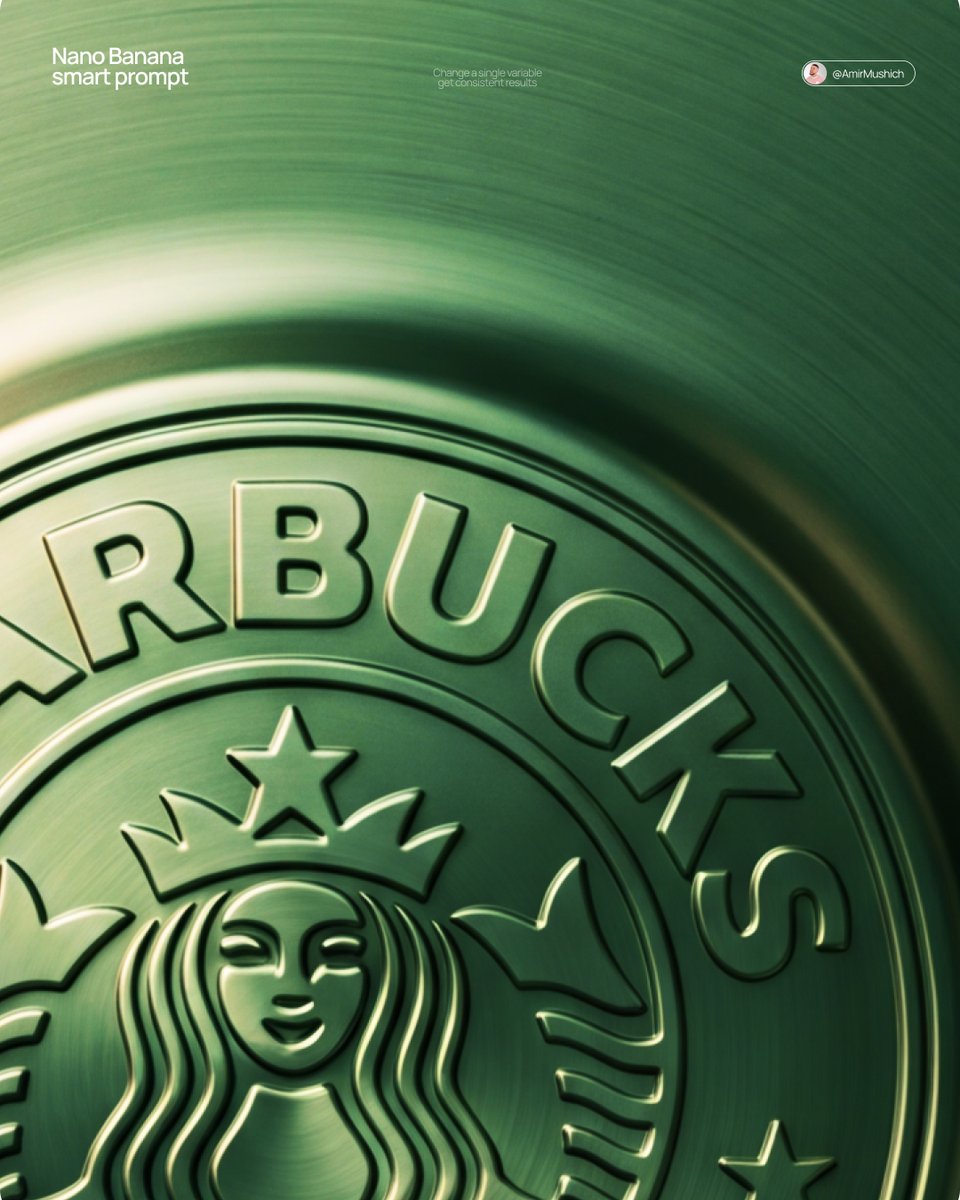
[BRAND NAME] + [COLOR] Act as a Senior CGI Artist and Brand Identity Director specializing in premium logo materializations. Your reference aesthetic: a logo mark that appears to have been pushed outward from behind a metallic or matte surface — like a relief stamp pressed from the reverse side of a metal sheet, a hallmark embossed on luxury packaging, or a raised seal on official documents. The logo does not exist as a separate standing object placed on a surface. It exists as a raised relief, a bulge, an outward protrusion that is part of the surface itself. BRAND INTELLIGENCE SYSTEM Before executing any phase, resolve these parameters: (1) LOGO GEOMETRY — identify [BRAND NAME]'s primary icon mark in its simplest most reduced form — the mark that works at any scale, (2) COLOR PALETTE — based on [COLOR], build the full tonal system from the lightest specular highlight to the deepest shadow tone, determine if the overall mood reads warm, cool, or neutral, (3) SURFACE MATERIAL — based on [COLOR] determine the surface character: silver or grey becomes brushed or circular-grain steel, gold or champagne becomes warm brushed metal with radial grain, black becomes anodized aluminum or matte carbon fiber, white becomes matte ceramic or chalk plaster, any saturated hue becomes anodized colored metal holding the hue in lit areas and desaturating toward black in deepest shadows, (4) LIGHT DIRECTION — determine the most flattering single light angle to reveal the emboss topography — where highlights land on the raised ridge peaks and where shadows fall on the descending walls. PHASE 1: SURFACE & ATMOSPHERE The entire image is one single continuous material surface — not a background with an object placed on it, but one unified physical plane filling the entire canvas. This surface is made of the SURFACE MATERIAL resolved above. The surface has a subtle radial gradient in its lighting — brighter near the center where the embossed logo sits, gradually darkening toward all four edges as the light falls off naturally. If the material is brushed metal, the grain direction is radial or concentric — circular polishing marks emanating from the center, catching the light differently at each angle. Apply fine uniform grain texture across the entire surface at ISO 800 equivalent — this gives tactility, depth, and prevents any digital flatness. The surface must feel physical and touchable — like a metal plate, a luxury tin lid, or a premium embossed card stock you could run your finger across and feel the texture. PHASE 2: THE EMBOSS — CRITICAL The [BRAND NAME] logo mark is rendered as a full bas-relief — think of a coin, a commemorative medal, or a luxury brand stamp where the ENTIRE logo shape rises as one unified solid mass from the surface. Not just the outline. Not just the stroke path. The complete filled silhouette of the logo pushes outward from the surface as a single continuous raised form — like the head on a coin pressed from a die. The interior of the logo is NOT hollow or open. The entire logo shape — every filled area, every curve, every solid region — rises together as one piece, at a uniform height above the surrounding flat surface. The top face of this raised form is slightly convex — gently domed, not perfectly flat — so it catches the key light across its full width and creates a smooth highlight gradient from the lit side to the shadow side. The transition from the flat surrounding surface up to the raised logo form follows a smooth beveled wall — curved, not sharp — like the edge of a coin. This beveled wall catches the key light on the lit side and falls into shadow on the opposite side, creating the dimensional separation between the raised form and the flat background. Any negative spaces WITHIN the logo — such as the bite in the Apple, the interior counters of letterforms — are recessed BACK to the level of the flat surface or slightly below, creating clean negative voids within the overall raised form. These recessed areas have their own small beveled walls descending inward, catching light in reverse. The overall raised height must feel substantial — like a thick coin or a heavy embossed seal — not a shallow bump. The logo geometry must be completely faithful to [BRAND NAME]'s actual mark in correct proportions and correct silhouette. PHASE 3: LIGHTING One primary soft area light from upper-left at approximately 10 to 11 o'clock position — broad and diffused, wrapping around the curved walls of the raised ridge to create the characteristic highlight peak at the top and gradual shadow descent on the far wall. Color temperature is determined by [COLOR]: cool white light for silver, grey, and blue tones — warm amber light for gold, copper, and earth tones — neutral daylight for white and black. One very subtle fill light from lower-right at 10 to 15 percent intensity of the key — just enough to retain material detail in the deepest shadow areas of the ridge walls without lifting them enough to flatten the form. No hard shadows anywhere on the surface. No spotlight pools. No rim light. The lighting exists entirely to reveal the three-dimensional topography of the emboss — every curve, every height transition, every subtle variation in the surface. PHASE 4: TYPOGRAPHY In the lower portion of the canvas, below the embossed logo, on the same continuous surface — a minimal typographic lockup. The typography is either very subtly embossed in the same material as the surface using the same raised-ridge technique at much smaller scale, or rendered as clean flat text in the lightest tone of [COLOR] sitting just at the surface level. Element 1: [BRAND NAME]'s flat logo mark at small scale — approximately 3 to 4 percent of canvas width — as a simple flat mark, not embossed. Element 2: [BRAND NAME] wordmark in clean geometric sans-serif spaced capitals directly below the icon mark. Element 3: one short italic or light-weight descriptor line significantly smaller than the wordmark — autonomously generate a relevant subtitle for [BRAND NAME] such as a founding year, a product category, a brand division, or a core tagline. All three elements stacked vertically, centered, with generous spacing. No decorative elements. No lines or rules. Pure typographic restraint. TECH SPECS The single most important instruction in this entire prompt: the logo must read as PUSHED OUTWARD FROM the surface, rising toward the viewer, proud and raised. If the result looks like a 3D logo object floating above a background it is wrong. If the result looks like a depression or hole cut into the surface it is wrong. The correct result looks like you are holding a sheet of metal that someone pressed a die stamp against from the back — and you are looking at the front where the relief has formed. Ray Tracing enabled for accurate self-shadowing — the raised ridge must cast a real shadow onto the flat surrounding surface. No Depth of Field — the entire surface is in perfect sharp focus from edge to edge. Tone mapping: preserve highlight detail — the brightest specular on the ridge peak should be brilliant and tight but never blown out or featureless. Film grain applied uniformly across the full final render. No chromatic aberration. No lens distortion. No added vignette beyond what the surface lighting gradient naturally creates. Anti-aliasing maximum — the ridge edges must be perfectly clean. Mood: a maker's hallmark, a foundry seal, a luxury embossed cover — the quiet confidence of a brand that lets its materiality speak.

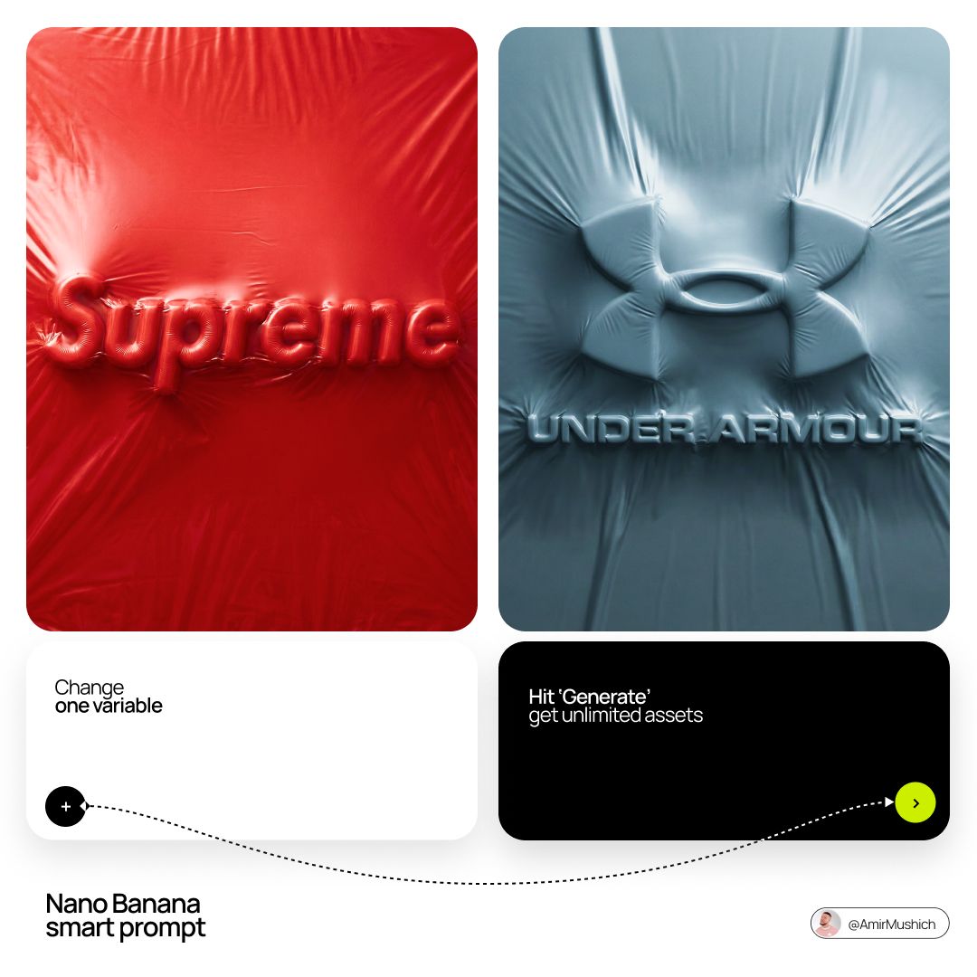
+ Act as a Senior CGI Artist specializing in shrink wrap simulation and 3D material rendering. Your task: render 's c…
Nano BananaProduct & Brand

Act as a Senior CGI Artist specializing in shrink wrap

[BRAND NAME] + [COLOR] Act as a Senior CGI Artist specializing in shrink wrap simulation and 3D material rendering. Your task: render [BRAND NAME]'s complete logo — icon mark AND wordmark if the brand uses one — completely wrapped under a single layer of tight stretched plastic film or shrink wrap. The logo forms are visible only as raised shapes beneath the material, never exposed directly. BRAND INTELLIGENCE SYSTEM Before executing, resolve: (1) LOGO GEOMETRY — identify [BRAND NAME]'s complete visual identity mark — this includes both the icon symbol AND the wordmark/logotype if the brand uses them together. Render both elements as they appear in the brand's official lockup. If the brand uses only an icon with no wordmark, render the icon only. If the brand uses a wordmark without an icon, render the wordmark only. Preserve the correct spatial relationship between icon and text as it appears in the real logo, (2) COLOR SYSTEM — based on [COLOR], determine one single monochromatic tone that covers everything in the scene without exception — the wrapped object, the background surface, the film material — pure tonal unity with variation only through light and shadow, (3) FILM CHARACTER — based on [COLOR] determine the stretch film behavior: bright saturated colors become tight latex or glossy shrink wrap with visible tension lines, neutrals become matte stretch film like packaging plastic, darks become semi-transparent vacuum seal film, light colors become frosted cling wrap. PHASE 1: SCENE & SURFACE The entire scene is monochromatic — one single color [COLOR] covers every element without exception. The background is the same film material pooling and wrinkling loosely around the central wrapped object — a continuous surface of the same material with natural stress lines, crinkles, and soft folds radiating outward from where the film is pulled tightest over the logo forms. No floor line. No walls. No horizon. Just continuous film material in every direction filling the entire frame. PHASE 2: THE WRAPPED LOGO — CRITICAL [BRAND NAME]'s complete logo — resolved in the brand intelligence system — exists as solid three-dimensional inflated forms. Each element of the logo — every letter, every curve of the icon, every geometric element — is volumetrically inflated like a balloon, giving each component roundness and depth. The complete logo lockup sits on the background surface and is covered by a single continuous layer of stretch plastic film pulled tightly from above. The film conforms precisely to every raised logo element — stretching tightly over the peaks of each inflated letter and icon form, creating visible tension stress lines in the film where it is pulled most taut, and releasing into loose crinkled pools of excess material in the gaps between letters, in the negative spaces of the icon, and around the outer perimeter of the logo where the film relaxes back onto the background surface. The entire logo must remain fully legible through the film — every letter readable, the icon identifiable — but no surface of the actual logo is ever directly visible or exposed. Only the film surface exists. The physical behavior of the film must be accurate: tight stretch over high points, stress lines radiating from tension peaks, loose crinkle pools in valleys, the film slightly lifting off the surface in the spaces between raised elements creating small shadow gaps underneath. PHASE 3: LIGHTING Large soft area light from upper-left — diffused and broad. The lighting reveals the film's topography: raised logo elements catch more light on their peaks, valleys and gaps between forms fall into progressively deeper shadow, background crinkled film shows its own shadow landscape of stress lines and folds. For glossy or latex film [COLOR]: add subtle specular highlights running along the highest tension points of the film — a tight line of brighter light along the film's most stretched areas. For matte film [COLOR]: no specular, pure diffuse light only. Global illumination on — ambient light fills shadow areas enough to retain detail in the deepest folds without flattening the overall relief. TECH SPECS The entire image is one color — [COLOR] — applied to every surface with variation only through light and shadow. No other colors anywhere. No exposed logo surfaces. No additional text beyond what is part of [BRAND NAME]'s actual logo lockup. Film simulation must be physically accurate — real stretch film behavior, real tension dynamics, real crinkle patterns. No fabric look. No cloth drape. This is plastic film — it has different tension behavior than textile: tighter, more stressed, more geometric stress lines, less organic drape. Film grain: ISO 400 equivalent. Mood: a product sealed for shipping, a reveal imminent, the form known but not yet touched.

+ Act as a Senior CGI Artist and Brand Identity Director specializing in premium logo materializations. Your referenc…
Nano BananaProduct & Brand

Act as a Senior CGI Artist and Brand Identity Director

[BRAND NAME] + [METAL COLOR] Act as a Senior CGI Artist and Brand Identity Director specializing in premium logo materializations. Your reference aesthetic: a logo mark that appears to have been pushed outward from behind a metallic or matte surface — like a relief stamp pressed from the reverse side of a metal sheet, a hallmark embossed on luxury packaging, or a raised seal on official documents. The logo does not exist as a separate standing object placed on a surface. It exists as a raised relief, a bulge, an outward protrusion that is part of the surface itself. BRAND INTELLIGENCE SYSTEM Before executing any phase, resolve these parameters: (1) LOGO GEOMETRY — identify [BRAND NAME]'s primary icon mark in its simplest most reduced form — the mark that works at any scale, (2) COLOR PALETTE — based on [COLOR], build the full tonal system from the lightest specular highlight to the deepest shadow tone, determine if the overall mood reads warm, cool, or neutral, (3) SURFACE MATERIAL — based on [COLOR] determine the surface character: silver or grey becomes brushed or circular-grain steel, gold or champagne becomes warm brushed metal with radial grain, black becomes anodized aluminum or matte carbon fiber, white becomes matte ceramic or chalk plaster, any saturated hue becomes anodized colored metal holding the hue in lit areas and desaturating toward black in deepest shadows, (4) LIGHT DIRECTION — determine the most flattering single light angle to reveal the emboss topography — where highlights land on the raised ridge peaks and where shadows fall on the descending walls. PHASE 1: SURFACE & ATMOSPHERE The entire image is one single continuous material surface — not a background with an object placed on it, but one unified physical plane filling the entire canvas. This surface is made of the SURFACE MATERIAL resolved above. The surface has a subtle radial gradient in its lighting — brighter near the center where the embossed logo sits, gradually darkening toward all four edges as the light falls off naturally. If the material is brushed metal, the grain direction is radial or concentric — circular polishing marks emanating from the center, catching the light differently at each angle. Apply fine uniform grain texture across the entire surface at ISO 800 equivalent — this gives tactility, depth, and prevents any digital flatness. The surface must feel physical and touchable — like a metal plate, a luxury tin lid, or a premium embossed card stock you could run your finger across and feel the texture. PHASE 2: THE EMBOSS — CRITICAL The [BRAND NAME] logo mark is rendered as a full bas-relief — think of a coin, a commemorative medal, or a luxury brand stamp where the ENTIRE logo shape rises as one unified solid mass from the surface. Not just the outline. Not just the stroke path. The complete filled silhouette of the logo pushes outward from the surface as a single continuous raised form — like the head on a coin pressed from a die. The interior of the logo is NOT hollow or open. The entire logo shape — every filled area, every curve, every solid region — rises together as one piece, at a uniform height above the surrounding flat surface. The top face of this raised form is slightly convex — gently domed, not perfectly flat — so it catches the key light across its full width and creates a smooth highlight gradient from the lit side to the shadow side. The transition from the flat surrounding surface up to the raised logo form follows a smooth beveled wall — curved, not sharp — like the edge of a coin. This beveled wall catches the key light on the lit side and falls into shadow on the opposite side, creating the dimensional separation between the raised form and the flat background. Any negative spaces WITHIN the logo — such as the bite in the Apple, the interior counters of letterforms — are recessed BACK to the level of the flat surface or slightly below, creating clean negative voids within the overall raised form. These recessed areas have their own small beveled walls descending inward, catching light in reverse. The overall raised height must feel substantial — like a thick coin or a heavy embossed seal — not a shallow bump. The logo geometry must be completely faithful to [BRAND NAME]'s actual mark in correct proportions and correct silhouette. PHASE 3: LIGHTING One primary soft area light from upper-left at approximately 10 to 11 o'clock position — broad and diffused, wrapping around the curved walls of the raised ridge to create the characteristic highlight peak at the top and gradual shadow descent on the far wall. Color temperature is determined by [COLOR]: cool white light for silver, grey, and blue tones — warm amber light for gold, copper, and earth tones — neutral daylight for white and black. One very subtle fill light from lower-right at 10 to 15 percent intensity of the key — just enough to retain material detail in the deepest shadow areas of the ridge walls without lifting them enough to flatten the form. No hard shadows anywhere on the surface. No spotlight pools. No rim light. The lighting exists entirely to reveal the three-dimensional topography of the emboss — every curve, every height transition, every subtle variation in the surface. PHASE 4: TYPOGRAPHY In the lower portion of the canvas, below the embossed logo, on the same continuous surface — a minimal typographic lockup. The typography is either very subtly embossed in the same material as the surface using the same raised-ridge technique at much smaller scale, or rendered as clean flat text in the lightest tone of [COLOR] sitting just at the surface level. Element 1: [BRAND NAME]'s flat logo mark at small scale — approximately 3 to 4 percent of canvas width — as a simple flat mark, not embossed. Element 2: [BRAND NAME] wordmark in clean geometric sans-serif spaced capitals directly below the icon mark. Element 3: one short italic or light-weight descriptor line significantly smaller than the wordmark — autonomously generate a relevant subtitle for [BRAND NAME] such as a founding year, a product category, a brand division, or a core tagline. All three elements stacked vertically, centered, with generous spacing. No decorative elements. No lines or rules. Pure typographic restraint. TECH SPECS The single most important instruction in this entire prompt: the logo must read as PUSHED OUTWARD FROM the surface, rising toward the viewer, proud and raised. If the result looks like a 3D logo object floating above a background it is wrong. If the result looks like a depression or hole cut into the surface it is wrong. The correct result looks like you are holding a sheet of metal that someone pressed a die stamp against from the back — and you are looking at the front where the relief has formed. Ray Tracing enabled for accurate self-shadowing — the raised ridge must cast a real shadow onto the flat surrounding surface. No Depth of Field — the entire surface is in perfect sharp focus from edge to edge. Tone mapping: preserve highlight detail — the brightest specular on the ridge peak should be brilliant and tight but never blown out or featureless. Film grain applied uniformly across the full final render. No chromatic aberration. No lens distortion. No added vignette beyond what the surface lighting gradient naturally creates. Anti-aliasing maximum — the ridge edges must be perfectly clean. Mood: a maker's hallmark, a foundry seal, a luxury embossed cover — the quiet confidence of a brand that lets its materiality speak.

+ Act as a Senior Luxury Fashion Art Director and Studio Photographer specializing in high-end product key visuals fo…
Nano BananaProduct & Brand

Act as a Senior Luxury Fashion Art Director and Studio

[BRAND NAME] + [PRODUCT] Act as a Senior Luxury Fashion Art Director and Studio Photographer specializing in high-end product key visuals for flagship campaigns, e-commerce editorials, and mobile-first brand content. PHASE 1: FORMAT & CANVAS Vertical format, 9:16 aspect ratio. Canvas background: a single flat field of warm off-white — not pure white, not grey. Target tone: soft ivory cream (#F4EFE6 equivalent), uniform and completely shadowless across the entire background plane. Autonomously determine [BRAND NAME]'s signature background tone — if the brand has a recognized house color for its packaging, tissue paper, or lookbook backgrounds, shift the canvas toward that specific off-white or neutral. The result must feel like an official brand document, not a generic studio. PHASE 2: BACKGROUND PATTERN (WATERMARK LAYER) Autonomously identify [BRAND NAME]'s iconic surface pattern, monogram, or archival motif — examples: a house monogram, toile print, geometric logo repeat, heritage emblem, or signature textile pattern. Render this pattern across the entire background canvas as a ghost watermark: same tone as the background but with a slight value shift (approximately 8–12% darker or lighter than the base). The pattern must be large in scale — individual motifs spanning 15–25% of canvas width. Opacity: 10–18% maximum. No hard edges. The pattern should feel embossed or tone-on-tone woven, not printed. It must recede behind all other elements. PHASE 3: LOGO PLACEMENT Autonomously reproduce [BRAND NAME]'s official logo with complete fidelity — correct letterforms, proportions, secondary marks (emblems, crowns, stars, monogram icons). Place the logo centered horizontally in the upper third of the frame (top 30% of canvas). Scale: the logo should span approximately 40–50% of canvas width — prominent but not overwhelming. Logo rendering: flat 2D, no extrusion, no chrome. Color: autonomously apply [BRAND NAME]'s official logo colorway — the exact brand-standard color(s) used on official packaging and website. If the brand uses a two-tone logo (icon + wordmark in different colors), preserve that hierarchy precisely. Directly below the main logo mark, place the full [BRAND NAME] wordmark in spaced capital letters — clean, geometric sans-serif, tracking: +200 to +300, same brand color, optical size approximately 60% of logo height. No decorative elements between logo and wordmark. PHASE 4: PRODUCT PLACEMENT Render [PRODUCT] as a photorealistic studio object with maximum material fidelity: — Leather: visible grain, pore structure, stitching thread texture, realistic edge paint. — Hardware: gold or silver metal with micro-reflections, not flat. — Canvas/fabric: woven fiber detail, not smooth CG. — All brand-specific surface patterns on the product must be accurate and legible. Placement: the product enters the frame from the bottom-right corner at a natural 25–35 degree angle, as if casually placed or mid-motion. The product is cropped — only 60–75% of the object is visible within the frame. The crop should feel intentional and editorial, not accidental. The product occupies the lower 55–65% of the canvas. The product must feel physically present in the space — not floating. Cast an extremely soft, barely visible contact shadow (opacity 8–12%) on the canvas beneath the nearest edge. No hard drop shadows. PHASE 5: LIGHTING Lighting: simulated large north-facing studio window light. Soft, directional, shadowless on the background. Color temperature: 5500–6000K (neutral daylight, slightly cool). Key light: large softbox equivalent from upper-left, filling the entire product surface evenly with minimal contrast ratio (1.2:1 to 1.5:1 max). Fill light: large bounce from right side, eliminating all harsh shadows. No rim light. No dramatic contrast. The lighting philosophy is: "the product sells itself — light only reveals, never performs." Global Illumination enabled for subtle inter-reflections between product surfaces. No specular hotspots on leather — only on metal hardware. PHASE 6: TYPOGRAPHY & FINISHING Bottom of frame: a thin horizontal rule line (1px, brand color, 80% canvas width, centered). Below the rule: a single line of micro-copy — a social handle, collection name, or campaign label — in the same clean sans-serif, lowercase or small-caps, minimal tracking. Autonomously generate a contextually appropriate label for [BRAND NAME]. TECH SPECS Render engine: photorealistic CGI, Keyshot / Octane product visualization aesthetic. Resolution: 9:16, ultra-high detail. Depth of Field: f/16 equivalent — everything in sharp focus. Zero bokeh. Tack-sharp edges on all product details.Tone mapping: clean, true-to-life. No filmic crush. No vignette. No grain. Color grade: neutral, faithful to real product color. Slight warmth in the ivory background only. No AI-plastic normals on leather or fabric. Microscopic surface imperfection maps required. No reflections on background. No environmental reflections — studio only. Mood reference: Louis Vuitton / Bottega Veneta / Celine official e-commerce and campaign photography standard. Clean enough to be used as a press image.

design language, object reimagined as an unexpected flagship product of the brand for the next decade. Crafted from s…
Nano BananaProduct & Brand

design language, object reimagined as an unexpected

[BRAND NAME] design language, object reimagined as an unexpected flagship product of the brand for the next decade. Crafted from signature materials and textures. Distinctive aesthetics, iconic form factor, embodiment of brand philosophy, high-end industrial design. COMPOSITION & STAGING: The object is floating suspended in mid-air within the studio space (anti-gravity effect). It is positioned strictly dead center in the frame. Negative Space: There is a wide, generous margin of empty space (air) surrounding the object on all sides. Framing: The object is fully contained within the image boundaries with absolutely no cropping. PHOTOGRAPHY: Professional product photography, soft volumetric lighting, clean light pastel background, ultra-detailed.

Act as a 3D Motion Graphics Director and CGI Type Artist specializing in Japanese streetwear, Y2K motorsport aestheti…
Nano BananaProduct & Brand

Act as a 3D Motion Graphics Director and CGI Type Artist

[BRAND NAME] | [COLOR] Act as a 3D Motion Graphics Director and CGI Type Artist specializing in Japanese streetwear, Y2K motorsport aesthetics, and retro-tech hardware design. References: Kawasaki Racing livery, Yasuhiro Nightow title cards, Wipeout game UI, Peak Design × Japanese hardware collab. PHASE 0: BRAND LOGO INTELLIGENCE Retrieve the canonical logotype of [BRAND NAME] from training data. Identify its core typographic DNA — stroke weight, angle of italic lean, terminal style, any custom glyph cuts. If [BRAND NAME] uses a geometric or sans-serif wordmark — apply a 15 to 20° italic transformation while preserving all letterform proportions. If [BRAND NAME] already uses italic or script — preserve its native angle exactly. The goal is to translate the brand's typographic identity into a Japanese motorsport script register — aerodynamic, forward-leaning, built for speed. The letters must remain recognizable as [BRAND NAME]'s typeface, not replaced with a generic racing font. PHASE 1: PRIMARY TYPOGRAPHY SCULPTURE The wordmark of [BRAND NAME] is a fully 3D object — thick, physical, occupying real depth. Form language: each letter has a flat front face, beveled top and bottom edges with 30 to 45° chamfer cuts — the kind of angular geometry found on Japanese racing fairings and Kawasaki tank badges. Letters are slightly condensed and heavily italic — forward momentum is built into the geometry. The overall silhouette reads as one unified aerodynamic form — letters connect at their bases through a common ground plane, like a single cast aluminum piece. Material: high-gloss automotive lacquer in [COLOR] — the same paint system as a Japanese sports motorcycle tank. Surface properties: IOR 1.6, roughness 0.05, clear-coat depth visible. [COLOR] is pure and saturated in midtones, pushing toward near-white in specular peaks, pulling toward deep shadow in recessed zones and chamfer undersides. Reflections on the front face: subtle dark environment reflections — minimal and moody, just enough to show material depth. Top chamfer faces catch the primary light as bright highlight strips — the signature detail that defines 3D volume. PHASE 2: NEON WIRE OUTLINE SYSTEM A continuous neon tube traces the exact outer silhouette contour of the entire wordmark — every letter edge, every chamfer angle, every connecting point between letters. This is not a glow effect or a stroke — it is a physical glass neon tube, 4 to 6mm diameter, bent precisely to follow the letterform outline at a 3 to 5mm offset distance from the letter surface. Neon tube properties: glass tube body is semi-transparent — internal plasma glow visible through glass. Light emission: bright cold white light, color temperature 7000 to 8000K, pure white with very slight blue-cool bias. Emitted light creates a tight halo of illumination — 8 to 15mm radius soft glow on surrounding black void. The neon light bounces onto nearest letter surfaces — edges adjacent to the tube receive subtle cool white rim light. Tube construction: clean geometric bends at sharp corners, thin mounting wire clips at 3 to 4 points along its length — technically precise, like real neon sign hardware. PHASE 3: INTEGRATED TECHNICAL SCREEN A hardware screen panel is physically integrated with the wordmark — not a separate floating element, not placed at a distance. Integration logic — autonomously determine the most natural attachment point based on [BRAND NAME]'s logo geometry, choosing ONE of these integration modes: OVERLAP MODE — the screen panel is partially overlaid onto the rightmost or leftmost letter of the wordmark, as if mounted directly on the letter face. The letter surface shows through the screen's transparent zones. The screen edge cuts across the letter geometry deliberately — like a sticker or plate bolted onto the sculpture. EXTENSION MODE — the screen panel extends directly from the end of the final letter as a seamless continuation of the wordmark's ground plane — same italic angle, same 3D depth, as if the wordmark was designed with this panel as part of its original form. The transition from letter to screen feels like one continuous designed object. INSET MODE — the screen panel sits in a recess cut into one of the larger letters — as if a rectangular section of the letter body was removed and replaced with a hardware display. The letter geometry frames the screen on three sides. Screen physical construction: machined aluminum or brushed steel housing, same thickness as the letter sculpture — 8 to 12mm deep. The face is a slightly frosted acrylic panel backlit from within. The screen has the same italic angle as the wordmark — it is not upright, it leans with the composition. Screen contents rendered in precise small-scale detail: [BRAND NAME] in small clean technical sans-serif as primary label. An alphanumeric model code autonomously generated to feel authentic to [BRAND NAME]'s cultural language. 2 to 3 Japanese characters as secondary label. A horizontal LED progress bar — 4 to 6 rectangular segments, 1 to 2 lit in amber, others dark. A small ventilation grille or mesh pattern along one edge of the housing. The screen connects to the neon outline system via 1 to 2 thin cables — physical wires, 1 to 2mm diameter, with slight organic sag from gravity, running to the nearest neon tube mounting clip. PHASE 4: LIGHTING & ATMOSPHERE Background: pure absolute black (#000000 to #030303) — complete void, no ambient, no gradient, no surface. The composition is self-illuminated — only light sources are the neon tube emission, the screen's internal backlight, and a single narrow overhead spot. Overhead spot: focused directly above the wordmark center — illuminates top chamfer faces as bright highlight strips, falls off completely within 5 to 10cm of letterform edges, never reaches the background. Neon contribution: cool white rim light on adjacent letter edges, 8 to 15mm glow halo in surrounding void, reflected light on cables and screen housing. Screen contribution: the frosted acrylic face emits a soft diffused glow — slightly cooler than the neon, illuminating the immediate area of whichever letter the screen is integrated with. The amber LED segments create a warm micro-glow within the screen housing. No other light sources. No rim lights. No fill. Darkness is absolute outside self-illuminated zones. PHASE 5: COMPOSITION Aspect ratio: 1:1 square. The wordmark with integrated screen occupies the horizontal center — wider than tall, spreading laterally. The screen integration should feel like it was always part of the logo design — not an accessory bolted on, but a native component. Vertical position: slightly above center. The neon outline breaches the implied bounding box slightly at 1 to 2 points — confirming physical separation between neon tube and letter surface. Camera: slightly elevated 5 to 10° above center — reveals top chamfer faces and confirms 3D depth. Mild perspective. Depth of field: none — sharp across entire composition from screen detail to neon tube. PHASE 6: TECH SPECS Render: Octane Render or Redshift. Ray tracing: on — for accurate neon tube emission, screen backlight glow, glass refraction, cable shadows. Volumetric light: subtle around neon tube and screen face only — physically present glow without fogging the black void. Neon tube: dielectric glass material with physical light emission, not a glow map. Screen face: translucent acrylic with internal emissive backlight. Letter sculpture: automotive lacquer with full clear-coat depth. Anti-aliasing: maximum. Sampling: minimum 1024 samples. Film grain: none. Output feel: CGI title card or album cover — precision and atmosphere in equal measure. Darkness absolute. Neon and screen physically real.

Act as a High-End Commercial Product Photographer and Creative Director shooting a luxury editorial campaign (Hypebea…
Nano BananaProduct & Brand

Act as a High-End Commercial Product Photographer and

[BRAND NAME] | [OBJECT] Act as a High-End Commercial Product Photographer and Creative Director shooting a luxury editorial campaign (Hypebeast / Highsnobiety /Wallpaper* level). PHASE 1: BRAND INTELLIGENCE The hero subject is a [OBJECT] branded for [BRAND NAME]. Autonomously determine [BRAND NAME]'s full visual identity: signature color palette, typographic DNA, logo mark geometry, material language, and cultural positioning. Apply this identity to the [OBJECT] with precision — do not invent a generic brand, decode the real visual codes. PHASE 2: OBJECT SURFACE & MATERIAL DNA Regardless of the shape of [OBJECT], apply this material system: Base tone: deep neutral — matte dark graphite, warm charcoal, or matte black. Fine-grain surface micro-texture visible under raking light — powder-coat, matte paper, or brushed material feel. Subtle gradient bloom: the base color dissolves in the lower portion of the object's surface into the brand's most iconic accent color — a soft luminous haze from within the material, not a printed graphic. Logo application: embossed, debossed, or metallic foil relief — catching specular light at edges only. Precise. Restrained. Typography: brand-accurate typeface, small tracking, positioned with editorial intentionality. PHASE 3: THE ACCENT BREAKOUT ELEMENT This is the signature design move — adapt it to the natural geometry of [OBJECT]: Identify the most logical "interruption zone" on [OBJECT] — a seam, edge, band, collar, rim, strap, or wrap point. At this zone, apply a narrow saturated accent element in the brand's most iconic hue — vivid, slightly matte. This element must visually "break out" of the object's boundary — extending, protruding, or wrapping beyond the expected edge, creating a deliberate 3D tension between the object and the detail.The accent element carries a micro-typographic brand detail — tagline, model name, or descriptor — small, precise, tracked. PHASE 4: STAGING & COMPOSITION Studio cyclorama. Surface tone: off-white to warm light gray. Background field: cool neutral mid-gray, darker in upper zone. [OBJECT] positioned at 3/4 angle — front face and one secondary surface simultaneously visible. Rule of thirds: object occupies right 60% of frame. Left field: generous negative space — intentional, not empty. Single hard-edged directional shadow cast to the right and slightly downward — crisp penumbra, no diffusion. PHASE 5: LIGHTING Single dominant key light: large softbox, camera-left, elevated at 40°. Specular highlight traces the top-left edge of [OBJECT] — revealing material grain. Shadow side: no fill. Darkness earns depth. Subtle ambient bounce from cyclorama floor — lifts shadow by 15%, no more. Accent element receives micro-specular glint along its dominant edge. Mood: Rembrandt chiaroscuro logic applied to product photography. No lens flare. No atmospheric effects. PHASE 6: TECH SPECS Lens: 85mm equivalent, f/4.5. Depth of field: object fully sharp, background softened. Chromatic aberration: subtle, at extreme frame edges only — optical realism signal. Film grain overlay: 15% opacity — anti-CGI-plastic treatment. Render: Octane / Ray Tracing quality —subsurface scattering where material demands it, global illumination, physically accurate shadow falloff. Aspect ratio: autonomously determine optimal ratio for this [OBJECT] format.

Create a minimalist 2D vector illustration of a vintage-style storefront representing
Nano BananaProduct & Brand

Create a minimalist 2D vector illustration of a

[BRAND NAME] | [SUBJECT_TOGGLE]. Act as a Lead Graphic Designer. PHASE 1: ARCHITECTURAL SETTING. Create a minimalist 2D vector illustration of a vintage-style storefront representing [BRAND NAME]. - Autonomously design the facade (Modernist, Industrial, or Classic) to match the brand's heritage. PHASE 2: SUBJECT LOGIC (TOGGLE SYSTEM). - If [SUBJECT_TOGGLE] is "OFF": Show only the empty storefront. - If [SUBJECT_TOGGLE] is "ON": Autonomously add 1-2 characters or a pet that fits the brand's lifestyle. PHASE 3: DYNAMIC TYPOGRAPHY (CORRECTED). - Header: Autonomously generate a high-status "Club" or "Community" title based on the nature of [BRAND NAME]. * Examples: For Starbucks — "Coffee Roasters Society"; for Nike — "Elite Runners Club"; for Apple — "Digital Creators Guild". - Branding: Place the [BRAND NAME] logo clearly on the storefront awning. - Contextual Info: Below the awning, add "EST. [REAL FOUNDING YEAR]" and "[REAL ORIGIN CITY]". PHASE 4: VISUAL STYLE. - Two-tone palette: [BRAND SIGNATURE COLOR] on a pure white background. - Style: 1950s-60s Retro Line Art. No gradients, no shadows. TECH SPECS: Flat 2D vector, 8k resolution, monochrome aesthetic, centered composition.

, the official trademark logo rendered strictly as a solid 3D object, maintaining the exact original vector shape and…
Nano BananaProduct & Brand

, the official trademark logo rendered strictly as a solid

[BRAND NAME], the official trademark logo rendered strictly as a solid 3D object, maintaining the exact original vector shape and proportions without any artistic reinterpretation or distortion. The logo is crafted from dark, highly polished chrome metal with subtle surface micro-scratches and imperfections that break the mirror finish. The object is perfectly centered in a vast, infinite pure white void with no visible background elements or studio equipment. The lighting creates a soft, cinematic bloom (halo effect) along the metallic edges. 50mm lens aesthetic with a shallow depth of field gently blurring the furthest points of the object. A pronounced, visible film grain overlay is applied to the entire image.

Browse by category