
Act as a Macro Product Photographer and Textile Art
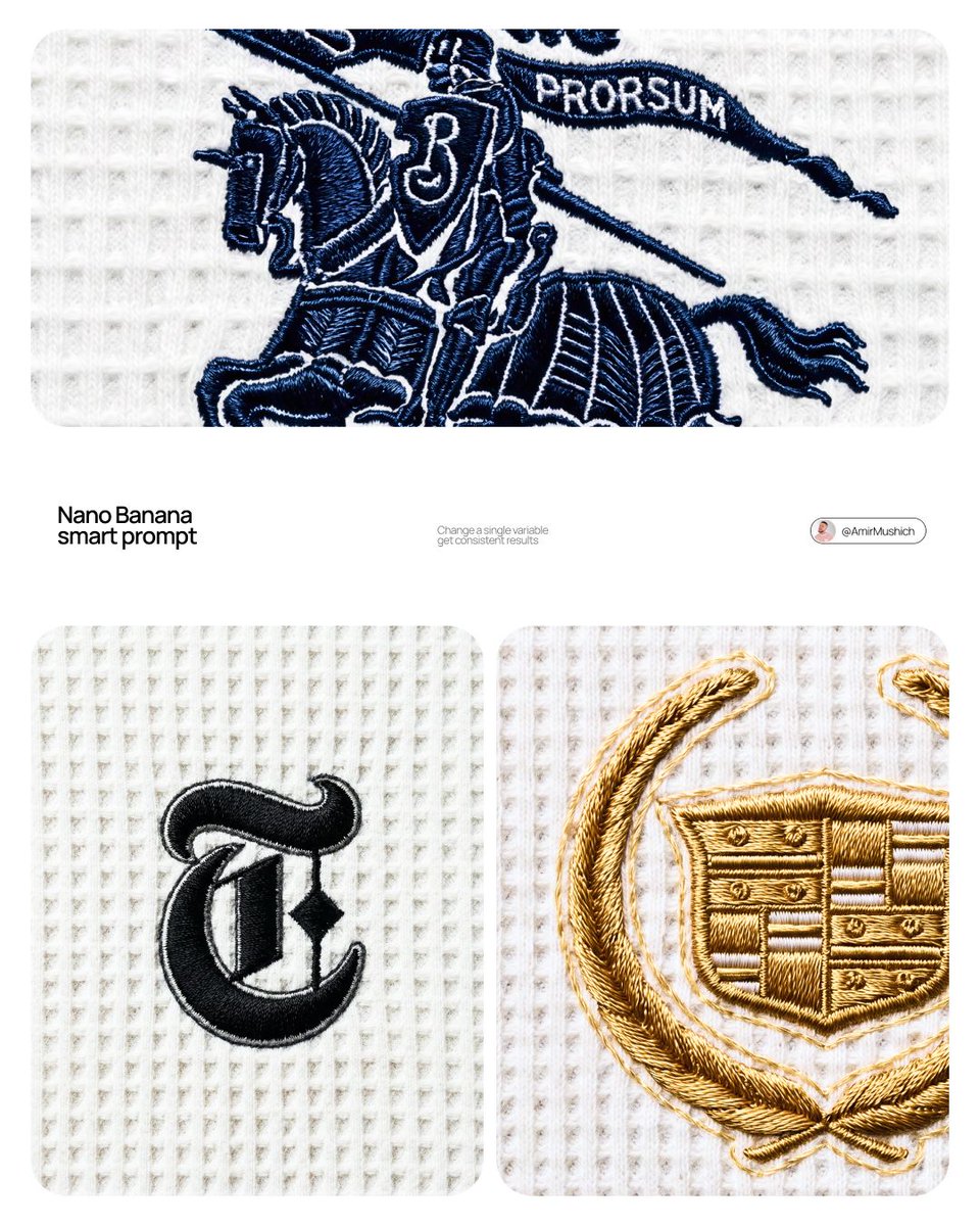
Full prompt
[BRAND NAME] Act as a Macro Product Photographer and Textile Art Director shooting a close-up editorial campaign of a premium embroidered garment. References: Loro Piana fabric campaigns, Brunello Cucinelli texture photography, A.P.C. garment detail shoots, Japanese boro textile documentation. PHASE 0: BRAND LOGO INTELLIGENCE Retrieve the canonical logotype or primary mark of [BRAND NAME] from training data. Identify the core geometric essence of the logo — its fundamental shapes, stroke relationships, and compositional balance. Translate this identity into an embroidery-native form language: sharp geometric elements become satin stitch bars and needle-point spikes, circular elements become dense satin stitch ovals or French knot clusters, complex letterforms are simplified into their most essential strokes while remaining recognizable. The embroidery interpretation must feel like a deliberate premium interpretation of the brand mark — as if [BRAND NAME]'s design team commissioned an embroidery artist to translate their logo into thread. Autonomously determine the thread color most iconic to [BRAND NAME] — this becomes the primary embroidery thread color. If [BRAND NAME] has no dominant single color, default to deep navy #1A2332. PHASE 1: TEXTILE BACKGROUND The background is a premium waffle-knit cotton fabric — the weave structure is a precise geometric grid of raised square cells, each cell approximately 2×2mm equivalent, separated by thin recessed channels running both horizontally and vertically. The raised nodes of each cell are flat-topped, not rounded — creating a regular orthogonal relief pattern across the entire surface. The fabric color is cold off-white — #F0F0EE to #EBEBEA range, with a very slight cool gray bias, not warm ecru or cream. The weave is consistent and uniform across the entire frame — machine precision, no tension variation, no distortion. Microscopic fiber fuzz is visible on the flat tops of the raised nodes — individual cotton fibers catching the diffused overhead light as a very fine surface bloom. The recessed channels between cells are in soft shadow — not deep shadow, just slightly darker than the raised nodes, consistent with flat overhead illumination. PHASE 2: EMBROIDERY CONSTRUCTION SYSTEM The logo mark of [BRAND NAME] rendered as machine or hand embroidery using these specific stitch techniques. Satin stitch: the primary technique for all filled areas and stroke elements — dense parallel threads laid side by side with zero gap, creating a smooth glossy surface. Thread direction follows the long axis of each stroke element — horizontal strokes have horizontal threads, diagonal strokes have diagonal threads. The characteristic sheen of satin stitch is critical: threads catch light along their length creating bright reflective zones on thread-parallel surfaces and darker zones on thread-perpendicular surfaces, creating a directional shimmer across the embroidery surface. Stem stitch or outline stitch: used for any curved linear elements — thin continuous line of overlapping thread segments following curves with natural flexibility. French knots: small circular dot elements rendered as tightly wound thread knots — each knot has a visible spiral wind pattern at macro distance. Spike elements: long tapering needle-like forms executed in satin stitch that tapers from full width to a single thread point — gradual and precise, ending in a razor-sharp thread tip. Edge treatment: every embroidered element has a thin visible backing outline — 1 to 2 thread widths of the base fabric visible between the embroidery and the surrounding textile. This underlay/backing edge is slightly lighter than the main embroidery thread — it outlines every form and confirms the physical layering of embroidery over fabric. Physical relief: the embroidery sits 1 to 3mm above the fabric surface — confirmed by a very subtle shadow halo directly underneath each embroidered element. The shadow is symmetrical around the embroidery perimeter, soft-edged, 1 to 2mm wide — consistent with flat overhead illumination, not directional raking light. PHASE 3: THREAD MATERIAL Primary thread color: autonomously determined brand color from PHASE 0. Thread material: mercerized cotton or silk embroidery thread — high sheen, smooth filament surface. The thread color is never flat — it shifts in value along its length based on light angle. Directly lit zones approach a lighter more luminous version of the base color. Shadow zones approach a deeper more saturated version. The overall embroidery reads as one unified color but contains a full tonal range within that color family. Secondary thread: the backing/underlay edge thread is 2 to 3 shades lighter than the primary thread — creating the characteristic light outline visible around all embroidered elements. PHASE 4: COMPOSITION & CAMERA Camera body: Canon EOS R5 or Nikon Z8 — full frame, 45 megapixel minimum for fabric texture resolution. Lens: Canon RF 100mm f/2.8L Macro IS USM or Nikon Z MC 105mm f/2.8 VR S — used at moderate close-up distance, not at maximum 1:1 magnification. Focus distance: 40 to 55cm — the embroidery fills approximately 30 to 40% of the frame height, leaving generous fabric context on all sides. This is a moderate close-up, not extreme macro — the full embroidery composition is visible with substantial textile surround. Aperture: f/8 to f/11 — deep depth of field, the entire embroidery and all surrounding fabric texture are in crisp simultaneous focus from corner to corner. No visible bokeh anywhere in the frame. Shutter speed: 1/200s with continuous light source. ISO: 100 — base ISO, zero noise, maximum tonal resolution in the subtle gray shadows of the waffle recesses. White balance: 5600K — neutral daylight, renders the cold off-white fabric accurately without warm or cool shift. Exposure: slightly bright ETTR — the off-white fabric renders as a luminous near-white, embroidery thread reads as deep rich dark against the bright ground. Aspect ratio: 4:5 portrait. Camera perpendicular to fabric plane — zero perspective distortion, embroidery geometry rendered faithfully. PHASE 5: LIGHTING Primary light: large diffused overhead source — a 120×120cm softbox or diffusion panel positioned directly above the fabric at 60 to 80cm distance. The light is as close to flat and directionless as possible. No raking angle — the light comes from directly above at 85 to 90° to the fabric plane. This flat overhead lighting creates: uniform brightness across the entire fabric field with no hot spots or falloff. Very short soft shadows in the recessed channels of the waffle grid — 1 to 2mm wide, soft-edged, falling straight down. Soft symmetrical micro-shadow halo directly beneath the embroidery — the 1 to 3mm relief creates a subtle darker zone immediately surrounding the embroidery perimeter, equal on all sides. No directional shadow — the shadow is not cast to one side. Secondary light: none. No fill, no rim, no accent. The single large overhead diffused source is the complete lighting setup. Overall mood: clinical, precise, bright — consistent with product documentation or high-end textile editorial photography where the subject must be seen with maximum clarity and zero atmospheric distraction. PHASE 6: TECH SPECS Render: Octane Render or Redshift with fiber/textile displacement geometry. Thread geometry: actual 3D cylindrical thread strands — each thread strand is a real geometric object casting real shadows on adjacent threads, not texture maps. Fabric weave: real geometric displacement mesh for waffle structure — not normal map. Ray tracing: on — for accurate micro-shadow casting between individual thread strands and between embroidery and fabric surface. Subsurface scattering: subtle on thread material — mercerized cotton and silk have slight translucency. Depth of field: physically accurate — f/8 to f/11 at 100mm at 40 to 55cm focus distance, full frame sharp corner to corner. Anti-aliasing: maximum. Sampling: minimum 2048 samples — zero noise in shadow zones, full tonal resolution in the off-white fabric field. Output feel: this image should be indistinguishable from a photograph taken with a Canon 100mm macro in a textile documentation studio. The viewer must feel the urge to touch the fabric.
Source: AmirMushich
How to use this prompt
- 1. Copy the full prompt above.
- 2. Open the free generator and paste it into the prompt box.
- 3. Upload a reference image if the prompt calls for one, then generate.
This prompt was written for Nano Banana. It also works on the other Nano Banana models, with small differences in style and detail.
More Product & Brand prompts
View all →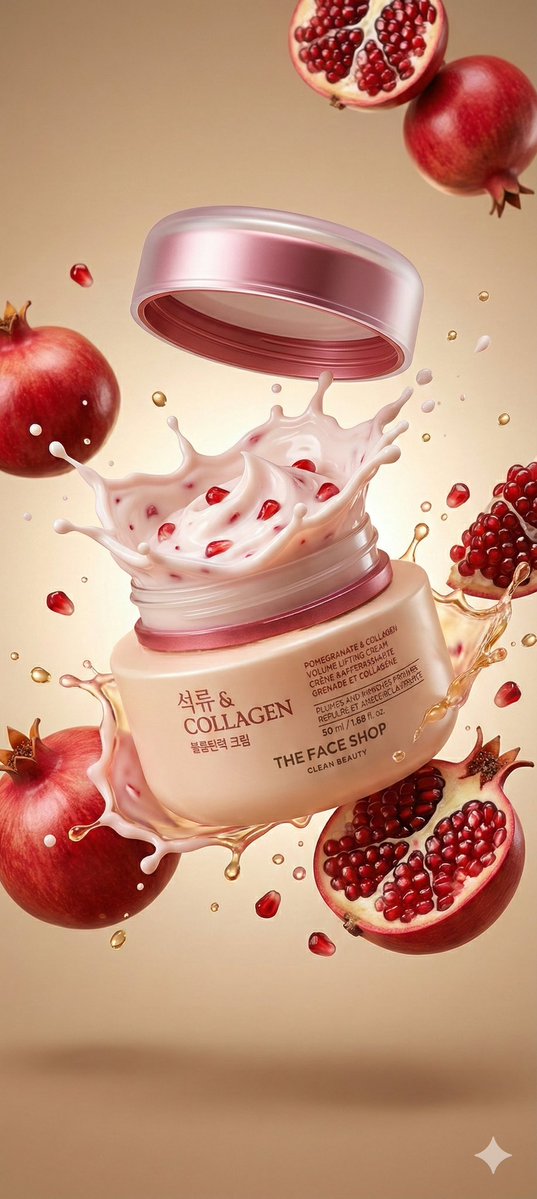
A hyperrealistic premium product photography scene of a
"A hyperrealistic premium product photography scene of a smooth beige cosmetic jar labeled “Collagen" Pomegranate & Collagen Volume Lifting Cream” exploding open mid-air, with the metallic rose-gold lid floating slightly above the jar and a thick, whipped, pale pink cream bursting upward in a dramatic splash, glossy and textured with visible red pomegranate seeds, surrounded by suspended whole red pomegranates and halved pomegranates with glistening ruby-red arils, golden liquid droplets and creamy splashes frozen in motion around the jar, the container tilted slightly to the right and centered in frame, shot from a straight-on macro perspective, illuminated by soft yet high-contrast studio lighting from above and slightly behind to create glowing highlights on the wet textures and translucent splashes, subtle shadows beneath the floating elements, a smooth warm beige gradient background enhancing the color palette of soft pinks, creams, and deep red fruit tones, ultra-sharp focus on the jar and cream with shallow depth of field for the outer fruit, cinematic realism, luxury skincare advertising aesthetic, crisp reflections, 8K photorealistic detail, energetic and fresh mood."
A bitten realistic classic product on the dish, revealed
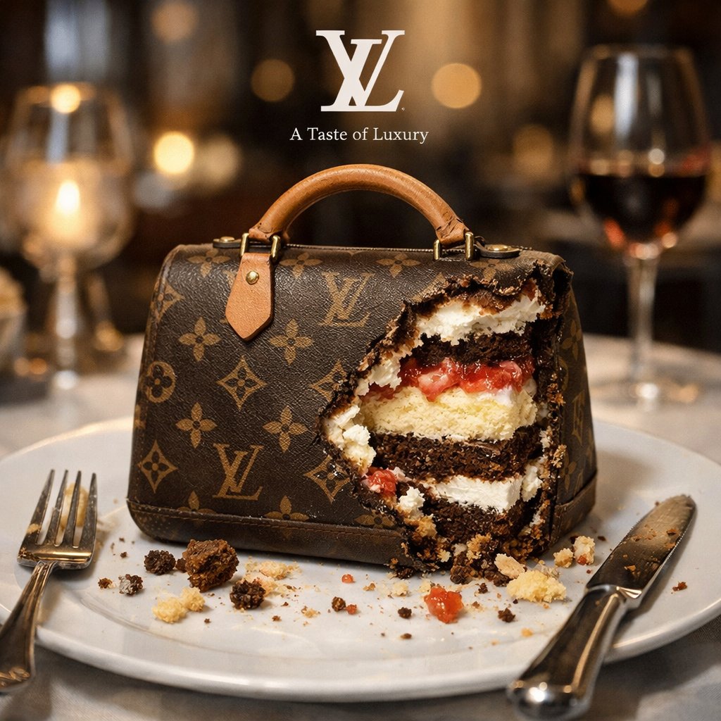
A bitten realistic classic [brand] product on the dish, revealed inner dessert layers, and there are cake crumbs near, finished fork and knife near by, against blurry high end restaurant background, white small logo on top of background, beneath the logo, there is a tiny brand slogan that suit this scene.
A detailed technical blueprint illustration of , drawn in
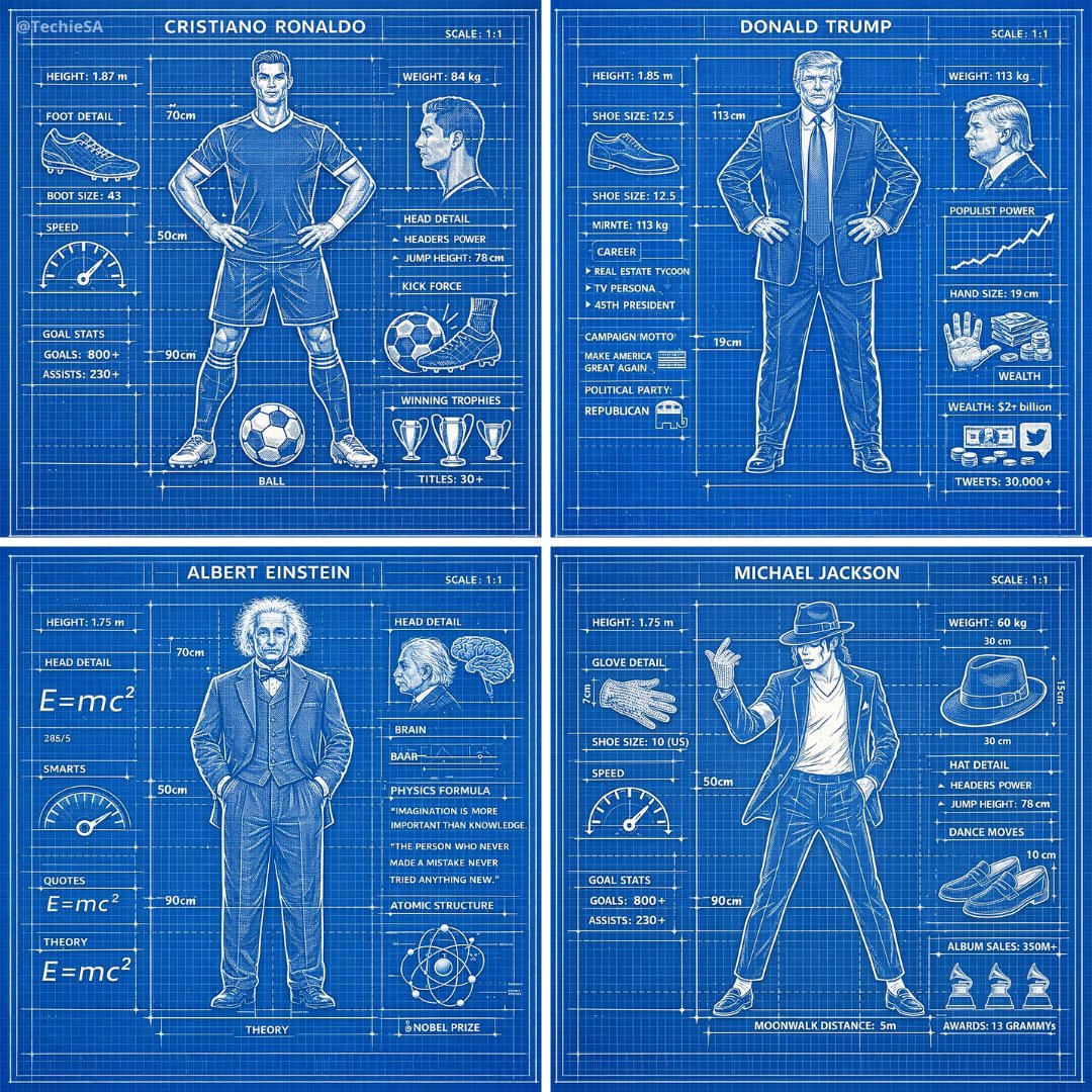
A detailed technical blueprint illustration of [CHARACTER], drawn in blueprint style on a blue grid background with precise white linework. Includes subtle measurement markings, labels, and schematic-style annotations around the figure. The design is clean, symmetrical, and centered, giving it the look of a professional engineering drawing.
ChatGPT Image 1.5 × Google Veo 3.1
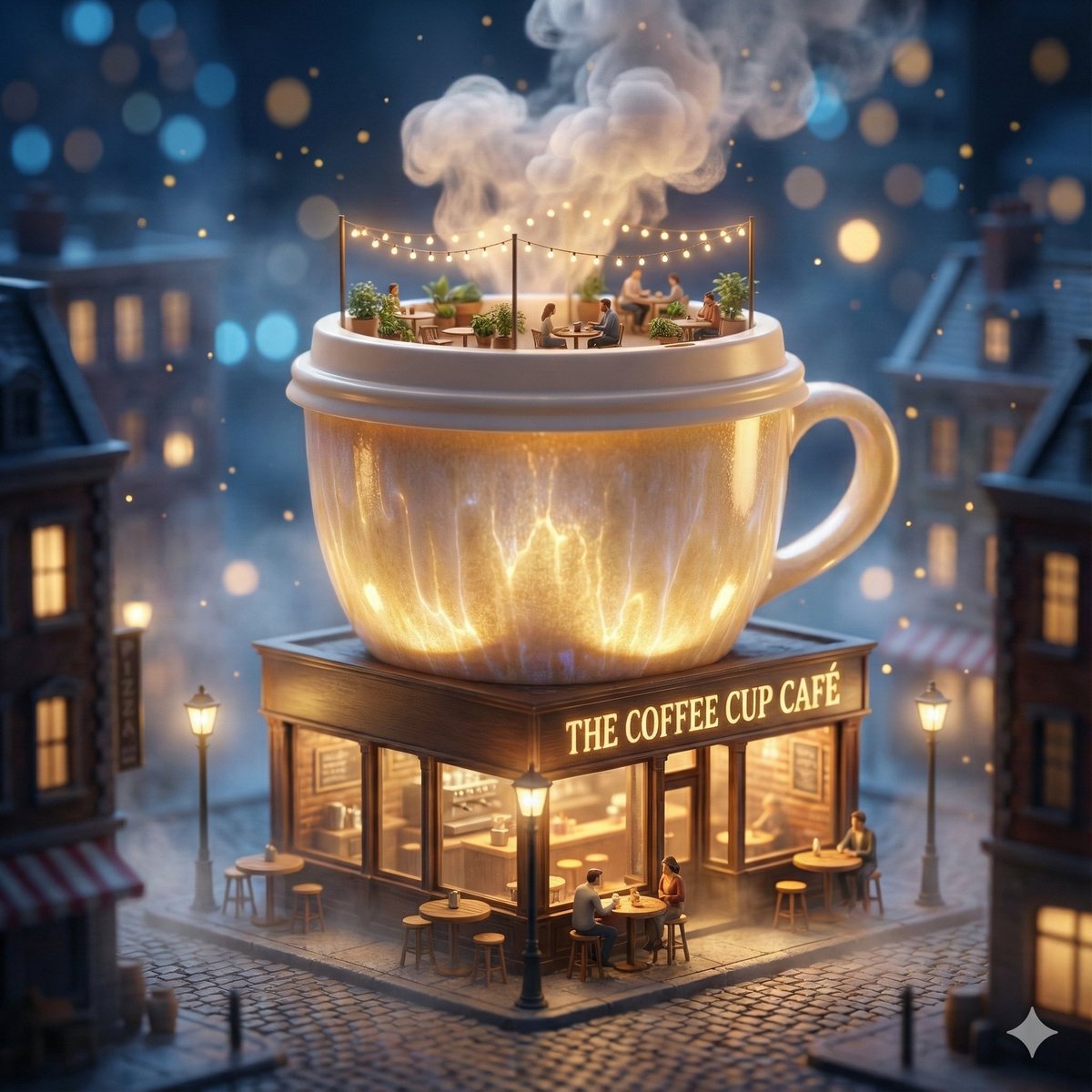
ChatGPT Image 1.5 × Google Veo 3.1 → Nano Banana Pro / GPT-Image 1.5 → Copy & Paste the Prompt → View Results Below ⤵️ Prompt: A surreal miniature city scene where a giant coffee cup transforms into a cozy café building. The coffee cup forms the main structure, with steam rising like clouds, ceramic textures glowing softly, and the lid acting as a rooftop terrace. The ground floor is a warmly lit café storefront with glass windows, tiny tables, stools, barista counters, and glowing street lamps. Nighttime atmosphere with cinematic bokeh lights, floating particles, soft fog, warm interior glow, hyper-detailed materials, fantasy realism, premium brand storytelling. Tilt-shift effect, ultra-sharp focus, dramatic lighting, square frame, 1080×1080, high-end commercial illustration, ultra-detailed 8K quality.
Commercial luxury product photography, photorealistic
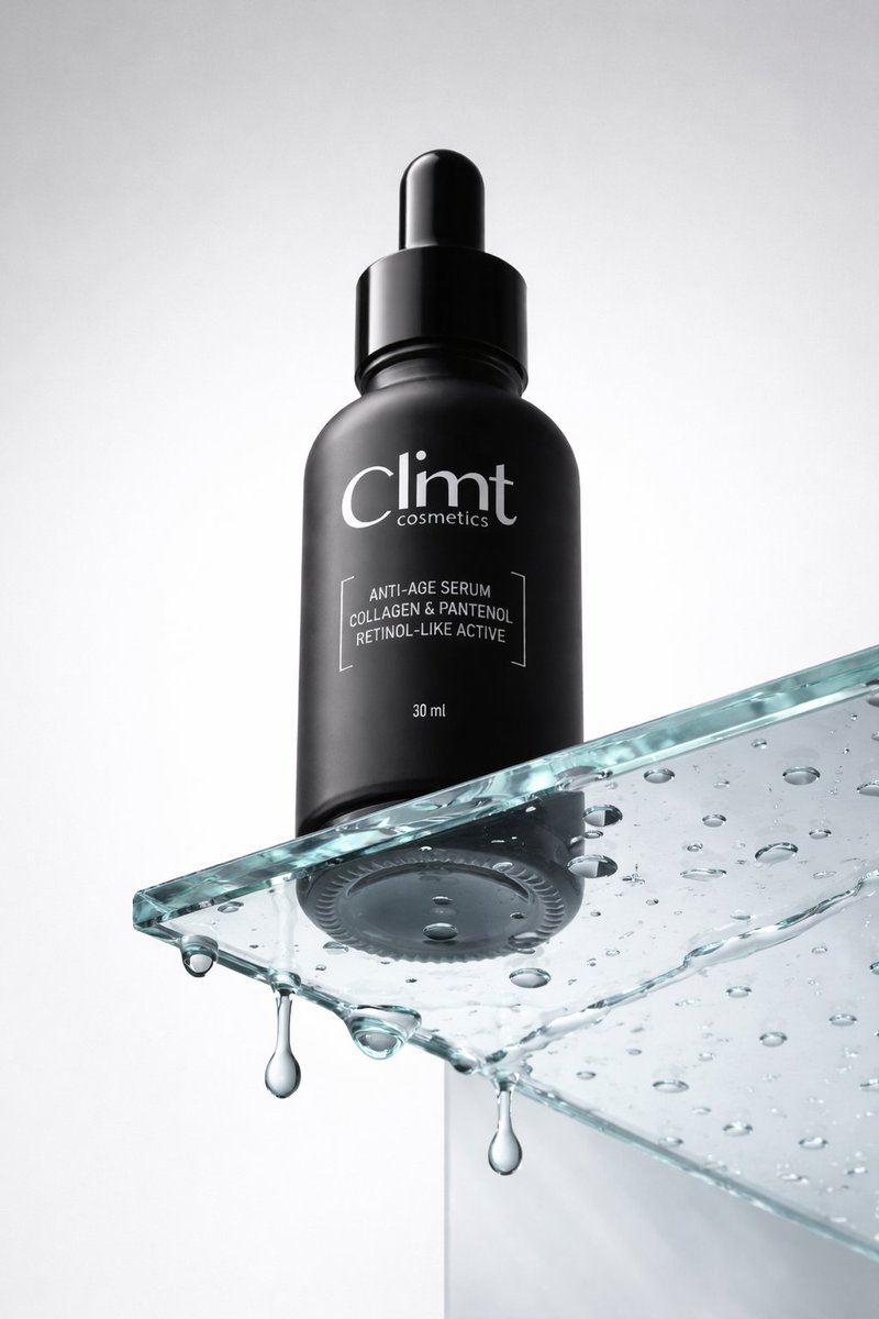
Commercial luxury product photography, photorealistic, ultra high detail, 8K quality. A minimalist matte black cosmetic dropper bottle placed on a clear glass podium. Low angle camera view to make the bottle feel tall and powerful. The bottom of the bottle is clearly visible through the transparent glass. The glass surface is wet with realistic water droplets, with a few drops hanging underneath the glass, frozen mid drip for a time stopped effect. Matte light gray background with no texture or gradient. Soft, even studio lighting with clean reflections, premium skincare advertising look, sharp focus, realistic materials, no distractions.
Conceptual transformation, bird nest construction
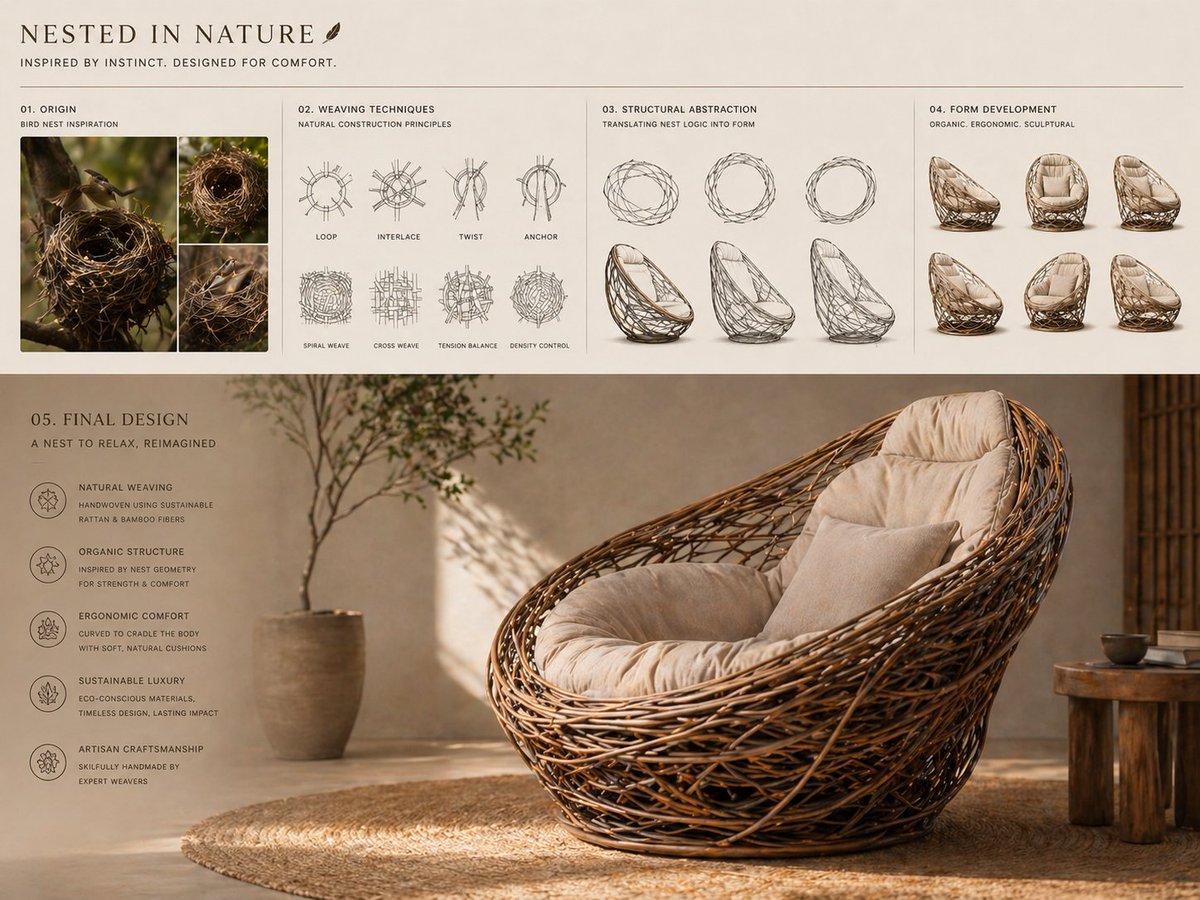
Conceptual transformation, bird nest construction techniques shaping a sculptural lounge chair, sequence from nest-building photography to weaving diagrams to organic structural abstraction to final product, interwoven frame forming seat and backrest, natural fibers with soft cushioning, earthy tones with refined finish, sustainable luxury aesthetic, presentation layout, sketches above, render below, warm natural lighting. AR – 4:3
Create a 16:9 horizontal bento-grid brand collage for in a
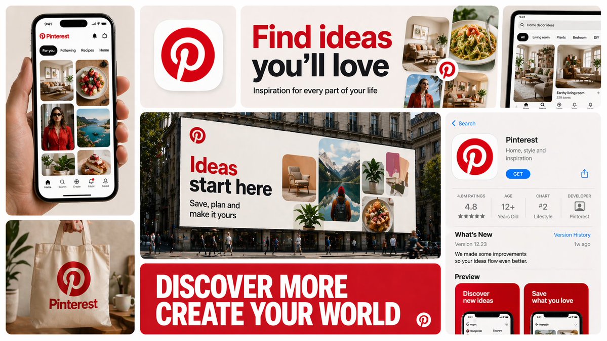
Create a 16:9 horizontal bento-grid brand collage for [BRAND NAME] in a polished contemporary campaign style. Use a fixed 3-row, 4-column bento structure with rounded tiles, equal gaps, clean alignment, and a light neutral background. The layout must stay consistent across generations, but the content inside each tile must adapt to the real business model, product ecosystem, and brand language of [brand name]. Grid blueprint Build the composition as 11 visible content zones arranged in a fixed bento layout: Top-left tile: 1 column × 2 rows, tall vertical hero device or primary brand surface Top-middle-left tile: 1 column × 1 row, compact square brand asset tile Top-middle-right tile: 2 columns × 1 row, wide headline/message tile Center tile: 2 columns × 2 rows, dominant campaign hero scene Top-right tile: 1 column × 1 row, secondary device / product surface / branded object Bottom-left tile: 1 column × 1 row, product artifact or branded utility object Bottom-center tile: 2 columns × 1 row, large bold typography tile Bottom-right tile: 1 column × 2 rows, tall informational product / interface / feature tile All tiles must share the same corner radius, spacing system, and visual polish. The dominant focal points are the large center hero tile, the wide top headline tile, and the wide bottom typography tile. Adaptive content logic Do not assume [brand name] is a fintech brand. Before deciding what appears inside each tile, infer what [brand name] actually is: social platform, SaaS tool, media brand, retailer, hospitality brand, hardware company, mobility app, AI product, consumer app, etc. Every tile must contain a plausible branded asset based on that business type. Use this rule: If [brand name] has a real consumer app, dashboard, product UI, creator interface, booking flow, editor, storefront, feed, player, workspace, or operating surface, use those. If [brand name] does not realistically have payment cards, watches, or hardware, do not invent them. Only include branded physical objects when they make sense for the brand: packaging, merch, signage, magazine, laptop sticker, storefront card, delivery box, product box, wearable, poster, notebook, tote, badge, ticket, book, etc. If the brand is primarily digital, prioritize screens, interface fragments, campaign graphics, app/store listings, editorial visuals, and branded communication assets. If the brand is a platform, use realistic platform surfaces: profile screens, creator dashboards, boards, playlists, templates, analytics, publishing tools, discovery feeds, search, collaboration views, etc. If the brand is a physical-product company, use realistic product shots, packaging, product detail pages, retail signage, and lifestyle scenes. If the brand is a service business, use realistic booking, scheduling, marketplace, onboarding, testimonial, results, or service-delivery interfaces. If exact assets are unknown, infer the most believable official-looking product and campaign system for [brand name]. Tile-by-tile rules 1) Tall left hero tile Show the most iconic primary branded surface for [brand name]. Examples: phone with app UI laptop with dashboard/editor tablet with creative workspace product packaging held in hand branded poster or printed object storefront or physical product close-up This tile should represent the brand’s main touchpoint, not a generic device. 2) Small square brand asset tile Show a compact brand-signature element: app icon logo mark symbol product badge branded motif miniature packaging unit icon system object sticker or seal simplified 3D brand emblem This tile should feel like a distilled identity marker. 3) Wide top headline tile Use a short strategic message that fits [brand name]’s category and tone. Do not repeat generic fintech copy. The line should feel like a real campaign headline for that specific brand. Examples of direction: discovery creativity organization inspiration connection travel productivity expression streaming collaboration automation Use large, bold, high-contrast typography. 4) Large center hero tile Create the main campaign scene for [brand name] in a real-world or branded-environment context. This should be the most expressive tile. Possible formats: outdoor billboard subway poster retail installation city poster wall laptop-on-desk hero scene creator workspace product-in-use lifestyle shot editorial campaign image interface projected into environment branded event signage The scene must make sense for the brand’s world and audience. 5) Top-right support tile Show a secondary but still realistic brand surface: another device view product detail branded object campaign variation interface zoom-in packaging angle social post mockup desktop widget creator tool panel notification / discovery / search view This tile should complement the main touchpoint, not duplicate it exactly. 6) Bottom-left artifact tile Show a category-appropriate branded artifact, not a fixed “bank card”. Choose the artifact based on [brand name]: for fintech: payment card, wallet pass, transfer screen, exchange card for social/media: creator card, profile card, post template, content preview, board tile, channel card for SaaS/productivity: workspace card, document preview, template card, dashboard widget for e-commerce/retail: packaging, shipping box, loyalty pass, product tag, order card for travel/hospitality: booking card, room key, boarding-style pass, itinerary card for music/media: album card, playlist card, player card, event ticket for AI/software: prompt card, generation result card, model card, workflow card This tile must feel like a believable branded unit of value for that company. 7) Wide bottom message tile Use one strong oversized statement in uppercase or bold display typography. This is not necessarily the slogan from the top tile; it can be a broader campaign line or category promise. The message must match the actual brand behavior of [brand name]. For example, do not use “MOVE MONEY WITHOUT BORDERS” unless the brand actually deals with payments or finance. 8) Tall right informational tile Show a structured branded information surface: app store page product page onboarding screen feature overview marketplace listing creator profile brand campaign landing screen dashboard overview editorial page discovery feed help center / setup / feature panel This tile should add product depth and make the collage feel like a full brand system. Brand realism rules Use the real or highly plausible brand identity of [brand name]: logo, color palette, typography feel, icon language, image treatment, interface style, and tone of voice. If exact assets are unavailable, invent only what is necessary, but make it feel like the official visual system of [brand name]. Do not force a product category onto the brand. Do not invent impossible hardware, payment tools, packaging, or app features unless they are realistic adjacent extensions of the brand. Prefer believable brand adaptation over visual symmetry. Visual consistency rules Even though tile content is adaptive, the final image must still feel like one campaign system: same overall grid structure same tile spacing same corner radius same art direction quality same brand palette across all tiles consistent typography logic consistent mockup realism consistent lighting and polish Style Clean premium brand presentation, high detail, polished mockup realism, soft shadows, strong hierarchy, editorial-quality composition, modern campaign aesthetics. Avoid random collage chaos. Avoid tiny unreadable text. Avoid generic placeholder UI. Keep the structure fixed, but let the objects and branded surfaces adapt intelligently to [brand name]. Stronger one-line instruction Important: the layout is fixed, but the objects are not fixed. For each generation, select tile content based on what [brand name] realistically sells, ships, publishes, displays, or lets users interact with. Never insert category-inappropriate objects just to fill the grid.
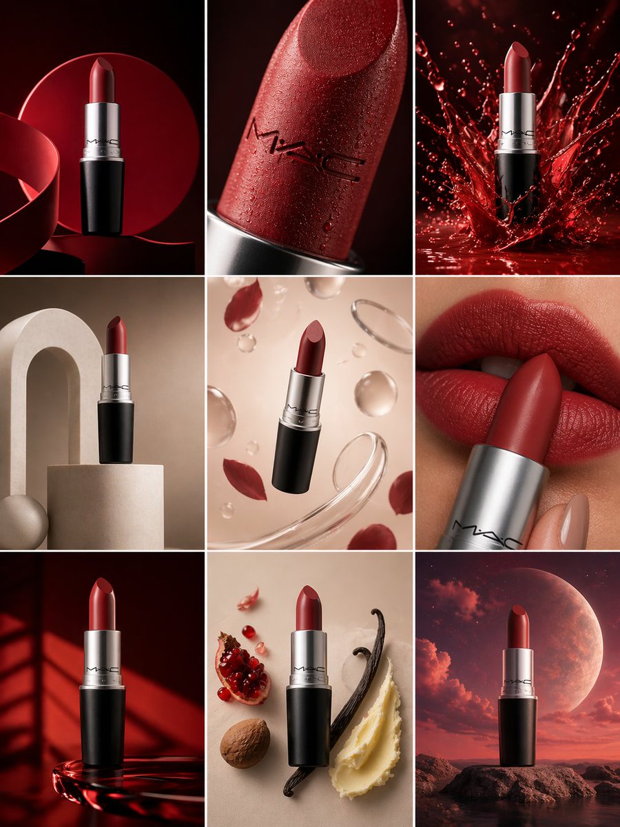
Create a 3×3 grid in
Create a 3×3 grid in 3:4 aspect ratio for a high-end commercial marketing campaign using the uploaded product as the central subject. Each frame must present a distinct visual concept while maintaining perfect product consistency across all nine images. Grid Concepts (one per cell): 1. Iconic hero still life with bold composition 2. Extreme macro detail highlighting material, surface, or texture 3. Dynamic liquid or particle interaction surrounding the product 4. Minimal sculptural arrangement with abstract forms 5. Floating elements composition suggesting lightness and innovation 6. Sensory close-up emphasizing tactility and realism 7. Color-driven conceptual scene inspired by the product palette 8. Ingredient or component abstraction (non-literal, symbolic) 9. Surreal yet elegant fusion scene combining realism and imagination Visual Rules: Product must remain 100% accurate in shape, proportions, label, typography, color, and branding No distortion, deformation, or redesign of the product Clean separation between product and background Lighting & Style: Soft, controlled studio lighting Subtle highlights, realistic shadows High dynamic range, ultra-sharp focus Editorial luxury advertising aesthetic Premium sensory marketing look Overall Feel: Modern, refined, visually cohesive High-end commercial campaign Designed for brand websites, social grids, and digital billboards Hyperreal, cinematic, polished, and aspirational
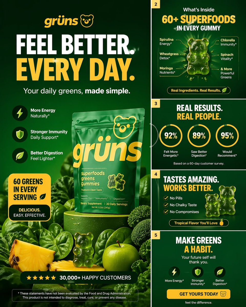
Create a high-converting carousel image for Grüns (greens
Create a high-converting carousel image for Grüns (greens gummies). Bold hook, clear outcome, premium DTC design. Mobile-first, 4:5, advanced design level.
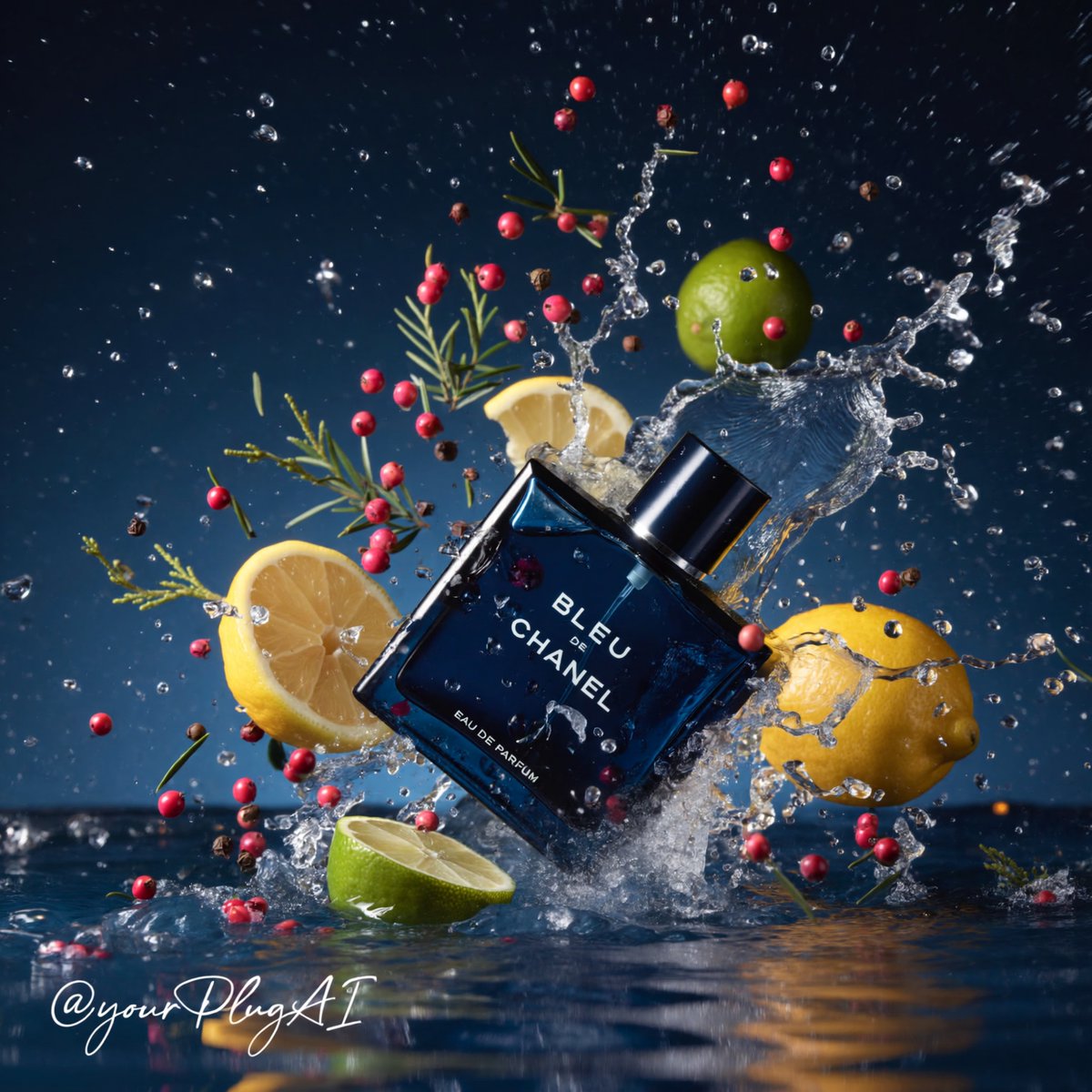
Create a hyper-realistic cinematic luxury perfume product
Create a hyper-realistic cinematic luxury perfume product photograph featuring [PERFUME BOTTLE DESIGN] positioned in [COMPOSITION / ANGLE] within a dramatic elemental environment of [ELEMENTAL SETTING: water, smoke, ice, firelight, forest, florals, spices, gemstones]. The bottle should feel premium and tactile, with [MATERIAL DETAILS: glossy glass, metallic cap, gold label, transparent liquid, frosted surface, engraved text], sharp reflections, realistic refractions, and crisp readable branding: [BRAND / LABEL TEXT]. Surround the product with carefully arranged sensory ingredients such as [BOTANICALS / SPICES / FRUITS / OBJECTS], using strong contrast between [PRIMARY COLOR PALETTE] and [ACCENT COLORS]. Lighting should be cinematic and high-contrast, with [LIGHTING STYLE], deep shadows, sparkling highlights, volumetric atmosphere, and a luxurious commercial advertising finish. Background: [BACKGROUND DESCRIPTION], shallow depth of field, premium editorial composition, ultra-detailed textures, 8k resolution, photorealistic studio quality. Cheat Sheet [PERFUME BOTTLE DESIGN]: shape, color, cap, label style [COMPOSITION / ANGLE]: tilted crash, centered still life, close-up tray, hand interaction [ELEMENTAL SETTING]: splash, smoke, candlelight, ice, forest, aurora [MATERIAL DETAILS]: glass, metal, liquid, frost, reflections [BRAND / LABEL TEXT]: exact readable perfume text [BOTANICALS / SPICES / FRUITS / OBJECTS]: lemons, vanilla pods, roses, pinecones, gemstones [PRIMARY COLOR PALETTE]: navy, amber, silver, black, icy blue [ACCENT COLORS]: gold, red, lime green, magenta, teal [LIGHTING STYLE]: dramatic spotlight, candle glow, cool moonlight, golden rim light [BACKGROUND DESCRIPTION]: moody studio, dark forest, blurred luxury interior, smoky backdrop
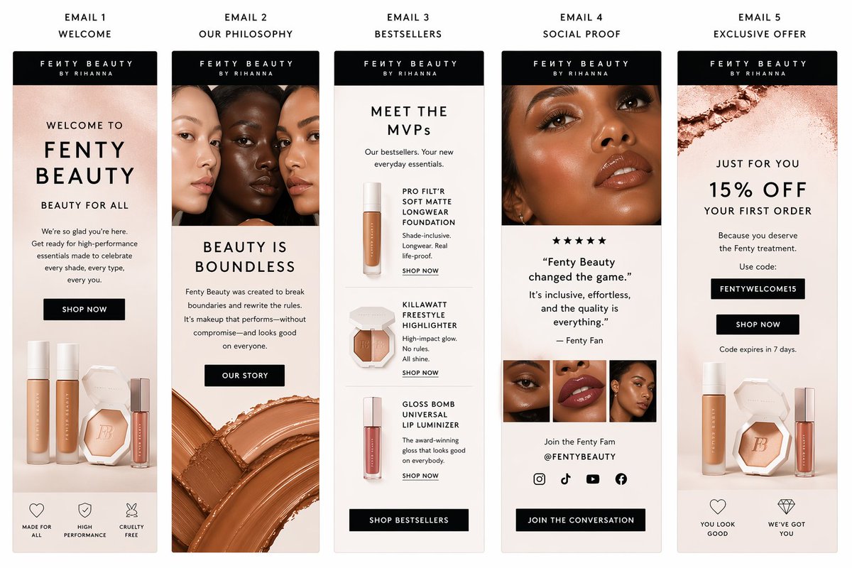
Create a polished email sequence template for fenty beauty
Create a polished email sequence template for fenty beauty
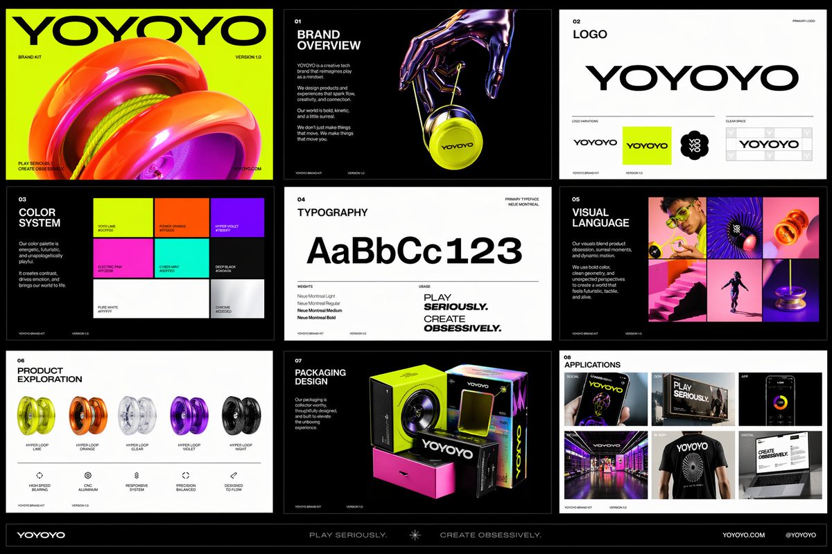
Create a polished multi-page (multiple images) brand kit
Create a polished multi-page (multiple images) brand kit for a company called [YOYOYO]. The brand should feel playful, futuristic, vibrant, and design-forward, blending the energy of a toy-inspired product with the sophistication of a premium creative tech brand. Use a bold, experimental visual identity with bright color, clean geometry, modern typography, dynamic motion cues, and slightly surreal imagery. The overall mood should feel inventive, youthful, rhythmic, tactile, and high-concept, with a balance of fun consumer product culture, fashionlike presentation, and contemporary digital design. Include a sense of product obsession, visual experimentation, packaging exploration, editorial photography, immersive retail, and cross-platform brand application. Make it feel like a confident, contemporary brand world that is both accessible and art-directed, with strong graphic cohesion and a premium creative-studio aesthetic.